See your user’s experience of their day through their eyes with the User Clock Sketch.
The power of mapping user experiences
Are you involved in making products and services for customers and communities? If so, you’ll know how important it is to make sure your offering matches what they need. A standard way of connecting user research to making products and services is to visually map out the journeys that they go through, using techniques like journey mapping, user story mapping, and service blueprinting.
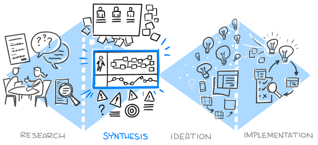
These visual tools are really effective. They’re a great way to – quite literally – get people from various parts of the business ‘on the same page’. They help everyone to see where the pain points are in a user journey, and where opportunities might be, too. Often more importantly, they help everyone to get a shared understanding of how all the various individual parts (from their perspective) relate as a whole, according to a common reference point. The user’s perspective.
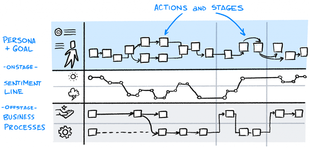
A user journey map (or customer journey map), for example, is more than just boxes and arrows. It can show what a particular persona/user type is doing (tasks), thinking (expectations, decisions) and feeling, as they use one or more of your products and services. This is a bit different to user story maps and Indi Young’s mental model diagrams, which are usually independent of your product.
User journey mapping is versatile
User journey maps, and the act of mapping as a team, can be applied in different ways. You can map out existing experiences, along with pain points, workarounds that the user type is doing, and opportunities for improvement. You can also map out envisioned experiences, where you have redesigned the experience to fix those pain points and take hold of those opportunities. In fact, an envisioned user journey map is like a new prototype, to show all the benefits of the new experience before going ahead and building anything.
Limitations with some mapping
As great as these patterns are, though, the way the information is arranged is still often according to your particular product or service. This means that there are some limitations:
- Hard to scope – It’s sometimes hard to know where the journey map should start and stop, and can seem somewhat contrived
- Susceptible to bias – The nature of scoping a map to show a particular type of user achieving a particular goal in a particular ‘happy’ scenario means we’re making lots of decisions to keep it convenient for us to map. This can open the door to unconscious bias.
- They don’t take external factors into account – It’s usually too hard to visualise all the other factors contributing to that journey (e.g. other products and services that the user type interacts with), to achieve the user type’s goal you are focused on
- Branching, cycles, multi-tasking, oh my! – Some journeys just aren’t linear (i.e. this action then that action then the next action and stop), or there may be multiple tasks going on at the same time. This can sometimes be excruciating to try to map!
Try adding the User Clock Sketch to visualise the ‘customer journey’
I remember trying to do journey mapping for some scenarios where people use Confluence, Atlassian’s wiki/documentation software. It got super-complicated really quickly, because people tend not to just do one linear this-then-that task. Instead, people tend to read several pages in different web browser tabs, search for some page in some other tab, and edit another page in yet another tab… all for different tasks and different goals! And then the following day, they do it all over again! Agh!
So, I asked: “What if we changed the perspective we’re taking, from Confluence’s point-of-view to the user’s point-of-view? What if we mapped a day in the life of the user type we are focused on (in that case it was project managers), to see what that looked like?”
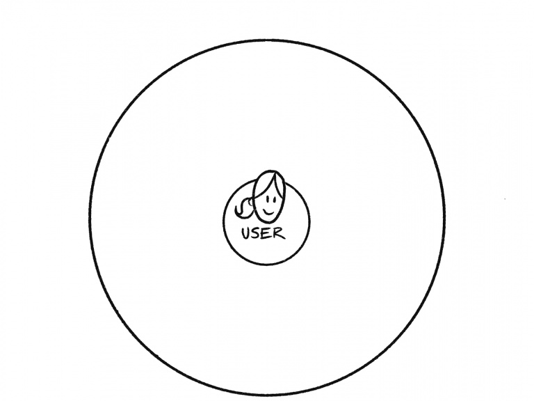
And that’s how the User Clock Sketch was born. And it looks like this:

This is particularly useful for journeys that are pretty much the same, day after day (ergh, that sounds so depressing, but it’s not meant to!). It maps the actions of a particular user type from the point where they wake up in the morning, to the point where they go to sleep. Rather than getting into the nitty gritty of each task they do, it groups actions according to significant chunks of the day that matter to them, according to their context. AND it quite literally puts the ‘user at the centre’ of the picture, how good’s that? 😉
Here’s how to do it:
Step 1: Draw your user type in the centre of a big circle
Whether you’re using one sheet of paper or a large whiteboard, draw a large circle, and then draw a simple figure in the centre. You can label the figure as a role, persona, or whatever way you are identifying that particular user type.
Step 2: Draw a line up to the ‘12’ position
Draw a vertical line from the user type up to where the ‘12’ would normally go on a clock. This is the point where your user type wakes up.

Step 3: Section the ‘clock’ into significant sections
I tend to draw a line radiating up from the centre to about the ‘9’ position, to show the time where the user type would be asleep. After you’ve done that, draw radiating lines around the face of your ‘clock’. Each line will separate a particular ‘stage of the day’ that matters to that user type and their role. If it’s an office worker, it’ll tend to include commuting time and a lunch time. It might be important that you include small but significant moments, like a daily stand-up with the team, or an important meeting with executives.
Label each of the slices of the clock. Dress up the labels with some simple drawings that show real things going on: the type(s) of devices being used, their location and environment, and other significant factors.
Step 4: Overlay your product’s/service’s context
Notice that so far you haven’t included your product or service at all; this has been all about them and their goal, their tasks, their job, and so on. Now, you can grab a different colour, go back over the ‘clock’, and add in significant information according to your product/service context.
This might include particular product tasks that the user type needs to get done using your product at that particular time of the day. Or it might include specific features that get used a lot at specific times, or specific parts of your service that get hammered more than others.

Step 5: Explore, explain, enrich
Now is the point where you can start to ‘see’ your product being used in a new ‘re-framed’ way. Either individually or as a group, you can explore the ‘clock’ you have drawn as a map of time, to provoke more insightful questions and enrich your understanding of your users.
I’ve seen this visual pattern come in handy for anyone in a multi-disciplinary team, but as a start:
- Researchers can share insights from research and tell a story according to this ‘day in the life of’ picture, so that others can relate to it from the user type’s point of view more easily, and empathise more easily
- Product managers can gain a deeper sense of what features the user type depends on more often and why (and if there are gaps), and where the moments of greatest value to the user are, so that you can align strategy, plans and roadmaps to real value metrics
- Designers and content writers can make connections from feature usage (or lack of a feature) to importance and urgency, from a user point-of view, so that you can prioritise where you want to spend the most creative energy
Adapting the User Clock Sketch
Every time I demonstrate this sketch to others, there always seem to be more uses for it… which is a good sign! Since the pattern relies on a journey being cyclical, it can come in handy in a way that a strictly linear map might not. You can also change the ‘resolution’ of the time, too. It could show a typical week for a user type, or a financial year, or for as long as it takes to order a meal and have it delivered… it’s up to you and your context. Here are a couple of variations:

Enrich the way you ‘see’ your customers
What I’m really getting at here is this: we have to see our customers as real people, not just consumers of our products. We have to see the world through their eyes, not just through the eyes of our products. And we have to use multiple various ‘frames’ on how we see them, by visualising them and describing them in different ways, and not just reducing them to conceptual abstractions using one familiar pattern or the other.
According to Capgemini research (back in 2017, at least), 75 percent of companies considered themselves to be customer-centric, but only a measly 30 percent of customers agreed. I suspect this gap is because a lot of companies mentally and physically engage with customers on a pretty superficial level, and view them as replaceable parts of the whole (as seen on a chart), rather than as individuals with genuine goals and needs to fulfil.
But I’m hoping that using patterns like the User Clock Sketch (along with other mapping tools) can help this! By changing up the way we visualise customers, I think we can inoculate ourselves against this superficial kind of thinking, and enrich our mental models of our customers and users.
This will not only improve the quality of what we offer our customers, but will ultimately make our own businesses more successful.
…
- Follow Presto Sketching on Instagram
- Sign up to the Presto Sketching newsletter by using the box at the top right of this page, and get more tips and techniques like this
- Buy the Presto Sketching book, and get an absolute boat-load of this sort of stuff in one go, and really amp up your visual thinking and visual communication game