Your visual communication pieces can land with your audience or miss them entirely, depending on what layout you choose. This post shows you the principles behind why some layouts work better than others.
Layout: your secret sauce for communication success
One of the questions I get asked a lot in the training sessions I do about sketchnoting (or visual note-taking) is: how do I organise content on the page?
Visual layout is really important. It’s what guides your audience’s eye around the page (or screen), and sends them a bunch of signals about what parts to pay more attention to than others. And it’s just as important regardless of size and medium, whether it’s small format (like sketchnoting), or larger-format, like scribing and graphic recording, and whether it’s physical or digital.
Some might say that layout doesn’t matter if you’re sketchnoting just for yourself, but I disagree. Once you finish a sketchnote, you actually swap from being the creator to the audience, i.e. you still have to read and understand it yourself. So, why wouldn’t you make it easier for yourself, as well as for others, to appreciate and understand your good work?
Introducing the 5 principles
Let’s jump into 5 principles of great layout. You’ll find that once you see these in other sketchnotes (or anything laid out in print or digital, really!), you won’t be able to unsee them.
These principles from from the world of graphic design, and are known as gestalt principles.
Let’s take a closer look at each one.
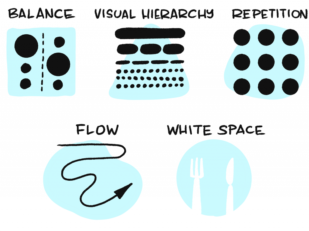
Balance
Think of all the various words, images, lines, frames and whatnot that you draw in sketchnoting as having a visual weight, i.e. a mass and density that they take up on the page (or screen). Some elements – and groups of elements – are going to be visually heavier and denser than others, and this affects how our eyes and brain judge them to be in balance.
Elements that collectively have a visual balance tend to convey calmness, order, and stability. Elements that are not in balance tend to convey disorder, discomfort, and tension. You can use this to great effect, depending on your subject matter, and what you want to communicate!
Visual hierarchy
Our eyes will gravitate to larger visual elements (text or images) before smaller visual elements. That’s why titles are usually the largest thing on a page, and footnotes are the smallest. That’s the logic of having sub-titles smaller than the title, but larger than regular text (or ‘body copy’ in print design parlance). As visual note-takers and communicators, this visual hierarchy of elements is super important to understand and use. We can change the proportion of elements on our pages to guide our audience’s eyes around the page, and use variable proportions of elements to convey what’s more important.
Repetition
Related to visual hierarchy and proportion is repetition. Being consistent in the layout and proportion of elements is a great way to convey unity and in your visual note-taking and graphic recording work, and make them easier to read and remember. Examples:
- Keeping all your sub-titles the same size and colour helps your audience to scan and understand the piece much more easily
- Using one, two or three colours to set up a visual pattern is often better than trying to use every colour marker you’ve got in the one piece
- Using a small set of different types of frames, separators and backgrounds in the one piece, rather than hitting your audience with a kaleidoscope of umpteen different elements
Flow
I mentioned how we can lead our audience’s eyes around a page using visual hierarchy. We can also do this by paying attention to the rhythm, proximity, and flow of visual elements (or groups of elements). Layouts help us ‘package’ groups of elements together, according to rhythm, proximity, and flow.
This makes it easier for our audience’s eyes to read the whole by intuitively knowing what order to read various groups of elements. If there is no layout in place, our eyes find it harder to know how to navigate the whole; if that happens we fall back to an intuitive default of scanning a page from the top left corner to the bottom right corner (for Western audiences at least).
As visual note-takers and recorders, we of course have other juicy elements that pop up in various layouts, to help with flow. These are super effective, and other visual communicators can’t often use these the way we can:
- Arrows – arrows are purpose-built to guide the eye. They convey sequence, order, step logic, and progress. Sometimes they even convey speed. Sometimes the whole layout is just one big arrow!
- Separators – we can use lines of all kinds and characters to visually separate and sequence ideas and content
- Frames – we can add order, sequence and hierarchy using frames of different kinds. Frames can also help audiences know what type of content to expect to read, which helps understanding and recall.
- Shapes – we can use different kinds of shapes to arrange and classify content types in layouts. Shapes can be schematic (rectangles and circles), but they can also be metaphorical (e.g. silhouettes of icebergs, hot air balloons, mountains and clouds).
White space
Closely related to flow is knowing how layouts use white space. Layouts have areas of white space built-in.
Use them wisely!
Now that you know these 5 principles, here are some tips to help you actually do something with them:
- Take a look at others’ sketchnotes or graphic recordings, and ‘read’ them according to these principles, to help you understand how to apply them. What can you detect about the pieces you see, when it comes to Balance, Visual hierarchy, Repetition, Flow, and White Space?
- Deconstruct some of your own sketchnotes or drawings. How might you improve them, according to each of the principles?
- The next time you do a sketchnote or graphic recording, pick one principle, and try to do the best you can in expressing that one principle.
I hope this helps you improve in your visualisation and drawing journey!
…
- Follow Presto Sketching on Instagram for more
- Sign up to the Presto Sketching newsletter by using the box at the top right of this page, and get more tips and techniques like this
- Buy the Presto Sketching book, and get an absolute boat-load of this sort of stuff in one go, and really amp up your visual thinking and visual communication game.