Here’s a set of sketchnote layouts to try, plus some tips about which layouts to use for which particular purpose.
Lead them down the garden path
One of the questions I get asked a lot in the training sessions I do about sketchnoting (or visual note-taking) is: how do I organise content on the page?
The layout of your sketchnotes and graphic recordings is really important for guiding your audience around the information you want them to take in, much like paths in parks and gardens are designed to help people see the best of what’s on offer. The layout you choose also makes it easier for your audience’s eyes to read the whole by intuitively knowing what order to read various groups of elements. If there is no layout in place, our eyes find it harder to know how to navigate the whole; if that happens we fall back to an intuitive default of scanning a page from the top left corner to the bottom right corner (for Western audiences at least).
Sketchnote layouts to try
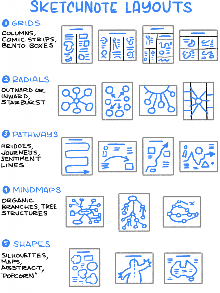
Here is a poster image of various kinds of layouts you might like to try. I know there are lots of these summaries around, but these are the ones I teach, that are most effective, most of the time.
Note that these layouts work well for portrait or landscape… or square, for that matter. They’re all based on some age-old gestalt principles, borrowed from the world of graphic design.
And don’t forget to continue reading past this image, because we’ll get into some ideas for which layouts to try for which purpose…
Which layouts to try for which purpose
Columns and grids are your gateway
If you’re fairly fresh to sketchnoting, all this layout business might seem a bit daunting! By now though, I hope you can appreciate that using different layouts isn’t just about making content look more attractive; it’s about adding order and sequence, to make the content more meaningful, more understandable, and more memorable.
The thing about text-based communication is that it treats any topic the same way. Whether it’s a news article, a how-to guide, a work email, or a letter from your grandmother (this blog post, even!), it’s all arranged the same (barring being broken up with images). Paragraphs always come one after the other. To consume a text communication, you start at the top, and work your way through in a linear fashion.
I’m certainly not hating on this format (I rely on it for this post, after all!) but it’s very limiting. By contrast, using different layouts helps us to break out of that linear flow, and lay out our ideas in a sequence and space that often makes communication more effective and more meaningful.
Column layouts are your gateway to this new world! This is the easiest way to start the progression from the regular habit of text-based note-taking, and communicating everything in the same format of slabs of text:
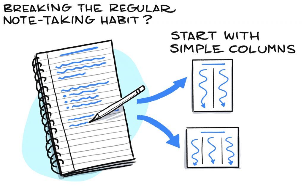
Just like we can break up our text and images into columns, we can also break them up into rows…. although not too many, otherwise it turns into a spreadsheet! 😉
2×2 grids and 3×2 are very popular for communicating content that can be mapped on 2 spectra/axes, or for displaying content in a storyboard-like set of panels.
Radial layouts for guides
Continuing with the theme of freeing up content from the linear railway-carriage style of text-based communication, you might like to indulge in a radial layout.
Radial layouts come in handy when there is a set of principles or ideas related to one overall concept or message, in no particular order. You see this at work in listicles (I mean, try not to click on 20 Lipstick Names That Are Awkward As Hell), and in some public talks and podcast sessions.
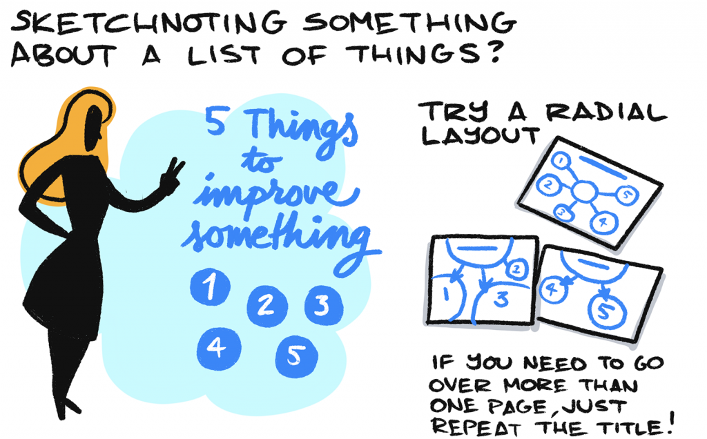
Start with the title in the middle of the page (rather than at the top of the page), and capture each idea around the title. Link them with lines and arrows if you want to. Need to go over more than one page? No problem. Just repeat the title in the middle of the next page, and away you go.
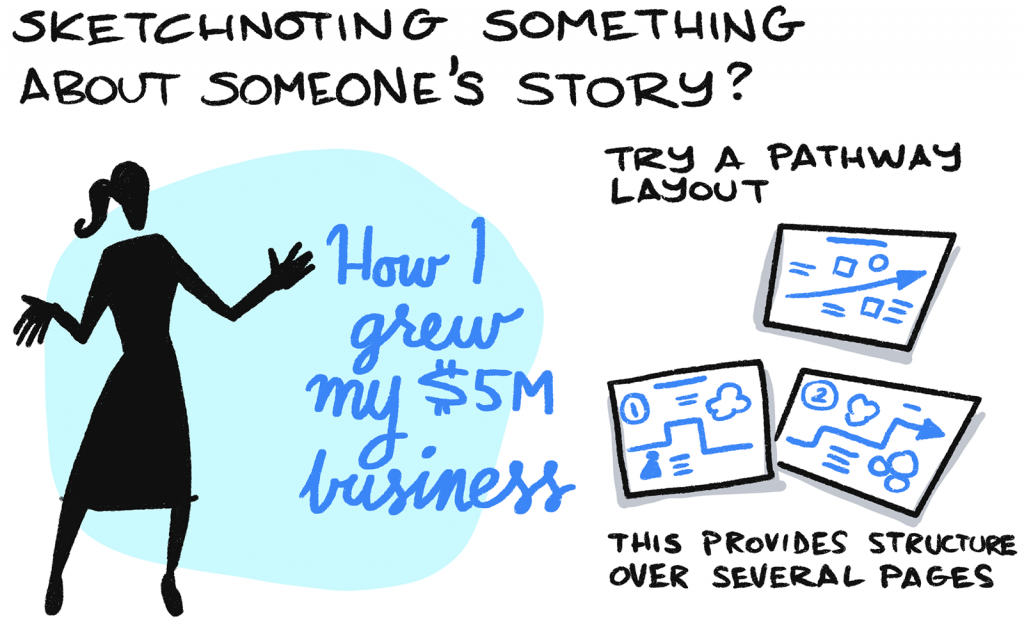
Pathway layouts for stories and sequences
If there is a set of ideas that need to be in a specific sequence, then you probably need something like a pathway layout. Pathway layouts are especially good when you know the main topic of what you are capturing is a story of some kind, but you’re not sure where it’s going to go.
Stories and journeys pop up in books (surprise surprise), public talks, podcast sessions, blog posts… you name it! It’s a great format to listen to, and to remember sequences of ideas and events, and pathway layouts lend themselves well to visually capturing these sequences.
Basic layouts for business meetings
Visually capturing the progress and results of business meetings is a huge win for you, and (in my humble opinion) for your team as well. If you jot down your thoughts and reflections of what you experience in a meeting just for yourself, that will definitely improve your focus and your productivity. But if you capture progress and results for everyone else too, in view of everyone as the meeting progresses, you will definitely help everyone’s focus and productivity.
This is a HUGE part of visual thinking and communication to get into, so let me just offer a first step into getting started, with a few examples of simple layouts for a few different kinds of meetings:
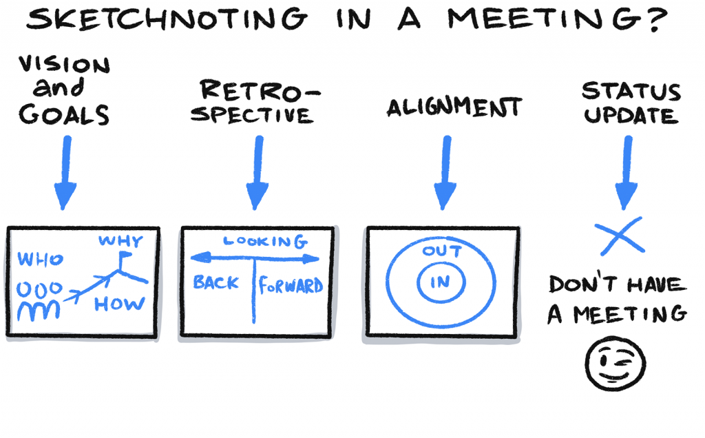
Do you need help everyone to:
- Define a guiding vision and purpose? Draw the object and subject as a basic map, where object = your customers, clients or community, and subject = you, your team, your product, your service. Draw in the reason driving the object and subject (WHY) perhaps as a mountain. Leave a space for HOW you’re going to achieve this vision.
- Analyse the progress of their team or project? Visualise a retrospective by dividing a page into two space to capture your notes: looking back and looking forward
- Get clarity and alignment on a topic or scope? Draw two concentric circles, label the outer circle OUT and the inner circle IN. Use this as a guide to help people define (and align on) what’s out of scope and what’s in scope.
Experiment!
I don’t want you walking away from this post thinking that this layout game has super strict rules. Au contraire, rules – once understood – are made to be broken, and one of the great gifts that sketchnoting has given us is its freedom and fluidity! So go ahead and have a play, try different layouts, make them, break them, and see each one as an experiment.
Further reading and watching
If you’d like more inspiration and further thoughts on this area of sketchnoting, try the following places as suggestions:
- Sketchnote Basics: Layout – Emily Mills
- Sketchnote Layouts: The Ultimate Guide – Chris Wilson
- Sketchnoting Layout: Portrait or Landscape? – Video by Verbal to Visual
…
- Follow Presto Sketching on Instagram for more
- Sign up to the Presto Sketching newsletter by using the box at the top right of this page, and get more tips and techniques like this
- Buy the Presto Sketching book, and get an absolute boat-load of this sort of stuff in one go, and really amp up your visual thinking and visual communication game.