There’s that fantastic time in any product or service design project where an idea is just starting to take shape, and spread its wings. Will it be The Next Big Thing? Will it be able to stand up to the barrage of oncoming questions, like: will it resonate with your target audience? How will it work? Is it even feasible?
That’s where storyboards are your friend, and the best way to help your idea spread those wings, and be ready for those questions.

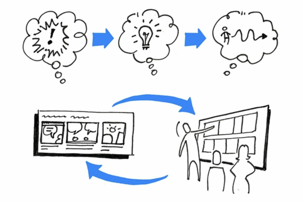
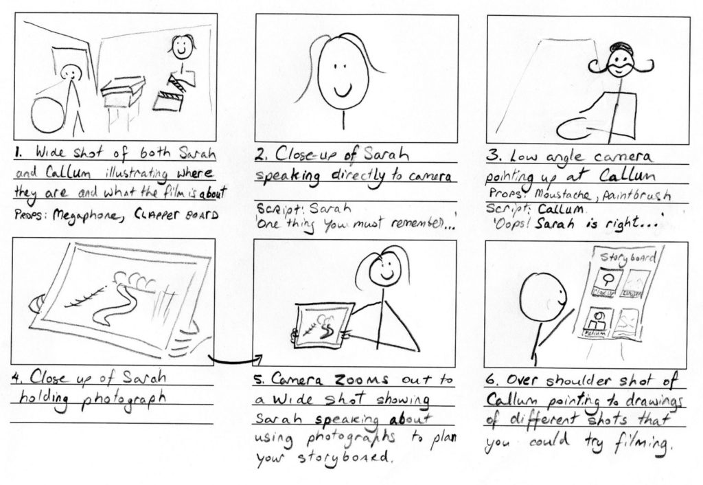
Storyboards are sets of frames with pictures and narrative text, organised as a sequence to be read as a story. They’re very useful for when an idea is too hard or conceptual or expensive to prototype. You can sketch out your idea using a sequence of simple pictures arranged like a comic, to show the context of that idea: who is experiencing the idea, what they do, how they do it, when they do it, and why.
Why storyboarding is so effective for any team project
As far as design asset bang for buck goes, it’s hard to go past storyboards. They not only capture and communicate an experience so fast and so well, they also double as a prototyping tool; the act of drawing a storyboard helps you to understand and test your own ideas.
Storyboards came from the world of film. They bring the various elements of the craft of cinema – such as script, characters, location, and of course the plot – to life in a unified way that others can start to see how it all comes together.
Storyboards are an important way to visualise stories involved in user experience design:
- Illustrating an existing experience, often showing a particular problem in the experience, and its negative impact on people
- Illustrating an envisioned experience, showing a solution and the benefits of that solution
- Showing state differences in products and services where interface designs wouldn’t be enough, such as showing differences based on different times of the day, different locations, or different personas/archetypes
They are also very handy when it comes to envisioning, prototyping and planning other kinds of experiences, like:
- Change management envisioning and roll-outs
- E-learning content and training videos
- Explainer videos and promotion videos
- Games
- Video advertisements
What storyboards are not
Here’s how storyboards differ from other assets created in the world of product and service design:
Journey maps – journey maps offer a schematic view of an experience from a single user’s perspective, showing how a string of actions leads (or in some cases doesn’t lead) to a goal, and often how that journey feels. Journey maps are useful for visually summarising many different aspects of an experience – such as pain points, opportunities, sentiment – as a single map, in a way that just wouldn’t fit on a storyboard.
Service blueprints – service blueprints are similar to journey maps, but usually replace indications of how the journey feels, with much more information about what the journey includes from a system perspective, covering all user types. This means that what happens behind the scenes (or off-stage) is visually captured as well as what happens from the user’s perspective (on-stage). This can include internal teams, processes and systems, such as customer support resources and approval processes.
User flows – user flows are a schematic view of the experience from a task perspective. They typically show a flowchart of the sequence of actions and decision points linked together, usually outside of time. They capture what happens, rather than how, or how long.
Screenflows – screenflows and user flows are often interchangeable, but screenflows show the experience from the interface perspective. They tend to be sets of simplified screen designs or wireframes. They are useful for understanding how a given task/s is/are achieved across various screens and interface elements on a website, application, or other product, rather than who is doing the actions, or when.
What makes a great storyboard for your project?
Storyboards are best used as instruments of process, not product. In other words, they are best used to stimulate discussion, not seek approval. They are best used as prototypes, sketches only, made to inform others and get feedback about how an idea works, rather than being a fully-formed aesthetically-pleasing product about what the idea is.

Storyboards should focus on being:
Quick – they take hours – rather than days or weeks – to create

Cheap – they are created using simple tools like pencil, sticky notes and paper, possibly some pre-made templated elements (rather than needing sophisticated software and training), before needing to spend any great amounts of money.

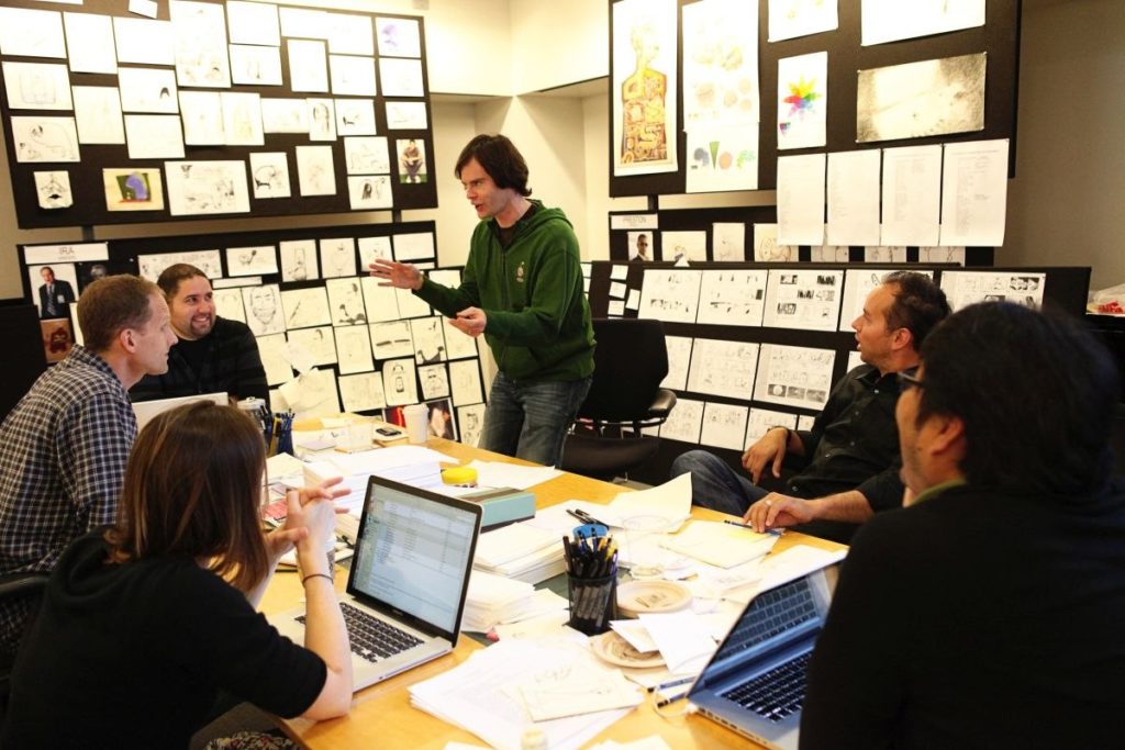
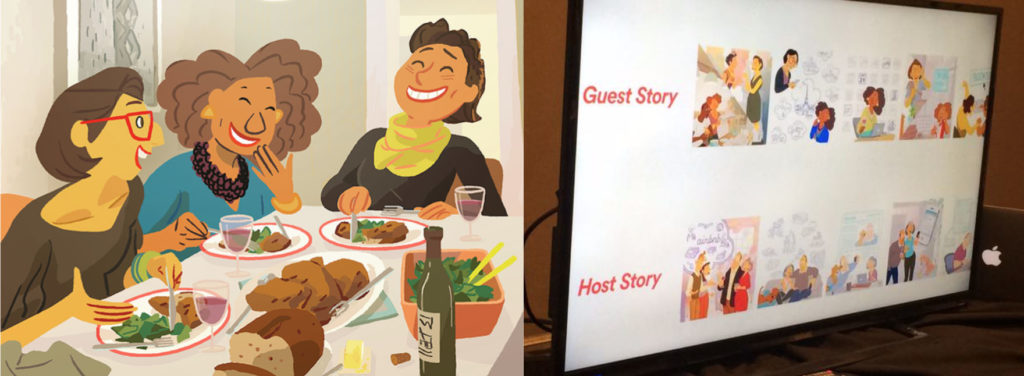
Evocative – they should capture your audience’s attention, and help anchor discussion to how to improve the experience, not how to make the solution. In a now-famous move, Airbnb hired Pixar animator Nick Sung to bring specific moments in their customers’ experiences to life (code-named “Snow White”), and posted them around the organisation’s office walls.

Unifying – storyboards are great at giving everyone – from designers to developers to customer support agents to managers – a common language to use, to discuss and improve customer experiences or employee experiences.

Minimal – they should focus on the essence of what needs to be communicated and validated. This includes the level of detail and draughtsmanship finesse; when it comes to communicating the idea of a house, a simple blocky rendering of a house is the same as a professionally-drawn house, or a computer-generated image of a house. In cases like these, simple drawings are usually better, because extraneous distracting details can be omitted, e.g. age and style, size, materials.
As author Scott McCloud says, they focus on amplification through simplification.
What you need to create a storyboard
I’ll get into how to draw storyboards in another post, but for now, it’s good to know that you need the following elements to set yourself – and the idea that you want to communicate – up for success:
- A user type – Who is your main character?
- A goal – Why is the character doing what they’re doing?
- An audience – Who will read this storyboard, and what do you want from them? Are you wanting to persuade them about fixing a particular problem? Or for them to provide feedback on a particular solution? Or to empathise with customers in a particular way?
- A story – All of these elements come together and are brought to life through the story itself, or a sequence of events that is usually meant to engage your audience’s head (how does it relate to their knowledge and experience), heart (what does it mean to them) and hands (what do you want them to do).
That last element – crafting your story – is the subject of another post too.