Life is full of all kinds of people, and your sketches can be too, with these ideas and examples.
Do you want your presentations and business communications to be more inclusive, and show more diversity, but you don’t want to use those cheesy contrived multi-racial stock photos?
Well, help is here! Let’s look at simple ways to sketch diversity in simple figures and faces for your presentations, and other things like whiteboard drawings in meetings, user interface designs, journey maps, and storyboards.
Let’s back up a minute. What do I mean by ‘diversity’? Rather than every figure in your drawing being a white male, I mean showing a variety of figures and faces, in terms of gender, age and life stage, ethnicity and sociodemographic background. This makes your communications much more inclusive.
“Whoah, Ben!” you might be gasping, “That’s a tall order! I can barely draw a figure that looks human, let alone a variety of humans!” Good news – it’s easier than you think. Once you start doing some simple sketches like these (instead of using hilariously bad stock photography), the greater your confidence will be to share them and use them in your own work.
In sketching, detail and diversity go together
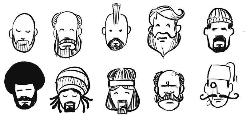
Look at the range of faces below. The more abstract a face, the less you need to worry about diversity, but the more detail you add, the more diversity — or lack thereof — will become an issue. Work on a sketching style (or fidelity) that’s got only a little bit of detail; that way, you can suggest diversity in easy, economical ways.

Think about head shape
All of the examples I show you here are using a low level of fidelity; simple lines, no mouths, that sort of thing. This is great for anything from whiteboard drawings in meetings, to slide presentations and design work. Firstly, think about the shapes of the heads you draw. Almond-shaped heads with slightly pointy chins appear more feminine, squarer-shaped heads appear more masculine. Weird-shaped heads appear alien (hey, we’re being inclusive here, right?).

Hair’s the easiest way to variety
Drawing a variety of hair is the easiest way to indicate a variety of gender, age, and ethnicity. The picture below shows how adding just a simple line here and there can indicate things like plaits, a ponytail, or a bun (a man-bun, maybe?).

Once you master those simple lines, try drawing different shapes and varieties of hair as seen below: young spiky hair, long wavy feminine hair, emo hair with a streak through it, permed hair or balding hair. Close-cropped curly hair is also a good way to show someone whose gender is not identified by hair shape.

Beards, facial hair, and accessories like headbands, glasses, caps and other headwear are also great ways to indicate various nationalities, ethnicities, styles, and ages:

Little details mean a lot for different ethnicities and religions
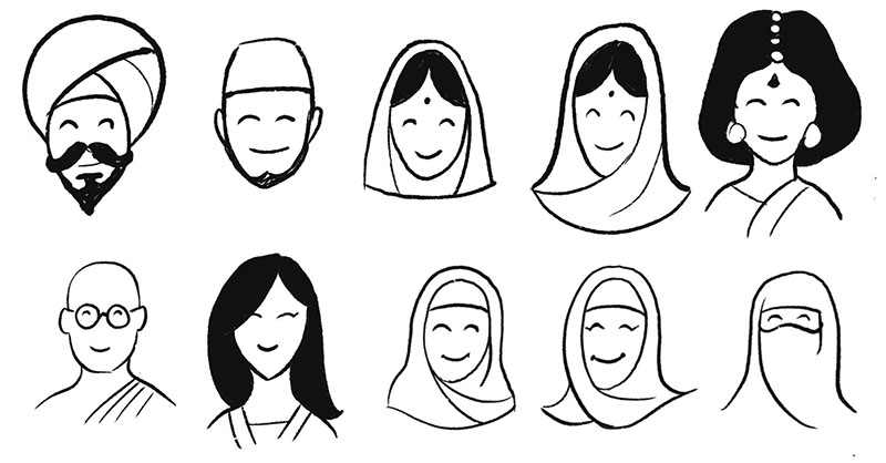
It’s worth investing a little bit of time practising the faces below, so that you can include different ethnicities and religions in your drawings.
Seen here in the top row from left to right: a Sikh turban (the dastar), a Muslim skullcap (taqiyah or topi), two Indian head coverings (chunni), and an Indian woman with a tikka and sari. In the second row from left to right: a Buddhist wearing a Kasaya, an Asian female (the clothing is simple enough to be a Vietnamese áo dài or a Chinese cheongsam), two hijabs (simple enough to be Al-Amira or Shayla style), and a niqab.

Being more inclusive when sketching figures
Just like the faces above, the figures drawn here are really simple. By thinking about different ages and stages (childhood, parenting, older age), we can add a whole lot more variety to the figures we sketch. Here are just a few examples:

Think about different life situations (like parenthood), and different levels of ability and mobility as well.
One thing I like to think about when doing more inclusive figures like this: even if I do a figure with a walking stick or in a wheelchair, I never want that thing to define them as OLD or DISABLED. That’s a stereotype. Instead, I like to include a little detail to show some character in some way, so that they’re not perceived as a stereotype (e.g. old people use smartphones too! A woman in a wheelchair can zip along pretty fast!).
Similarly to the faces you saw, adding a bit of detail to indicate different dress can indicate more inclusivity too (in the case above, the female figure is wearing a sari and maybe a choli).
Your turn
I hope this helps you think about how you might be more inclusive in the way you draw, wherever you draw, and whatever you draw. And I bet you that everyone around you will really appreciate it, too.
Other things worth reading
- Representation in graphic recording – a really insightful reasoned article by ImageThink
- You can’t just draw purple people and call it diversity – an amazing analysis of the unconscious biases that dog us all, and then some, by Meg Robichaud and her drawings she did for Shopify
…
Would you like more of this sort of thing in your inbox every week to help you be more clever, and more valuable to your team? Then why not use that there box at the top right of this page, and sign up to the Presto Sketching newsletter. I send tips out weekly, and I make them as useful as possible.