• Skip to primary navigation
  • Skip to main content
  • Skip to primary sidebar

Presto Sketching

A book to help you think and communicate better with drawing

  • Home
  • About the book
  • About the author
  • Learn
  • Blog

See a clearer path to your goal with the Build a Bridge framework

01/09/2019 by Ben Crothers

One of the best things about sketching is how it can help clarify your thinking. I’m sure you’ve had times where your head is swirling with thoughts, questions, worries and maybes… it could be about that important meeting tomorrow, or that prickly situation with stakeholders at work, or maybe something closer to home.

Whatever it is that’s keeping you up at night, getting your thoughts out of your head and onto paper is always a great idea. I want to show you a simple framework I’ve picked up along the way (I forget where I first saw it now) that has helped un-muddle my thinking a lot, and I hope it helps you too.

Visualising your goal with a simple bridge sketch

Take a look at the Build a Bridge framework sketch below, and why not grab a pen and some paper, and try drawing it yourself. It’s a really simple sketch, but I find it communicates a lot.

On the left side is you, and where you are right now. On the right side is your goal. That goal could be something quite tangible (like losing 10Kg, or launching a book by next July), or it could be more intangible (like a stronger team, or a healthier marriage).

Whatever your goal is, try to make it specific and realistic (hello SMART goal framework). You might want to even try drawing what that goal is, rather than a flag like I’ve done.

Next, draw a curved line from one side to the other. As you do that, visualise yourself reaching that goal. This is your bridge to your future. Now draw a few lines on the bridge, like this:

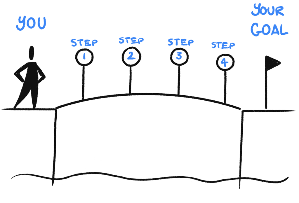
Those little lines across your bridge represent specific steps you can take to get to your goal. Think about these steps, and make notes above the lines about what each step could be. Don’t worry too much about the order and effort needed in each step; just get all those thoughts out as words on the paper, because you can worry about order and effort later on.

Next, draw a couple of crocodiles under your bridge. These are the things you’ll happily avoid now that you have a bridge to your goal (rather than swimming across, geddit?), but can still be distracting for you, as you try to reach that goal. Take a look at my crocs; they’re never going to win a Waterhouse Natural Science Art Prize, but they look enough like crocs to represent distraction.

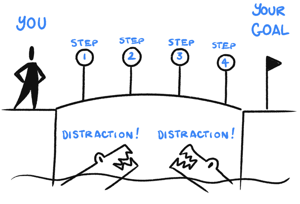
Now, name each crocodile with a specific thing that could distract you from reaching your goal, like – oh, I don’t know – Toblerone chocolate, or too much scrolling on your phone at night rather than getting a good night’s sleep (guilty!).

“Ah, but what about the things that get in my way, Ben?” I hear you muse. It’s a good thing not to overburden one drawing with too many things. Plus, we’ll deal with barriers in another post…

And behold – this is a map to your future. Look at your drawing, and think: how can I get to each step across this bridge? Keep that drawing taped up in your bathroom, or on your fridge… anywhere where you’re likely to see it every day, as a reminder of what you want to achieve.

It works super well for businesses too. Here’s a variation of the bridge drawing, this time with a building representing an organisation:

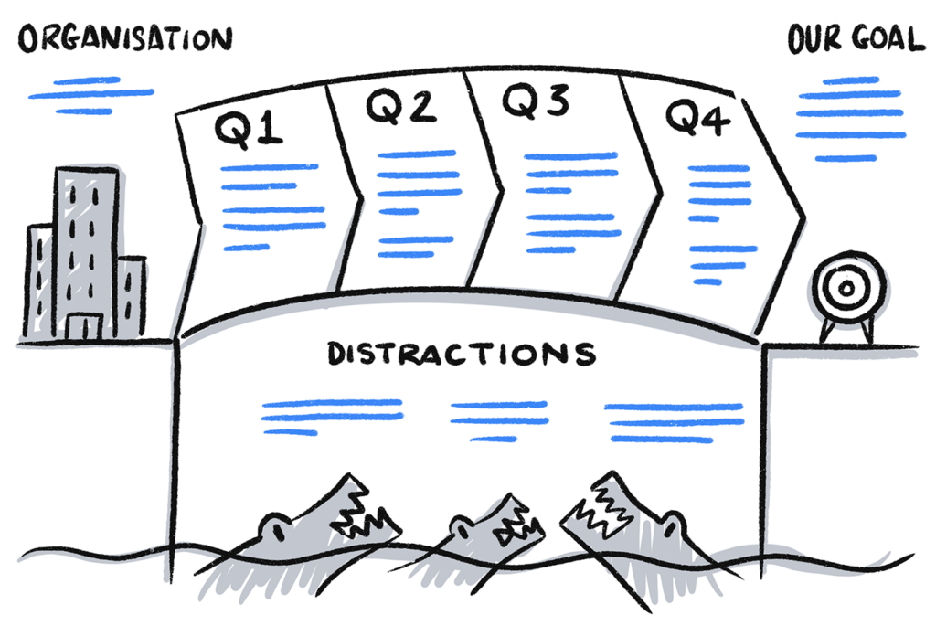
I’ve drawn the steps as financial quarters, but these could be anything that represents meaningful progress for your organisation. Why not give this a go in your next project planning meeting, or company strategy meeting?

How was it for you?

Try drawing this visual framework yourself, for a goal of your own. Or, you might like to try it at your next project kick-off meeting, as a way to help everyone get a clear, shared understanding of the project’s goal and major stages, before digging into the detail. If this is useful for you, either for yourself as an individual, or at work, why not drop me a line and let me know?

Until next post, happy sketching!

Filed Under: For meeting leaders and coaches, Visual strategy and facilitation Tagged With: coaching, facilitation, goals, meetings, productivity

Mapping your user’s day with the User Clock Sketch

28/06/2019 by Ben Crothers

See your user’s experience of their day through their eyes with the User Clock Sketch.

The power of mapping user experiences

Are you involved in making products and services for customers and communities? If so, you’ll know how important it is to make sure your offering matches what they need. A standard way of connecting user research to making products and services is to visually map out the journeys that they go through, using techniques like journey mapping, user story mapping, and service blueprinting.

The synthesis stage in the Double Diamond of design, showing where journey mapping usually happens

These visual tools are really effective. They’re a great way to – quite literally – get people from various parts of the business ‘on the same page’. They help everyone to see where the pain points are in a user journey, and where opportunities might be, too. Often more importantly, they help everyone to get a shared understanding of how all the various individual parts (from their perspective) relate as a whole, according to a common reference point. The user’s perspective.

A user journey map (or customer journey map), for example, is more than just boxes and arrows. It can show what a particular persona/user type is doing (tasks), thinking (expectations, decisions) and feeling, as they use one or more of your products and services. This is a bit different to user story maps and Indi Young’s mental model diagrams, which are usually independent of your product.

The main parts of a user journey map

User journey mapping is versatile

User journey maps, and the act of mapping as a team, can be applied in different ways. You can map out existing experiences, along with pain points, workarounds that the user type is doing, and opportunities for improvement. You can also map out envisioned experiences, where you have redesigned the experience to fix those pain points and take hold of those opportunities. In fact, an envisioned user journey map is like a new prototype, to show all the benefits of the new experience before going ahead and building anything.

Limitations with some mapping

As great as these patterns are, though, the way the information is arranged is still often according to your particular product or service. This means that there are some limitations:

  • Hard to scope – It’s sometimes hard to know where the journey map should start and stop, and can seem somewhat contrived
  • Susceptible to bias – The nature of scoping a map to show a particular type of user achieving a particular goal in a particular ‘happy’ scenario means we’re making lots of decisions to keep it convenient for us to map. This can open the door to unconscious bias.
  • They don’t take external factors into account – It’s usually too hard to visualise all the other factors contributing to that journey (e.g. other products and services that the user type interacts with), to achieve the user type’s goal you are focused on
  • Branching, cycles, multi-tasking, oh my! – Some journeys just aren’t linear (i.e. this action then that action then the next action and stop), or there may be multiple tasks going on at the same time. This can sometimes be excruciating to try to map!

Try adding the User Clock Sketch to visualise the ‘customer journey’

I remember trying to do journey mapping for some scenarios where people use Confluence, Atlassian’s wiki/documentation software. It got super-complicated really quickly, because people tend not to just do one linear this-then-that task. Instead, people tend to read several pages in different web browser tabs, search for some page in some other tab, and edit another page in yet another tab… all for different tasks and different goals! And then the following day, they do it all over again! Agh!

So, I asked: “What if we changed the perspective we’re taking, from Confluence’s point-of-view to the user’s point-of-view? What if we mapped a day in the life of the user type we are focused on (in that case it was project managers), to see what that looked like?”

And that’s how the User Clock Sketch was born. And it looks like this:

The User Clock Sketch – mapping an experience around the face of a ‘clock’

This is particularly useful for journeys that are pretty much the same, day after day (ergh, that sounds so depressing, but it’s not meant to!). It maps the actions of a particular user type from the point where they wake up in the morning, to the point where they go to sleep. Rather than getting into the nitty gritty of each task they do, it groups actions according to significant chunks of the day that matter to them, according to their context. AND it quite literally puts the ‘user at the centre’ of the picture, how good’s that? 😉

Here’s how to do it:

Step 1: Draw your user type in the centre of a big circle

Whether you’re using one sheet of paper or a large whiteboard, draw a large circle, and then draw a simple figure in the centre. You can label the figure as a role, persona, or whatever way you are identifying that particular user type.

Step one of the User Clock Sketch

Step 2: Draw a line up to the ‘12’ position

Draw a vertical line from the user type up to where the ‘12’ would normally go on a clock. This is the point where your user type wakes up.

Step two of the User Clock Sketch

Step 3: Section the ‘clock’ into significant sections

I tend to draw a line radiating up from the centre to about the ‘9’ position, to show the time where the user type would be asleep. After you’ve done that, draw radiating lines around the face of your ‘clock’. Each line will separate a particular ‘stage of the day’ that matters to that user type and their role. If it’s an office worker, it’ll tend to include commuting time and a lunch time. It might be important that you include small but significant moments, like a daily stand-up with the team, or an important meeting with executives.

Step three of the User Clock Sketch

Label each of the slices of the clock. Dress up the labels with some simple drawings that show real things going on: the type(s) of devices being used, their location and environment, and other significant factors.

Step 4: Overlay your product’s/service’s context

Notice that so far you haven’t included your product or service at all; this has been all about them and their goal, their tasks, their job, and so on. Now, you can grab a different colour, go back over the ‘clock’, and add in significant information according to your product/service context.

This might include particular product tasks that the user type needs to get done using your product at that particular time of the day. Or it might include specific features that get used a lot at specific times, or specific parts of your service that get hammered more than others.

Step four of the User Clock Sketch

Step 5: Explore, explain, enrich

Now is the point where you can start to ‘see’ your product being used in a new ‘re-framed’ way. Either individually or as a group, you can explore the ‘clock’ you have drawn as a map of time, to provoke more insightful questions and enrich your understanding of your users.

I’ve seen this visual pattern come in handy for anyone in a multi-disciplinary team, but as a start:

  • Researchers can share insights from research and tell a story according to this ‘day in the life of’ picture, so that others can relate to it from the user type’s point of view more easily, and empathise more easily
  • Product managers can gain a deeper sense of what features the user type depends on more often and why (and if there are gaps), and where the moments of greatest value to the user are, so that you can align strategy, plans and roadmaps to real value metrics
  • Designers and content writers can make connections from feature usage (or lack of a feature) to importance and urgency, from a user point-of view, so that you can prioritise where you want to spend the most creative energy

Adapting the User Clock Sketch

Every time I demonstrate this sketch to others, there always seem to be more uses for it… which is a good sign! Since the pattern relies on a journey being cyclical, it can come in handy in a way that a strictly linear map might not. You can also change the ‘resolution’ of the time, too. It could show a typical week for a user type, or a financial year, or for as long as it takes to order a meal and have it delivered… it’s up to you and your context. Here are a couple of variations:

Two User Clock Sketch usage alternatives

Enrich the way you ‘see’ your customers

What I’m really getting at here is this: we have to see our customers as real people, not just consumers of our products. We have to see the world through their eyes, not just through the eyes of our products. And we have to use multiple various ‘frames’ on how we see them, by visualising them and describing them in different ways, and not just reducing them to conceptual abstractions using one familiar pattern or the other.

According to Capgemini research (back in 2017, at least), 75 percent of companies considered themselves to be customer-centric, but only a measly 30 percent of customers agreed. I suspect this gap is because a lot of companies mentally and physically engage with customers on a pretty superficial level, and view them as replaceable parts of the whole (as seen on a chart), rather than as individuals with genuine goals and needs to fulfil.

But I’m hoping that using patterns like the User Clock Sketch (along with other mapping tools) can help this! By changing up the way we visualise customers, I think we can inoculate ourselves against this superficial kind of thinking, and enrich our mental models of our customers and users.

This will not only improve the quality of what we offer our customers, but will ultimately make our own businesses more successful.

…

  • Follow Presto Sketching on Instagram
  • Sign up to the Presto Sketching newsletter by using the box at the top right of this page, and get more tips and techniques like this
  • Buy the Presto Sketching book, and get an absolute boat-load of this sort of stuff in one go, and really amp up your visual thinking and visual communication game

Filed Under: For designers and researchers, Visual strategy and facilitation Tagged With: canvases, cx, design, ex, product design, product management, product strategy, service design, ux

Better visual brainstorming with the Concept Canvas

27/01/2019 by Ben Crothers

Making big decisions about which idea or option to invest in amongst a group is really hard. Using the Concept Canvas to visually compare apples to apples makes it a bit easier (includes free PDF).

I was in a brainstorming session from hell once. I was part of a team to help a telecommunications company redesign several of its systems into a seamless customer experience. The stakes were high, and the salaries in the room were pretty high too. The facilitator (a project manager from another agency) started us off by describing the state of the existing systems. Then with whiteboard marker in hand, asked us for ideas.

My heart sank. 

I love brainstorming, I really do. I know some people will gnash their teeth and tell you that brainstorming never works, but it can and does work really well, if you ask the right questions, and have just a bit of structure. But alas, we didn’t have the right questions or structure in that session. And the only thing I remember that vaguely sounded like an idea that was written on the whiteboard was QR codes.

That was it, really. QR codes.

The problem with picking out one idea from many… will everyone else understand what it is and why?

I’m sure it made perfect sense to the regional manager that kept clanking on about it, but that’s all we had by the end of the session. I remember thinking that QR codes weren’t connected to the problem we were there to solve (nor to the customers and their situations) at all.

The problem with ideas

Ideas are awesome. An idea can be as vague and unrelated to anything as — yes — QR codes, or as grand and bold as democracy itself. A great idea can come from anywhere as they say, and the more ideas we have, the more chance we have of striking the right idea that will become the right solution.

But as great as ideas are, they can wither and die a premature death if others can’t ‘get it’ the way you do. An idea might seem clear and actionable to you, but it’s usually very tricky for everyone else to ‘see’ what you ‘see’ in your head. How is it connected to the original challenge? How does it work? What’s the risk? What’s in it for me?

Stakeholders may not understand your idea (let alone get onboard), but framing it as a concept helps!

Ideas usually need to be combined and refined into concepts. A concepts is what links one or more ideas into a structured actionable solution. It contains a lot more information that fleshes things out in such a way that you and a team could then execute on it. If you only ever go as far as generating ideas, it can be hard trying to refine and combine them, and it gets really hard to then make any decisions based on them, such as comparing one over another, or estimating how long it might take to make, or which market to take that idea into.

Refine and combine your ideas into concepts

The Concept Canvas

That’s where the Concept Canvas comes in. The Concept Canvas gives you and your team a way to add enough structure to your ideas, so that you can evaluate them more confidently. Like all canvases used in design and business strategy, you can draw it up on a whiteboard for a group to use, or draw it on single sheets of paper for individuals to use. And it looks like this:

The Presto Sketching Concept Canvas: This is an easy template to use to turn several vague ideas into a consistently structured set that you can then compare for value, risk, or any other factor you need

(By the way, you can also read about this canvas in Presto Sketching, the book).

Here’s a free PDF of the Concept Canvas for you to download and use yourself. 🙂

The Concept Canvas helps you to keep a ‘line of sight’ from the original problem you’re trying to solve and/or value proposition, to the solution you set up, through to the shipped product, service or process.

How to use the Concept Canvas

For the purposes of explanation, let’s assume you’re doing some sort of brainstorming session with a group to generate ideas on how to solve a particular problem, or meet a certain customer need.

Start your session with a clear problem statement or design challenge that the group must tackle.

Example: “We believe that people under 25 want to invest in property, but id it too expensive to even begin. We can help them by selling them small pieces of existing properties and then giving them the proportional share of any net rental income. We’ll know we’re right when first-time buyers of one piece return to buy more pieces.”

Ask everyone to individually come up with as many ideas as possible, on any particular aspect of this challenge. Wild and random; boring and expected; big, little… it doesn’t matter. Help get them started with more focused creative “How…?” questions, like these:

  1. How can we attract prospective customers who have never considered this as a service?
  2. How can we encourage existing customers to buy more pieces?
  3. How do existing customers sell their pieces?

Now, of course people will (hopefully) come up with all sorts of ideas early on, and it’s great to capture those as phrases on sticky notes, whiteboard scrawls and sketches on paper. But watch out for ideas that are just one word. For example, I can just imagine my QR Code Guy blurting out “Referrals!” If this does happen, ask the person to add a bit more detail according to the “How…?” question, the audience and its goal.

Ask everyone to refine and combine all those ‘small’ ideas into their strongest three ideas, and fill in a Concept Canvas (above) to flesh out each of those ideas into a more realised concept.

  1. Begin by copying the hypothesis into the Hypothesis section of the canvas.
  2. Write in which particular audience type each idea is suited to in the Audience section (e.g. “Cynical evaluator, Brand new customer, Champion regular customer).
  3. In the Goal section, write what that audience type’s goal is. It should be specific to the audience, and not a business or product goal. This helps everyone to really think hard about connecting their idea properly to the initial challenge.
  4. In the Channels section, write in what channels are involved in the concept. How does the customer actually experience/use this concept? Is it through the existing company website? A new app on her mobile phone? On her laptop at work?
  5. Now, use the main area of the canvas (Experience section) to describe and illustrate what the actual experience is. This could be a bulleted list, a flowchart, a storyboard, a set of wireframes… whatever helps to really bring this concept to life, and add rigour to your group’s thinking.
  6. Finally, put a mark on each of the sliding scales in the Scope Sliders section for how ‘big’ the concept is. Just rough guesses is fine at this stage. You can use the existing sliders (risk, effort, value, resourcing, timing), or replace them with your own factors that would be important to you and your project.

Because everyone is using a common structure, the Concept Canvas now makes it easier for everyone to read and understand everyone else’s concepts. As a way of refining the output of the group, you can get each person to briefly pitch their concepts to everyone, and then them give them all three sticky dots to ‘vote’ on the concepts that they think are the strongest.

What you should now have is a refined ‘gallery’ of Concept Canvases. Even though the contents of each main Experience section might visually vary, you’ve given everyone just enough structure to help you sort through them and start sizing them for risk, effort, value, resourcing, and timing (or any other factors that you might have used).

Give it a try

As with all the canvases and whiteboard patterns that I share, why not download the free PDF of the Concept Canvas and try it yourself? There’s no harm in trying it out on paper yourself first, and then with your team on the whiteboard; I guarantee that visually structuring your ideas as fleshed out concepts will help everyone ‘get’ your ideas a whole lot more.

…

  • Follow Presto Sketching on Instagram for more of these 4-step practice sketches
  • Sign up to the Presto Sketching newsletter by using the box at the top right of this page, and get more tips and techniques like this
  • Buy the Presto Sketching book, and get an absolute boat-load of this sort of stuff in one go, and really amp up your visual thinking and visual communication game.

Filed Under: For designers and researchers, Visual strategy and facilitation Tagged With: brainstorming, canvases, concepts, creativity, downloads, free, product design, product management, products, service design, services, templates, ux

Solve the right problem with the Problem Pyramid

23/10/2018 by Ben Crothers

Get clarity on a problem to be solved – either by yourself or as a team – by exploring it, reframing it and articulating it in a more insightful way using this simple visual pattern.

Ambiguity and confusion? You probably don’t have a proper problem statement

Have you ever had those times where you’re lying awake at night, with your mind gnawing on a problem, and you just can’t seem to think it through properly? You toss and turn, and as much as you want to turn your brain off, you can’t!

Or, you might have a project at work where you (and probably others too) can’t really say why you’re doing it. The project might have a goal, but still there’s no clear purpose. Sometimes people might even say smart things like “We need to know what problem this project is solving” (very true!) but still, nobody can actually articulate what the problem is.

Or you might even have a problem statement – or inherited a problem statement from somebody else – but it still just sounds like a goal.

If this is a problem statement, what’s the actual problem?

A proper problem statement – and I can’t believe I have to say this – should contain a problem. Something that is in the way of someone (or a business, or a system) achieving a goal. Yes, the statement itself can contain the goal, and yes it should say something about who has the problem, and no it should definitely not already contain the solution. Here’s a good guide that has always helped me:

[Persona / Customer type] wants to [Goal] but [Problem]. This is unacceptable because [Impact].

Note how adding the impact of the problem helps to say why we need to solve this particular problem, and maybe why we need to solve it now.

Is it hard to come up with such a succinct, insightful problem statement? Usually, yes. Do you come up with it just by getting a group of people to talk? Probably not. Problem framing by definition is all about describing a problem from a specific point of view, and we all know how likely it is that everyone is going to have a different point of view!

That’s why it makes so much more sense to visually map out the problem space, to get clarity and alignment first, before being able to distill it all into a problem statement. And that’s where the Problem Pyramid comes in!

What is the Problem Pyramid?

The Problem Pyramid is a visual pattern you can draw to help you explore and clarify a particular problem space, especially if that problem space is complex, ambiguous or misunderstood. You use it give more structure and meaning to any conversation about the problem space, so that you have a better chance of distilling a more insightful problem statement.

When do I use the Problem Pyramid?

You can apply this to all sorts of problems and in different situations, such as:

  • You have a problem, you’ve tried one or more solutions, but you can’t crack it yet
  • A team is struggling with the scope and purpose of a project, and needs a shared clear understanding of its intent
  • You’ve been given a problem statement, but it’s not helping to point the way to a solution
  • You’re ‘selling a solution’ about a particular problem to management, and you want to check your thinking by asking yourself the hard questions up front

What is the Problem Pyramid made up of?

Take a look at the sketch below:

In the triangle you write whatever you think is the problem you need to solve (this is the existing problem statement). The triangle (or pyramid) has 3 sides, which symbolise 3 different ways to explore that problem:

  • 5 Whys – root cause analysis
  • 5 Whos – perspective analysis
  • 5 So whats – impact analysis

How do you do the Problem Pyramid?

You can draw this Problem Pyramid on a whiteboard, paper, even in an online collaboration space (like Miro or Mural). You can do it with your team as a session on its own, or as part of an existing meeting.

Let’s take a look at how you and your team can tackle a problem by visually exploring each of these ‘sides’ together. Be sure to share some markers and sticky notes around for different people to add what they want to, at different points throughout this activity.

Start by drawing a large triangle in the centre of a whiteboard, and write what you think is the problem you’re trying to solve so far inside the triangle. This may well change… but you have to start somewhere!

5 Whys

Problems are usually tackled more effectively when they’re addressed at the source, rather than tackling just a symptom of the problem. The ‘5 Whys’ activity is well known in the design and product innovation domains, and helps us do root cause analysis. For more information about 5 Whys, see the Gamestorming 5 Whys activity or IDEO.org’s 5 Whys activity.

Ask everyone why the problem written in the large triangle is happening (or what is causing the problem), get them to write their responses on sticky notes, and stick them in the area below the large triangle. For example: if the problem is “We didn’t reach our quarterly target of selling 15 thousand shinklebots“, ask them “Why didn’t we sell 15 thousand shinklebots?”

There’ll probably be several different answers to this question that you can read on the sticky notes that people wrote, and you may need to group any duplicates. Now, take each response, and ask why again. For example, if one of the responses was “The factory couldn’t make the shinklebots fast enough“, ask “Why isn’t the factory making shinklebots fast enough?”, and so on. The ‘5’ in the ‘5 Whys’ is to get you and your team to really push your thinking beyond the default top-of-mind cause. The deeper you dig, the better insights you’ll get.

Before long, you’ll unearth some juicy root causes to the original problem that as a team you’ll want to focus on more than others. It’s tempting to now race off and solve one of those causes, but hold up! We have to explore the other two sides first…

5 Whos

Next, ask everyone who is affected by this problem, and get them to write on sticky notes (one per sticky note) who they think is most involved, and group as necessary. Depending on the nature of the problem, it’ll be a mix of particular types of customers, or types of staff members, or partners…maybe even you and your team.

If the team come up with more than 5 (there usually are more than 5), ask them: who is most affected by or involved in this problem?

Why do we do this? Because it’s important to get everyone out of their own mental bubble, and thinking of others. This isn’t a blame game at all; it’s about seeing who’s who in the whole system of the problem space. Identifying different kind of people affected by the problem then leads to helping to see and describe the problem through each of their perspectives, which is what re-framing is all about.

5 So whats

Thirdly, it’s good to do some impact analysis. Looking at the causes of the problem and types people who are most involved in the problem you have generated so far, ask “So what?” I don’t mean “So what?” in a glib, negative way, I mean: “What happens next for the people we identified? What’s the impact of that problem on each of them?”. Whatever the answer to that question is, ask “So what?” again, and so on.

For example: if the problem is “We didn’t reach our quarterly target of selling 15 thousand shinklebots“, asking “So what?” generates answers like:

  • Quarterly revenue will be less than expected (business impact)
  • We’ll need to work out why (action to take)
  • There are too many shinklebots taking up space in the warehouse (business impact)

…and asking “So what?” again generates answers like:

  • We don’t get the capital needed to open the new branch yet (business impact)
  • We’ll need to temporarily divert some resources to do customer research (action to take)
  • We need to find more warehouse space for the incoming products (business impact)

You can visually capture these in the same way as the other two ‘sides’ of the problem area, using a mix of writing, sticky notes and simple drawing on a whiteboard. You might like to ask “So what?” for each type of person you have isolated, too. Doing this impact analysis helps you and your team get a keener sense of urgency about the problem, as well as a sense of the impact if you delay action, or don’t do anything at all.

Step back and see the story

Now’s a great time to step back and get a sense of the whole problem space you and your team have generated. You now have a ‘map’ of the problem. It’s bound to contain some areas that are more tightly defined than other areas, as well as areas that may be completely new and insightful for you and others in the team.

You can use this ‘map’ to join up some elements that stick out as being more important. For example, there might be a specific customer type affected more than others, and the impact on them leads to more negative impacts on others. Or there might be an underlying cause that the team needs to focus on and fix, which will alleviate most of the impact for most of the people affected.

This is how the Problem Pyramid has visual storytelling power, as well as analytical power!

Here’s what a Problem Pyramid looks like in action. Note, it’s normal for it to get messy first, before you can ‘join the dots’ and home in on a particular story to distill into a problem statement.

Try it yourself

As with all of the visual patterns I share, do let me know if you try it out, and what worked well, and what didn’t work so well. I hope this Problem Pyramid helps you see your problems better, so that you can solve them better!

Filed Under: For designers and researchers, For meeting leaders and coaches, For project managers and facilitators, Problem solving, Visual strategy and facilitation Tagged With: business strategy, facilitation, problem framing, product design, product strategy, service design, strategy, visual framework, visual frameworks, visual storytelling

How to draw mandalas

28/09/2018 by Ben Crothers

Have you ever wanted to try drawing mandalas? It’s more fun and rewarding than you probably think, and the results are probably better than what you imagine, whether you think you have no drawing skill at all, or you’re a seasoned sketcher.

If you’re after a free and easy way to relax, centre yourself, and practise a bit of mindfulness, it’s hard to go past drawing a mandala. It’s a great way to focus on something, and it’s not the kind of drawing that needs to be ‘correct’. But be warned! you might find it a bit addictive… 😉

Mandalas have deep significance in Hinduism and Buddhism, and represent the universe, from its grandest through to its tiniest sense (mandala is actually Sanskrit for ‘circle’). The act of making mandalas has always been used for focusing attention, for establishing ‘space’ in the mind and spirit, and for meditation. Even destroying mandalas has deep spiritual significance in Tibetan Buddhism, as a way of emphasising how fleeting life is. They’re also incredibly popular as decoration, which makes them perfect for wall art, greeting cards, tattoos, and so on.

Draw your mandala as a gift from you to you

Drawing a mandala can be really fun, relaxing and meditative, so long as you leave your inner critic in its playpen, and treat it as random discovery rather than a piece of performance. Just like zentangling, you start simple, and then take it wherever you and your imagination want to go, and make it as simple or as complex as you want it to be.

Materials

You can make mandalas out of just about anything; from coloured sand (like the Tibetan Buddhist mandalas), to paper, candy, plants, crochet, salt, even people. But for now, let’s stick to good ol’ pen and paper, shall we? You can start with as little as this:

  • Plain office paper
  • Pencil or black marker
  • Coloured markers / art markers of your choice

You can draw your mandalas totally freehand if you like, but if you want them to be super neat, and you feel like you need some more structure to work with, you’ll want these:

  • A compass
  • A ruler
  • A protractor

Another good idea is to use polar graph paper that you can print out and use as a guide. You can either draw directly on the graph paper, or place it under the piece of paper you’re drawing on as a guide.

Setting up your mandala structure

Start with a point in the middle of your paper, and use a ruler and pencil to draw lines through the middle, horizontally and vertically. Next, draw several circles with your compass using that point at the centre of the paper where the lines intersect. Try to draw the circles at various random diameters, rather than a regular pattern:

Now it’s time to think about how many sections you would like in your mandala. Drawing it in quarters is perfectly fine, but let’s go for eighths. Two 45-degree lines going through the same middle point should give you 8 equal sections across the circles.

You should have something that looks like this:

Starting your mandala

The hardest stroke is the first one, so go ahead and jump in by drawing a simple shape from the very centre of your circles, outward to the first circle guideline you drew. Here’s my first set of shapes:

It’s really important to take your time. Enjoy it. Don’t rush it. Draw each line deliberately and neatly. You’ll get a much better result. Also, do one type of line or shape all the way around before starting the next type of line or shape. Resist the temptation to go galavanting off doing a whole segment, and then trying to come back to the centre again; it won’t look as good.

Adding variety and imagination

As you continue drawing your mandala, don’t try to think too hard about it; just let the pen and your imagination go where they want to go. This is such a great example of intuitive drawing.

You can change up the type of shapes that you’re drawing, or stick to a theme, it’s completely up to you. Try circles, triangles, leaves, straight lines, curved lines and spirals…

As the mandala gets bigger, you might like to experiment with longer lines and larger shapes, like these petal shapes that end up overlapping each other:

At any point, you can go back over your mandala and add some thicker lines, and other shapes and details if you like:

Finishing your mandala

Sooner or later you’ll wonder when it’s time to stop! Getting to the edge of the paper is probably far enough, so try to leave a bit of a gap, like you can see here:

How much detail you put in is up to you. Here’s my finished mandala below, just in black marker, and again once I’d gone through it and added some yellow colour:

Try it yourself

I hope you liked seeing this mandala take shape, and I hope it gives you a nudge to try drawing one yourself. Start small, start simple, experiment with shapes and colours, and let it be fun and relaxing! Oh, and if you’re after other ideas for simple ways to get sketching, try these 10 ideas to get you inspired to sketch.

Filed Under: Fun and creativity, Getting started Tagged With: abstract, creativity, intuitive drawing, mandalas, mindfulness, relaxation

3 ways to add extra impact to figure sketches

17/08/2018 by Ben Crothers

Do you ever wonder why some figure drawings have a way of jumping out at you and grabbing your attention? By trying out these ideas in your sketching, yours can do that too.

Figures help your audience put themselves in the picture

Whether you draw for fun or for a living (or both!), and you want to liven up your work by making it more visually interesting (or both!) adding figures and faces to your communications makes a big impact. Our eyes can’t help but lock into the eyes of another face, or the pose of a figure. Why? To seek meaning and affinity. My own pet theory is that we are constantly looking to see something of ourselves, or to learn more about ourselves, whenever we look at art in general, and visuals in particular.

Or as George Bernard Shaw said:

You use a glass mirror to see your face; you use works of art to see your soul.

Figures can do the ‘heavy lifting’ for business audiences

You can also use this to great effect for visuals in business communication. Take a leaf out of the advertising playbook:

  • Do you want to attract staff to be part of some change at work? Show figures thinking about and/or reaching the same goals that they have.
  • Do you want to highlight a particular product/ service problem to stakeholders? Show people being impacted by that problem.
  • Do you want to sell a benefit of a new product or process? Show people being happy when they use it.

In this way, visuals of figures are doing some of the cognitive ‘heavy lifting’; in other words, making it easier for the audience to relate to what’s being communicated, and understand what their response is.

Good news: you can draw figures and faces yourself, that can add a lot more life and impact to your communications at work, and it’s easier than you think. We’re not aiming for anatomically correct works of art here; we’re just aiming for the essence of a figure, or an expression.

In this post, I’m going to focus on figures, and show you 3 secrets to drawing more impactful figures.

1. Draw the body language

Most communication to each other we pick up on is non-verbal, and a big part of that is through body language. This differs depending on context, but essentially: what we say with our bodies matters. So, the poses of the figures you draw matters, too!

The pose of the figure you draw instantly tells a story about what they’re doing, and maybe how they feel about what they’re doing. People rarely just stand bolt upright not doing anything; showing them moving around, slouching, sitting, lying down, or doing various things adds so much more vitality.

Compare the pairs of figures below. Even though they’re really simple, the second figure of each pair communicates a lot more, doesn’t it? Your figures will have more character and appear more real (no matter how simple they are), which makes your message much more compelling to your viewers.

2. Draw people in their natural habitat

Just like how people rarely stand bolt upright not doing anything, people tend to exist in some kind of environment, rather than just in a void. Think about where your figure is, not only what they’re doing. Add a hint of background, something simple to indicate where they are, and perhaps even what time of the day it is. Add a hint of an accessory or something to add a bit more interest, too. When you use your imagination in your sketching in this way, you’ll ignite your viewers’ imaginations too, which will make your message more memorable.

3. Dial up the drama

Use a trick that cartoonists do, and try exaggerating the poses of your figures. This works really well when you want to cut through the noise of other communications, and imply more drama and urgency.

Try it yourself

So, there you go. I hope these examples inspire you to try adding figures to whatever your draw, and to add more character, nuance, movement and visual story to your figures.

Filed Under: For designers and researchers, Fun and creativity, Getting started, Sketchnoting and graphic recording Tagged With: creativity, figure sketching, figures, visual storytelling

For more creative sketching, try SNAILS

17/08/2018 by Ben Crothers

Looking to change up how you draw the same thing all the time? Or to boost the variety and style of what you draw? I got you: try this easy and effective SNAILS method.

If I got a dollar for every light bulb that I drew in my work, I’d be… well, I wouldn’t be rich, but let’s just say that the beers would be on me next time!

The point is: if you do any kind of sketching regularly, you might find yourself drawing the same old things in the same old ways, and you might be after some fresh ways to increase the visual variety of what you’re sketching. Whether it’s sketching for yourself (e.g. sketchnoting, urban sketching) or sketching for others (e.g. scribing, storyboarding, graphic recording, graphic facilitation), it can be easy to feel in a bit of a rut when it comes to what you draw and how you draw.

I got to this point fairly often a while back, so I started working on various ways I could spice up what I was drawing, to keep it more interesting and more meaningful. I’ve refined these various ways into an easy-to-remember method: SNAILS! I had the joy and honour of sharing this SNAILS technique as part of a workshop on using visual metaphor to explore and solve problems at the EuViz conference in Denmark, 2018.

SNAILS – An easy-to-remember set of sketching prompts

No, I’m not saying you draw snails on everything (although, hey, that might be your style). SNAILS stands for 6 creative prompts, or aspects you can think about changing whenever you draw something, to add more creativity and meaning.

SNAILS stands for:

  • Shape
  • Number
  • Angle
  • Identity
  • Line
  • Size

The SNAILS approach is a great way to take something you’ve already drawn and try a little bit of ‘visual first aid’ to help it visually ‘work’ a bit better. It’s also a good way to think more creatively about the topic, object, or concept you’re sketching. Let’s take a look at each of the 6 ways…

Shape

Changing the shape of an object can change its meaning, especially if it’s a visual metaphor for something. In the light bulb examples below, the shape of the glass changes to mimic other objects (e.g. a deflated balloon), to show what type of idea it represents.

Number

Sometimes adding more of the same object can add some nuance to what you’re showing, like one fish amongst a whole school of fish that looks different, or one bright idea amongst lots of ‘dim’ ones. A dozen fresh free-range ideas, anyone? 😉

Angle

Changing the angle – or your point of view – can enrich the meaning of the thing you’re drawing. It can give it more character (e.g. showing it viewed from slightly below looking up), or indicate that something is not quite right (showing an object upside down or backward), or movement (slanted to look like it’s moving fast).

Identity

If you’ve been following Presto Sketching for a while, you’ll probably know by now that I like putting faces on anything and everything. By putting a face on an inanimate object, you give that object an identity and an opinion. What type of face you give it obviously shows what personality or point of view it has, no matter how subtle or obvious the face is.

Line

This prompt is straight from art school. The nature of the line we draw says so much about what it is we’re drawing. Thin trembly lines indicate fragility or brittleness. Thick flowy lines indicate confidence. But you can take this further in so many different creative ways. Here are a few examples:

Size

Lastly, by playing with the size of what we draw, we can show how important it is in relation to what’s around it. For this to work, you usually need something else in the picture to give the particular object scale, for comparison.

Share your sketches!

I hope this SNAILS method has given you some ideas about adding some more variety to what you draw. Try it today, whether it’s on a whiteboard in a meeting, or in your sketchbook, or as part of live scribing. And as always, I’m keen to see how you use these methods in your own sketching, so feel free to share it on the socials and tag it with #prestosketching, or tag @prestosketching on or Instagram.

Filed Under: Fun and creativity, Getting started, Sketchnoting and graphic recording Tagged With: creativity, inspiration, snails, style, visual metaphor

Fun emoji facts

04/05/2018 by Ben Crothers

Emoji number plates?! Level up your emoji mojo with these 15 nuggets of tasty tips, tricks and trivia about our favourite adorable little pictures.

To state the bleeding obvious, emoji are a thing. In a BIG way. Regular Presto Sketching newsletter readers might know that I have a soft spot for emoji. They’re an amazing, fun and flexible way to express ourselves visually. And emoji are pretty much our main international language; around 95% of humans online are now using these little characters.

So I thought I’d make your day with 15 nuggets of emoji trivia and links. Let’s get into it, shall we?

1. We are sending 60 million of them to each other on Facebook, and 5 billion on Facebook Messenger alone, EV. VER. REE. DAY. Over on Instagram, nearly half of all comments and captions contain emoji, and users from Finland 🇫🇮 are at the top of the table, using emoji in over 60% of text!

2. The most popular emoji (according to this Brandwatch report 📝) are the ‘Face with tears of joy’ 😂 (#1 on Instagram and Twitter), Heart ❤️, Sparkles ✨ and ‘Loudly crying face‘ 😭. And surprise surprise, most popular emoji differ in different countries. France, for example, is rather fond of the wink 😉, but Italy and Spain take it a bit further with a wink and a kiss!  😘

Top 10 most used emojis in the first half of 2021

3. Emoji were invented by Shigetaka Kurita in Japan, and were first seen on Japanese mobile phones in 1999. This interview with Kurita is brilliant, and his first sketches of emojis are absolute gold:

Shigeta Kurita’s original sketches for the first emoji set

The original set of 176 emoji now resides in the Museum of Modern Art in New York.🗽

4. Shigetaka Kurita’s favourite emoji? The heart ❤️. Awww.

5. The original smiley 😃 (perhaps the first emoji?) was invented by ad man and graphic designer Harvey Ross Ball in 1963. He was commissioned to create a graphic to raise morale among the employees of an insurance company after a series of difficult mergers and acquisitions. Ball finished the design in less than 10 minutes and was paid $45 for his work 💸.

6. Oxford Dictionaries named ‘Face with tears of joy’ 😂 its 2015 Word of the Year.

7. World Emoji Day is 17 July. Why? Because that’s the date shown on the ‘calendar’ emoji for Apple and Google 📅 (but not for Samsung, Twitter, WhatsApp and other platforms) And does World Emoji Day have an anthem you can sing along to? Why yes. Yes it does. 🎶

8. Do you want to know what emojis are being used on Twitter? In real time? Of course you do.

9. What about those times when you want to include emoji, but you’re in front of a regular keyboard? Got you covered! Head to getemoji.com or iemoji.com and copy-and-paste 📋 emojis to your heart’s content  👍.

10. Some emoji can have multiple meanings, or different meanings in different cultures. Turns out that this symbol ♻️ means ‘recycle’ in Western culture, but is commonly used for ‘share’ in Islamic  ☪️ cultures, like when people post prayers on social media, and encourage others to share. If ever in doubt of the meaning of what you’re sending, best to check using emojipedia.org.

11. Speaking of checking, it’s worth knowing that not all platforms use the same emoji for the same thing, so you might be inadvertently confusing receivers of your messages. For example, the ‘Grinning face with smiling eyes‘ might look like this 😬, or like this 😄, depending on the platform you view it on…. and depending on what you’re trying to say, it could carry a very different tone!

From Investigating the Potential for Miscommunication Using Emoji

12. You can read the entire Moby Dick story in emoji. I can’t wait to see the CliffsNotes of that. 😂😂😂

13. Emoji are being used to evade monitoring and censoring. The Chinese government regularly squashes anything in social media that would appear to be a threat to communist rule, like the growing women’s movement in China. For instance, China’s Twitter-like service Weibo shut down the Feminist Voices account, and then private messaging app WeChat did the same. FYI, Weibo also blocks the #metoo hashtag. But Chinese feminists found a way around it, by using #RiceBunny in its place along with the rice bowl and bunny face emoji. When spoken aloud the words for “rice bunny” are pronounced “mi tu,” a homophone for “me too” that cleverly evades detection.

(Side note: iPhone users in China are missing one specific emoji on their emoji keyboard that shows on all others: the flag for Taiwan.)

14. And what about emoji on number plates? That would be brilliant, if only it were true. As an April fools joke in 2016, the Honda website published a news item that they were introducing emoji number plates in the UK. But hey, you never know… 😉

Would you like an emoji numberplate?

15. And so, what lies ahead for us in Emoji-Land? If the latest incarnation of emoji and 3D technology are anything to go by, expect more and more animations, face filters, and other facial customisations on your messaging apps and elsewhere. The launch of Apple’s iPhone X brought with it the TrueDepth camera and Animoji, which simply has to be seen to be believed.

It’s worth having a play with these apps, just to get a feel for how your own face can morph into all sorts of expressive, entertaining — and in some cases VERY CREEPY — avatars and whatnot:

  • 💃 Gabsee: Put your 3D avatar in the real world
  • 😮 Mirror AI: Turn your selfie into an emoji
  • 🎤 MyIdol: I had loads of fun creeping out my family and friends with this one… you’ve been warned!

Emoji will be more and more inclusive and instructive

Expect emoji to also bring more of our beautiful diverse world to our keyboards, and therefore to our mindsets. The upcoming Unicode version 11 includes faces with red hair and curly hair, superheroes, more body parts, and more accessories. I think it’s actually good to see a ‘woman’s shoe’ that is flat-soled and blue, rather than the stereotypical (and some might say overly-sexualised) red stiletto heel.

Some new emoji actually take advantage of the way they can transcend language as we know it, especially for people who are illiterate. Earlier this year, Unicode approved the addition of the mosquito emoji, which can be used as a way to better describe mosquito-borne illnesses like malaria and Zika.

And don’t forget: anyone can submit an emoji proposal. What would you submit?

Parting note: use emoji as inspiration ✨in your own sketching

As I’ve mentioned in Chapter 5 of Presto Sketching (Sketching Faces and Expressions), sketching emoji is a great way to broaden the range of facial expressions you can render in your own visual communication. Try copying the emoji that you see on your device today into a notebook, and then try incorporating them into other sketching and visualising you do. Before long, all of your sketches will have a lot more vitality and character! 👋

Filed Under: For designers and researchers, Fun and creativity, Getting started, Sketchnoting and graphic recording Tagged With: emoji, faces, figures, fun, objects

Nail your product strategy with the Product Pyramid

04/05/2018 by Ben Crothers

Features! Story points! Sprints! UIs! It’s all too easy to let the detail of product management drown out the actual product strategy. The Product Pyramid can help.

Strategy is a tricky game. The more complicated the product(s), service(s) and business(es), and the more people involved, the trickier things get. Trying to get shared understanding about vision, direction, risk, priority, and so on is hard enough, let alone getting shared alignment, decision, and execution.

But so often I find that it’s all about connecting the various pieces of product management into a cohesive product strategy story. This usually involves visual framing, and getting everyone involved using a shared perspective and vocabulary that describes where we want to play and how we want to win.

Lots of product managers, designers and entrepreneurs struggle with strategy, because they jump into details too soon, or find it hard to separate what they know from what they believe/suspect/assume. Japanese master swordsman, author, philosopher and all round legend Miyamoto Musashi put it well: “Perception is strong and sight weak. In strategy it is important to see distant things as if they were close and to take a distanced view of close things“.

What is the Product Pyramid sketch?

With that in mind, the Product Pyramid sketch is a way for product managers, designers and founders to visually relate the detail of any product (or service) to the rest of what’s important about that product: the experience it provides, the benefits it gives to customers, and the value it creates for customers and the business.

It’s a simple pattern that you can draw on a whiteboard in a strategy meeting, and it looks like this:

How does it work?

The Product Pyramid is a visual guide to remind you and others how all of the parts of your product are related.

  • P = PURPOSE of the product, usually to increase some value to your business and your customers; the change your product is trying to make in the world
  • B = BENEFITS to your customers; what they talk about to others that’s so good about your product
  • J = JOURNEY people go through when evaluating, buying, using, getting help and sharing your product
  • F = FEATURES of the product; what people use in the journey
  • P = PERSONAS that interact with the product; the different types of people that go through different parts of the journey. JTBD and needs (i.e. the jobs-to-be-done framework) fit in here.
  • C = COMPETITION that also attracts the same personas with the same needs

When should I use the Product Pyramid sketch?

Use this sketch (or visual framework) if these sorts of scenarios happen:

  • You can’t seem to focus product conversation at the right ‘level’ (i.e. people get bogged down in talking about user interfaces, bugs or features when you actually need to talk about benefits)
  • You don’t have a shared understanding of the product’s strategy across the team
  • You need to come up with good research questions
  • You can’t remember all your user stories

How do I use the Product Pyramid sketch?

Make sure you have a whiteboard. If any of the symptoms above start to happen in a meeting:

  • Draw a nice big triangle
  • Draw in some horizontal lines to separate the triangle into the different zones (Benefits, Journey, etc)
  • Make some notes in the zone (or beside the zone) that reflect the conversation you’re hearing. It could be questions, assumptions, or things you’re trying to understand better
  • Listen for connections in what’s being talking about, and visually reflect this with arrows from one zone to another

The Product Pyramid is a map

The Product Pyramid is a map. It’s there to help you know where you’re at in a product discussion, and where you want to be. It’s not meant to contain lots of detail, but it does serve to point the way to that detail (that would live elsewhere). For example, the Journey layer should ‘link’ to any customer journey maps you have created.

It’s also there to highlight any gaps, vagueness, or disagreement in your product strategy.

The Product Pyramid is a story

Because the Product Pyramid ‘connects the dots’ of your product’s purpose, benefits, journey and features, it also doubles as a great way to tell your product strategy as a cohesive logical story. Two examples:

Pitch to leaders (top-to-bottom) – “The most important change we want to make in this business is [Purpose]. To do that, we need to help [Persona(s)] with [Benefits]. As they use our product, they [Journey], and they way they experience [Benefit] is through [Features]. If we invest in [Feature], this will unlock greater [Benefit].”

Rationale for a feature improvement sprint to engineering (bottom-to-top) – “This particular [Feature] in our product might be small, but it’s the source of a disproportionate amount of support requests. At the moment, it gets in the way of [Journey], and stops too many customers from realising [Benefit]. That’s why we need to focus on improving it this quarter, so that [Purpose].”

Try it yourself

So, the next time any of your product team meetings include even a bit of product strategy – e.g. sprint planning, feature brainstorming, business review meeting – your team can now have a way to keep all the various parts of the product related, and optimise discussion for business benefit and customer benefit.

Filed Under: For designers and researchers, For meeting leaders and coaches, For project managers and facilitators, Problem solving, Visual strategy and facilitation Tagged With: facilitation, product design, product strategy, service design, visual frameworks

Foundation lines: the killer technique for better sketching

08/02/2018 by Ben Crothers

If you struggle to draw from imagination – or even what’s right in front of you! – the foundation lines drawing technique is made for you. Try it yourself, and gain greater confidence and ability, with more satisfying results.

[UPDATED] Quite a while ago I was filling my Presto Sketching Instagram account with a big collection of 4-step how-to practice drawings, like this one:

How to draw a bowl of ramen in 4 steps

I started doing these ages ago, as a way to build a visual library of things that were (and still are) useful to mentally ‘reach for’ when sketching at work. This is handy for journey mapping, graphic recording, sketchnoting, storyboarding, or anything else where you need to communicate ideas and messages to others. I still do a lot of these during any training sessions I do about drawing, but especially back then I added a lot to Instagram, and then made an e-book out of 100 of them, called Draw in 4.

Draw in 4 e-book, available anywhere you buy your e-books

Extra plug: If black-and-white e-book doesn’t suit your style, you can also get the deluxe colour PDF version of Draw in 4 here.

These 4-step drawings use a technique in Chapter 6 of the Presto Sketching book, called foundation lines (or construction lines) as a way to increase ability and confidence in sketching. And it goes a bit like this:

  • Look at the object you want to draw, and in your mind’s eye, break it into basic geometric shapes. I recommend doing this with objects in front of you first, before trying to do it from imagination.
  • Draw those basic shapes with a light-coloured pencil or marker (or a very thin marker). The shapes themselves shouldn’t be perfect; it’s perfectly fine to draw them a few times, to help you place them right where you want them to go. My dearest old art teacher used to call this “finding the line”.
  • Once you’re happy with the main shapes, draw in any more lines that help to give you more guidelines to draw over, such as the lines indicating the ramen contents and chopsticks in the example above.
  • Now, start drawing with your darker marker, over the top of those foundation lines. You’ll see how the dark marks spring forward, and the lighter, coloured lines recede.
  • Finish your drawing with any detail you like. Sometimes it’s nice to add some shading or colouring using the colour you used for the foundation lines.

Nice, hey? By breaking anything down into shapes first, you help your mind observe, deconstruct, and then reconstruct the object for you to draw, to get a much more satisfying result.

I love this technique because it gets you to exercise a part of drawing that doesn’t get enough air-time: your observation skills. In other words, really seeing and paying attention to what you want to draw is just as valuable as how you end up drawing it.

Once you sketch anything using foundation lines a couple of times, your mind’s eye automagically ‘sees’ the foundation lines on the paper, tablet or whiteboard, and you can then draw whatever the object is with more confidence. You can also develop your own style, based on a more solid understanding of what it is you want to show.

I hope these examples tempt you to try this method yourself, the next time you draw. Before long, you’ll be able to sketch up an ice cream, a moped, a kraken — or whatever it is you want to draw — in no time at all!

Filed Under: Fun and creativity, Getting started, Sketchnoting and graphic recording Tagged With: basics, cactus, drawing, foundation lines, fundamentals, ramen, selfie

  • « Go to Previous Page
  • Page 1
  • Page 2
  • Page 3
  • Page 4
  • Go to Next Page »

Primary Sidebar

Recent Posts

  • Draw more creatively with FLARE
  • How adding a graphic recorder to your event makes it a game changer
  • Volume 2 of Journey Mapping Icons out now!
  • How to construct a great story
  • Why your project needs storyboarding

Categories

  • For designers and researchers
  • For meeting leaders and coaches
  • For project managers and facilitators
  • Fun and creativity
  • Getting started
  • Problem solving
  • Sketchnoting and graphic recording
  • Visual strategy and facilitation

Archives

  • July 2025
  • June 2025
  • September 2024
  • May 2023
  • August 2022
  • January 2021
  • October 2020
  • December 2019
  • September 2019
  • June 2019
  • January 2019
  • October 2018
  • September 2018
  • August 2018
  • May 2018
  • February 2018
  • January 2018
  • August 2017
  • July 2017
  • May 2017
  • April 2017
  • March 2017
  • Home
  • About the book
  • About the author
  • Learn
  • Presto Sketching Blog

© 2025 Ben Crothers, author of Presto Sketching - a book to help you think and communicate better with drawing.