• Skip to primary navigation
  • Skip to main content
  • Skip to primary sidebar

Presto Sketching

A book to help you think and communicate better with drawing

  • Home
  • About the book
  • About the author
  • Learn
  • Blog

Getting started

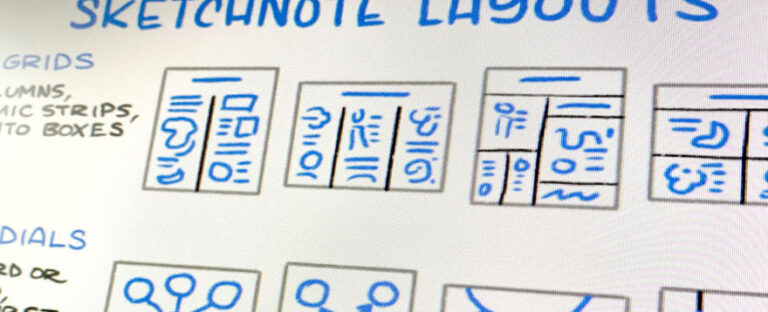
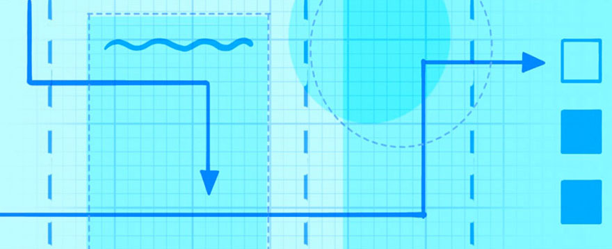
5 principles of great layout for your visuals

14/01/2021 by Ben Crothers

Your visual communication pieces can land with your audience or miss them entirely, depending on what layout you choose. This post shows you the principles behind why some layouts work better than others.

Layout: your secret sauce for communication success

One of the questions I get asked a lot in the training sessions I do about sketchnoting (or visual note-taking) is: how do I organise content on the page?

Visual layout is really important. It’s what guides your audience’s eye around the page (or screen), and sends them a bunch of signals about what parts to pay more attention to than others. And it’s just as important regardless of size and medium, whether it’s small format (like sketchnoting), or larger-format, like scribing and graphic recording, and whether it’s physical or digital.

Some might say that layout doesn’t matter if you’re sketchnoting just for yourself, but I disagree. Once you finish a sketchnote, you actually swap from being the creator to the audience, i.e. you still have to read and understand it yourself. So, why wouldn’t you make it easier for yourself, as well as for others, to appreciate and understand your good work?

Introducing the 5 principles

Let’s jump into 5 principles of great layout. You’ll find that once you see these in other sketchnotes (or anything laid out in print or digital, really!), you won’t be able to unsee them.

A diagram of some gestalt layout principles
Some principles involved in layouts that make them work so well

These principles from from the world of graphic design, and are known as gestalt principles.

Let’s take a closer look at each one.

Balance

Think of all the various words, images, lines, frames and whatnot that you draw in sketchnoting as having a visual weight, i.e. a mass and density that they take up on the page (or screen). Some elements – and groups of elements – are going to be visually heavier and denser than others, and this affects how our eyes and brain judge them to be in balance.

Elements that collectively have a visual balance tend to convey calmness, order, and stability. Elements that are not in balance tend to convey disorder, discomfort, and tension. You can use this to great effect, depending on your subject matter, and what you want to communicate!

Visual hierarchy

Our eyes will gravitate to larger visual elements (text or images) before smaller visual elements. That’s why titles are usually the largest thing on a page, and footnotes are the smallest. That’s the logic of having sub-titles smaller than the title, but larger than regular text (or ‘body copy’ in print design parlance). As visual note-takers and communicators, this visual hierarchy of elements is super important to understand and use. We can change the proportion of elements on our pages to guide our audience’s eyes around the page, and use variable proportions of elements to convey what’s more important.

Repetition

Related to visual hierarchy and proportion is repetition. Being consistent in the layout and proportion of elements is a great way to convey unity and in your visual note-taking and graphic recording work, and make them easier to read and remember. Examples:

  • Keeping all your sub-titles the same size and colour helps your audience to scan and understand the piece much more easily
  • Using one, two or three colours to set up a visual pattern is often better than trying to use every colour marker you’ve got in the one piece
  • Using a small set of different types of frames, separators and backgrounds in the one piece, rather than hitting your audience with a kaleidoscope of umpteen different elements

Flow

I mentioned how we can lead our audience’s eyes around a page using visual hierarchy. We can also do this by paying attention to the rhythm, proximity, and flow of visual elements (or groups of elements). Layouts help us ‘package’ groups of elements together, according to rhythm, proximity, and flow.

This makes it easier for our audience’s eyes to read the whole by intuitively knowing what order to read various groups of elements. If there is no layout in place, our eyes find it harder to know how to navigate the whole; if that happens we fall back to an intuitive default of scanning a page from the top left corner to the bottom right corner (for Western audiences at least).

As visual note-takers and recorders, we of course have other juicy elements that pop up in various layouts, to help with flow. These are super effective, and other visual communicators can’t often use these the way we can:

  • Arrows – arrows are purpose-built to guide the eye. They convey sequence, order, step logic, and progress. Sometimes they even convey speed. Sometimes the whole layout is just one big arrow!
  • Separators – we can use lines of all kinds and characters to visually separate and sequence ideas and content
  • Frames – we can add order, sequence and hierarchy using frames of different kinds. Frames can also help audiences know what type of content to expect to read, which helps understanding and recall.
  • Shapes – we can use different kinds of shapes to arrange and classify content types in layouts. Shapes can be schematic (rectangles and circles), but they can also be metaphorical (e.g. silhouettes of icebergs, hot air balloons, mountains and clouds).

White space

Closely related to flow is knowing how layouts use white space. Layouts have areas of white space built-in.

Use them wisely!

Now that you know these 5 principles, here are some tips to help you actually do something with them:

  • Take a look at others’ sketchnotes or graphic recordings, and ‘read’ them according to these principles, to help you understand how to apply them. What can you detect about the pieces you see, when it comes to Balance, Visual hierarchy, Repetition, Flow, and White Space?
  • Deconstruct some of your own sketchnotes or drawings. How might you improve them, according to each of the principles?
  • The next time you do a sketchnote or graphic recording, pick one principle, and try to do the best you can in expressing that one principle.

I hope this helps you improve in your visualisation and drawing journey!

…

  • Follow Presto Sketching on Instagram for more
  • Sign up to the Presto Sketching newsletter by using the box at the top right of this page, and get more tips and techniques like this
  • Buy the Presto Sketching book, and get an absolute boat-load of this sort of stuff in one go, and really amp up your visual thinking and visual communication game.

Filed Under: Getting started, Sketchnoting and graphic recording Tagged With: graphic recording, layout, sketchnoting

A guide to sketchnote layouts

14/01/2021 by Ben Crothers

Here’s a set of sketchnote layouts to try, plus some tips about which layouts to use for which particular purpose.

Lead them down the garden path

One of the questions I get asked a lot in the training sessions I do about sketchnoting (or visual note-taking) is: how do I organise content on the page?

The layout of your sketchnotes and graphic recordings is really important for guiding your audience around the information you want them to take in, much like paths in parks and gardens are designed to help people see the best of what’s on offer. The layout you choose also makes it easier for your audience’s eyes to read the whole by intuitively knowing what order to read various groups of elements. If there is no layout in place, our eyes find it harder to know how to navigate the whole; if that happens we fall back to an intuitive default of scanning a page from the top left corner to the bottom right corner (for Western audiences at least).

Sketchnote layouts to try

Here is a poster image of various kinds of layouts you might like to try. I know there are lots of these summaries around, but these are the ones I teach, that are most effective, most of the time.

Note that these layouts work well for portrait or landscape… or square, for that matter. They’re all based on some age-old gestalt principles, borrowed from the world of graphic design.

And don’t forget to continue reading past this image, because we’ll get into some ideas for which layouts to try for which purpose…

A visual summary of various sketchnote layouts to try

Which layouts to try for which purpose

Columns and grids are your gateway

If you’re fairly fresh to sketchnoting, all this layout business might seem a bit daunting! By now though, I hope you can appreciate that using different layouts isn’t just about making content look more attractive; it’s about adding order and sequence, to make the content more meaningful, more understandable, and more memorable.

The thing about text-based communication is that it treats any topic the same way. Whether it’s a news article, a how-to guide, a work email, or a letter from your grandmother (this blog post, even!), it’s all arranged the same (barring being broken up with images). Paragraphs always come one after the other. To consume a text communication, you start at the top, and work your way through in a linear fashion.

I’m certainly not hating on this format (I rely on it for this post, after all!) but it’s very limiting. By contrast, using different layouts helps us to break out of that linear flow, and lay out our ideas in a sequence and space that often makes communication more effective and more meaningful.

Column layouts are your gateway to this new world! This is the easiest way to start the progression from the regular habit of text-based note-taking, and communicating everything in the same format of slabs of text:

Just like we can break up our text and images into columns, we can also break them up into rows…. although not too many, otherwise it turns into a spreadsheet! 😉

2×2 grids and 3×2 are very popular for communicating content that can be mapped on 2 spectra/axes, or for displaying content in a storyboard-like set of panels.

Radial layouts for guides

Continuing with the theme of freeing up content from the linear railway-carriage style of text-based communication, you might like to indulge in a radial layout.

Radial layouts come in handy when there is a set of principles or ideas related to one overall concept or message, in no particular order. You see this at work in listicles (I mean, try not to click on 20 Lipstick Names That Are Awkward As Hell), and in some public talks and podcast sessions.

Start with the title in the middle of the page (rather than at the top of the page), and capture each idea around the title. Link them with lines and arrows if you want to. Need to go over more than one page? No problem. Just repeat the title in the middle of the next page, and away you go.

Pathway layouts for stories and sequences

If there is a set of ideas that need to be in a specific sequence, then you probably need something like a pathway layout. Pathway layouts are especially good when you know the main topic of what you are capturing is a story of some kind, but you’re not sure where it’s going to go.

Stories and journeys pop up in books (surprise surprise), public talks, podcast sessions, blog posts… you name it! It’s a great format to listen to, and to remember sequences of ideas and events, and pathway layouts lend themselves well to visually capturing these sequences.

Basic layouts for business meetings

Visually capturing the progress and results of business meetings is a huge win for you, and (in my humble opinion) for your team as well. If you jot down your thoughts and reflections of what you experience in a meeting just for yourself, that will definitely improve your focus and your productivity. But if you capture progress and results for everyone else too, in view of everyone as the meeting progresses, you will definitely help everyone’s focus and productivity.

This is a HUGE part of visual thinking and communication to get into, so let me just offer a first step into getting started, with a few examples of simple layouts for a few different kinds of meetings:

Do you need help everyone to:

  • Define a guiding vision and purpose? Draw the object and subject as a basic map, where object = your customers, clients or community, and subject = you, your team, your product, your service. Draw in the reason driving the object and subject (WHY) perhaps as a mountain. Leave a space for HOW you’re going to achieve this vision.
  • Analyse the progress of their team or project? Visualise a retrospective by dividing a page into two space to capture your notes: looking back and looking forward
  • Get clarity and alignment on a topic or scope? Draw two concentric circles, label the outer circle OUT and the inner circle IN. Use this as a guide to help people define (and align on) what’s out of scope and what’s in scope.

Experiment!

I don’t want you walking away from this post thinking that this layout game has super strict rules. Au contraire, rules – once understood – are made to be broken, and one of the great gifts that sketchnoting has given us is its freedom and fluidity! So go ahead and have a play, try different layouts, make them, break them, and see each one as an experiment.

Further reading and watching

If you’d like more inspiration and further thoughts on this area of sketchnoting, try the following places as suggestions:

  • Sketchnote Basics: Layout – Emily Mills
  • Sketchnote Layouts: The Ultimate Guide – Chris Wilson
  • Sketchnoting Layout: Portrait or Landscape? – Video by Verbal to Visual

…

  • Follow Presto Sketching on Instagram for more
  • Sign up to the Presto Sketching newsletter by using the box at the top right of this page, and get more tips and techniques like this
  • Buy the Presto Sketching book, and get an absolute boat-load of this sort of stuff in one go, and really amp up your visual thinking and visual communication game.

Filed Under: Getting started, Sketchnoting and graphic recording Tagged With: design, graphic recording, layouts, sketchnoting

How to draw mandalas

28/09/2018 by Ben Crothers

Have you ever wanted to try drawing mandalas? It’s more fun and rewarding than you probably think, and the results are probably better than what you imagine, whether you think you have no drawing skill at all, or you’re a seasoned sketcher.

If you’re after a free and easy way to relax, centre yourself, and practise a bit of mindfulness, it’s hard to go past drawing a mandala. It’s a great way to focus on something, and it’s not the kind of drawing that needs to be ‘correct’. But be warned! you might find it a bit addictive… 😉

Mandalas have deep significance in Hinduism and Buddhism, and represent the universe, from its grandest through to its tiniest sense (mandala is actually Sanskrit for ‘circle’). The act of making mandalas has always been used for focusing attention, for establishing ‘space’ in the mind and spirit, and for meditation. Even destroying mandalas has deep spiritual significance in Tibetan Buddhism, as a way of emphasising how fleeting life is. They’re also incredibly popular as decoration, which makes them perfect for wall art, greeting cards, tattoos, and so on.

Draw your mandala as a gift from you to you

Drawing a mandala can be really fun, relaxing and meditative, so long as you leave your inner critic in its playpen, and treat it as random discovery rather than a piece of performance. Just like zentangling, you start simple, and then take it wherever you and your imagination want to go, and make it as simple or as complex as you want it to be.

Materials

You can make mandalas out of just about anything; from coloured sand (like the Tibetan Buddhist mandalas), to paper, candy, plants, crochet, salt, even people. But for now, let’s stick to good ol’ pen and paper, shall we? You can start with as little as this:

  • Plain office paper
  • Pencil or black marker
  • Coloured markers / art markers of your choice

You can draw your mandalas totally freehand if you like, but if you want them to be super neat, and you feel like you need some more structure to work with, you’ll want these:

  • A compass
  • A ruler
  • A protractor

Another good idea is to use polar graph paper that you can print out and use as a guide. You can either draw directly on the graph paper, or place it under the piece of paper you’re drawing on as a guide.

Setting up your mandala structure

Start with a point in the middle of your paper, and use a ruler and pencil to draw lines through the middle, horizontally and vertically. Next, draw several circles with your compass using that point at the centre of the paper where the lines intersect. Try to draw the circles at various random diameters, rather than a regular pattern:

Now it’s time to think about how many sections you would like in your mandala. Drawing it in quarters is perfectly fine, but let’s go for eighths. Two 45-degree lines going through the same middle point should give you 8 equal sections across the circles.

You should have something that looks like this:

Starting your mandala

The hardest stroke is the first one, so go ahead and jump in by drawing a simple shape from the very centre of your circles, outward to the first circle guideline you drew. Here’s my first set of shapes:

It’s really important to take your time. Enjoy it. Don’t rush it. Draw each line deliberately and neatly. You’ll get a much better result. Also, do one type of line or shape all the way around before starting the next type of line or shape. Resist the temptation to go galavanting off doing a whole segment, and then trying to come back to the centre again; it won’t look as good.

Adding variety and imagination

As you continue drawing your mandala, don’t try to think too hard about it; just let the pen and your imagination go where they want to go. This is such a great example of intuitive drawing.

You can change up the type of shapes that you’re drawing, or stick to a theme, it’s completely up to you. Try circles, triangles, leaves, straight lines, curved lines and spirals…

As the mandala gets bigger, you might like to experiment with longer lines and larger shapes, like these petal shapes that end up overlapping each other:

At any point, you can go back over your mandala and add some thicker lines, and other shapes and details if you like:

Finishing your mandala

Sooner or later you’ll wonder when it’s time to stop! Getting to the edge of the paper is probably far enough, so try to leave a bit of a gap, like you can see here:

How much detail you put in is up to you. Here’s my finished mandala below, just in black marker, and again once I’d gone through it and added some yellow colour:

Try it yourself

I hope you liked seeing this mandala take shape, and I hope it gives you a nudge to try drawing one yourself. Start small, start simple, experiment with shapes and colours, and let it be fun and relaxing! Oh, and if you’re after other ideas for simple ways to get sketching, try these 10 ideas to get you inspired to sketch.

Filed Under: Fun and creativity, Getting started Tagged With: abstract, creativity, intuitive drawing, mandalas, mindfulness, relaxation

3 ways to add extra impact to figure sketches

17/08/2018 by Ben Crothers

Do you ever wonder why some figure drawings have a way of jumping out at you and grabbing your attention? By trying out these ideas in your sketching, yours can do that too.

Figures help your audience put themselves in the picture

Whether you draw for fun or for a living (or both!), and you want to liven up your work by making it more visually interesting (or both!) adding figures and faces to your communications makes a big impact. Our eyes can’t help but lock into the eyes of another face, or the pose of a figure. Why? To seek meaning and affinity. My own pet theory is that we are constantly looking to see something of ourselves, or to learn more about ourselves, whenever we look at art in general, and visuals in particular.

Or as George Bernard Shaw said:

You use a glass mirror to see your face; you use works of art to see your soul.

Figures can do the ‘heavy lifting’ for business audiences

You can also use this to great effect for visuals in business communication. Take a leaf out of the advertising playbook:

  • Do you want to attract staff to be part of some change at work? Show figures thinking about and/or reaching the same goals that they have.
  • Do you want to highlight a particular product/ service problem to stakeholders? Show people being impacted by that problem.
  • Do you want to sell a benefit of a new product or process? Show people being happy when they use it.

In this way, visuals of figures are doing some of the cognitive ‘heavy lifting’; in other words, making it easier for the audience to relate to what’s being communicated, and understand what their response is.

Good news: you can draw figures and faces yourself, that can add a lot more life and impact to your communications at work, and it’s easier than you think. We’re not aiming for anatomically correct works of art here; we’re just aiming for the essence of a figure, or an expression.

In this post, I’m going to focus on figures, and show you 3 secrets to drawing more impactful figures.

1. Draw the body language

Most communication to each other we pick up on is non-verbal, and a big part of that is through body language. This differs depending on context, but essentially: what we say with our bodies matters. So, the poses of the figures you draw matters, too!

The pose of the figure you draw instantly tells a story about what they’re doing, and maybe how they feel about what they’re doing. People rarely just stand bolt upright not doing anything; showing them moving around, slouching, sitting, lying down, or doing various things adds so much more vitality.

Compare the pairs of figures below. Even though they’re really simple, the second figure of each pair communicates a lot more, doesn’t it? Your figures will have more character and appear more real (no matter how simple they are), which makes your message much more compelling to your viewers.

2. Draw people in their natural habitat

Just like how people rarely stand bolt upright not doing anything, people tend to exist in some kind of environment, rather than just in a void. Think about where your figure is, not only what they’re doing. Add a hint of background, something simple to indicate where they are, and perhaps even what time of the day it is. Add a hint of an accessory or something to add a bit more interest, too. When you use your imagination in your sketching in this way, you’ll ignite your viewers’ imaginations too, which will make your message more memorable.

3. Dial up the drama

Use a trick that cartoonists do, and try exaggerating the poses of your figures. This works really well when you want to cut through the noise of other communications, and imply more drama and urgency.

Try it yourself

So, there you go. I hope these examples inspire you to try adding figures to whatever your draw, and to add more character, nuance, movement and visual story to your figures.

Filed Under: For designers and researchers, Fun and creativity, Getting started, Sketchnoting and graphic recording Tagged With: creativity, figure sketching, figures, visual storytelling

For more creative sketching, try SNAILS

17/08/2018 by Ben Crothers

Looking to change up how you draw the same thing all the time? Or to boost the variety and style of what you draw? I got you: try this easy and effective SNAILS method.

If I got a dollar for every light bulb that I drew in my work, I’d be… well, I wouldn’t be rich, but let’s just say that the beers would be on me next time!

The point is: if you do any kind of sketching regularly, you might find yourself drawing the same old things in the same old ways, and you might be after some fresh ways to increase the visual variety of what you’re sketching. Whether it’s sketching for yourself (e.g. sketchnoting, urban sketching) or sketching for others (e.g. scribing, storyboarding, graphic recording, graphic facilitation), it can be easy to feel in a bit of a rut when it comes to what you draw and how you draw.

I got to this point fairly often a while back, so I started working on various ways I could spice up what I was drawing, to keep it more interesting and more meaningful. I’ve refined these various ways into an easy-to-remember method: SNAILS! I had the joy and honour of sharing this SNAILS technique as part of a workshop on using visual metaphor to explore and solve problems at the EuViz conference in Denmark, 2018.

SNAILS – An easy-to-remember set of sketching prompts

No, I’m not saying you draw snails on everything (although, hey, that might be your style). SNAILS stands for 6 creative prompts, or aspects you can think about changing whenever you draw something, to add more creativity and meaning.

SNAILS stands for:

  • Shape
  • Number
  • Angle
  • Identity
  • Line
  • Size

The SNAILS approach is a great way to take something you’ve already drawn and try a little bit of ‘visual first aid’ to help it visually ‘work’ a bit better. It’s also a good way to think more creatively about the topic, object, or concept you’re sketching. Let’s take a look at each of the 6 ways…

Shape

Changing the shape of an object can change its meaning, especially if it’s a visual metaphor for something. In the light bulb examples below, the shape of the glass changes to mimic other objects (e.g. a deflated balloon), to show what type of idea it represents.

Number

Sometimes adding more of the same object can add some nuance to what you’re showing, like one fish amongst a whole school of fish that looks different, or one bright idea amongst lots of ‘dim’ ones. A dozen fresh free-range ideas, anyone? 😉

Angle

Changing the angle – or your point of view – can enrich the meaning of the thing you’re drawing. It can give it more character (e.g. showing it viewed from slightly below looking up), or indicate that something is not quite right (showing an object upside down or backward), or movement (slanted to look like it’s moving fast).

Identity

If you’ve been following Presto Sketching for a while, you’ll probably know by now that I like putting faces on anything and everything. By putting a face on an inanimate object, you give that object an identity and an opinion. What type of face you give it obviously shows what personality or point of view it has, no matter how subtle or obvious the face is.

Line

This prompt is straight from art school. The nature of the line we draw says so much about what it is we’re drawing. Thin trembly lines indicate fragility or brittleness. Thick flowy lines indicate confidence. But you can take this further in so many different creative ways. Here are a few examples:

Size

Lastly, by playing with the size of what we draw, we can show how important it is in relation to what’s around it. For this to work, you usually need something else in the picture to give the particular object scale, for comparison.

Share your sketches!

I hope this SNAILS method has given you some ideas about adding some more variety to what you draw. Try it today, whether it’s on a whiteboard in a meeting, or in your sketchbook, or as part of live scribing. And as always, I’m keen to see how you use these methods in your own sketching, so feel free to share it on the socials and tag it with #prestosketching, or tag @prestosketching on or Instagram.

Filed Under: Fun and creativity, Getting started, Sketchnoting and graphic recording Tagged With: creativity, inspiration, snails, style, visual metaphor

Fun emoji facts

04/05/2018 by Ben Crothers

Emoji number plates?! Level up your emoji mojo with these 15 nuggets of tasty tips, tricks and trivia about our favourite adorable little pictures.

To state the bleeding obvious, emoji are a thing. In a BIG way. Regular Presto Sketching newsletter readers might know that I have a soft spot for emoji. They’re an amazing, fun and flexible way to express ourselves visually. And emoji are pretty much our main international language; around 95% of humans online are now using these little characters.

So I thought I’d make your day with 15 nuggets of emoji trivia and links. Let’s get into it, shall we?

1. We are sending 60 million of them to each other on Facebook, and 5 billion on Facebook Messenger alone, EV. VER. REE. DAY. Over on Instagram, nearly half of all comments and captions contain emoji, and users from Finland 🇫🇮 are at the top of the table, using emoji in over 60% of text!

2. The most popular emoji (according to this Brandwatch report 📝) are the ‘Face with tears of joy’ 😂 (#1 on Instagram and Twitter), Heart ❤️, Sparkles ✨ and ‘Loudly crying face‘ 😭. And surprise surprise, most popular emoji differ in different countries. France, for example, is rather fond of the wink 😉, but Italy and Spain take it a bit further with a wink and a kiss!  😘

Top 10 most used emojis in the first half of 2021

3. Emoji were invented by Shigetaka Kurita in Japan, and were first seen on Japanese mobile phones in 1999. This interview with Kurita is brilliant, and his first sketches of emojis are absolute gold:

Shigeta Kurita’s original sketches for the first emoji set

The original set of 176 emoji now resides in the Museum of Modern Art in New York.🗽

4. Shigetaka Kurita’s favourite emoji? The heart ❤️. Awww.

5. The original smiley 😃 (perhaps the first emoji?) was invented by ad man and graphic designer Harvey Ross Ball in 1963. He was commissioned to create a graphic to raise morale among the employees of an insurance company after a series of difficult mergers and acquisitions. Ball finished the design in less than 10 minutes and was paid $45 for his work 💸.

6. Oxford Dictionaries named ‘Face with tears of joy’ 😂 its 2015 Word of the Year.

7. World Emoji Day is 17 July. Why? Because that’s the date shown on the ‘calendar’ emoji for Apple and Google 📅 (but not for Samsung, Twitter, WhatsApp and other platforms) And does World Emoji Day have an anthem you can sing along to? Why yes. Yes it does. 🎶

8. Do you want to know what emojis are being used on Twitter? In real time? Of course you do.

9. What about those times when you want to include emoji, but you’re in front of a regular keyboard? Got you covered! Head to getemoji.com or iemoji.com and copy-and-paste 📋 emojis to your heart’s content  👍.

10. Some emoji can have multiple meanings, or different meanings in different cultures. Turns out that this symbol ♻️ means ‘recycle’ in Western culture, but is commonly used for ‘share’ in Islamic  ☪️ cultures, like when people post prayers on social media, and encourage others to share. If ever in doubt of the meaning of what you’re sending, best to check using emojipedia.org.

11. Speaking of checking, it’s worth knowing that not all platforms use the same emoji for the same thing, so you might be inadvertently confusing receivers of your messages. For example, the ‘Grinning face with smiling eyes‘ might look like this 😬, or like this 😄, depending on the platform you view it on…. and depending on what you’re trying to say, it could carry a very different tone!

From Investigating the Potential for Miscommunication Using Emoji

12. You can read the entire Moby Dick story in emoji. I can’t wait to see the CliffsNotes of that. 😂😂😂

13. Emoji are being used to evade monitoring and censoring. The Chinese government regularly squashes anything in social media that would appear to be a threat to communist rule, like the growing women’s movement in China. For instance, China’s Twitter-like service Weibo shut down the Feminist Voices account, and then private messaging app WeChat did the same. FYI, Weibo also blocks the #metoo hashtag. But Chinese feminists found a way around it, by using #RiceBunny in its place along with the rice bowl and bunny face emoji. When spoken aloud the words for “rice bunny” are pronounced “mi tu,” a homophone for “me too” that cleverly evades detection.

(Side note: iPhone users in China are missing one specific emoji on their emoji keyboard that shows on all others: the flag for Taiwan.)

14. And what about emoji on number plates? That would be brilliant, if only it were true. As an April fools joke in 2016, the Honda website published a news item that they were introducing emoji number plates in the UK. But hey, you never know… 😉

Would you like an emoji numberplate?

15. And so, what lies ahead for us in Emoji-Land? If the latest incarnation of emoji and 3D technology are anything to go by, expect more and more animations, face filters, and other facial customisations on your messaging apps and elsewhere. The launch of Apple’s iPhone X brought with it the TrueDepth camera and Animoji, which simply has to be seen to be believed.

It’s worth having a play with these apps, just to get a feel for how your own face can morph into all sorts of expressive, entertaining — and in some cases VERY CREEPY — avatars and whatnot:

  • 💃 Gabsee: Put your 3D avatar in the real world
  • 😮 Mirror AI: Turn your selfie into an emoji
  • 🎤 MyIdol: I had loads of fun creeping out my family and friends with this one… you’ve been warned!

Emoji will be more and more inclusive and instructive

Expect emoji to also bring more of our beautiful diverse world to our keyboards, and therefore to our mindsets. The upcoming Unicode version 11 includes faces with red hair and curly hair, superheroes, more body parts, and more accessories. I think it’s actually good to see a ‘woman’s shoe’ that is flat-soled and blue, rather than the stereotypical (and some might say overly-sexualised) red stiletto heel.

Some new emoji actually take advantage of the way they can transcend language as we know it, especially for people who are illiterate. Earlier this year, Unicode approved the addition of the mosquito emoji, which can be used as a way to better describe mosquito-borne illnesses like malaria and Zika.

And don’t forget: anyone can submit an emoji proposal. What would you submit?

Parting note: use emoji as inspiration ✨in your own sketching

As I’ve mentioned in Chapter 5 of Presto Sketching (Sketching Faces and Expressions), sketching emoji is a great way to broaden the range of facial expressions you can render in your own visual communication. Try copying the emoji that you see on your device today into a notebook, and then try incorporating them into other sketching and visualising you do. Before long, all of your sketches will have a lot more vitality and character! 👋

Filed Under: For designers and researchers, Fun and creativity, Getting started, Sketchnoting and graphic recording Tagged With: emoji, faces, figures, fun, objects

Foundation lines: the killer technique for better sketching

08/02/2018 by Ben Crothers

If you struggle to draw from imagination – or even what’s right in front of you! – the foundation lines drawing technique is made for you. Try it yourself, and gain greater confidence and ability, with more satisfying results.

[UPDATED] Quite a while ago I was filling my Presto Sketching Instagram account with a big collection of 4-step how-to practice drawings, like this one:

How to draw a bowl of ramen in 4 steps

I started doing these ages ago, as a way to build a visual library of things that were (and still are) useful to mentally ‘reach for’ when sketching at work. This is handy for journey mapping, graphic recording, sketchnoting, storyboarding, or anything else where you need to communicate ideas and messages to others. I still do a lot of these during any training sessions I do about drawing, but especially back then I added a lot to Instagram, and then made an e-book out of 100 of them, called Draw in 4.

Draw in 4 e-book, available anywhere you buy your e-books

Extra plug: If black-and-white e-book doesn’t suit your style, you can also get the deluxe colour PDF version of Draw in 4 here.

These 4-step drawings use a technique in Chapter 6 of the Presto Sketching book, called foundation lines (or construction lines) as a way to increase ability and confidence in sketching. And it goes a bit like this:

  • Look at the object you want to draw, and in your mind’s eye, break it into basic geometric shapes. I recommend doing this with objects in front of you first, before trying to do it from imagination.
  • Draw those basic shapes with a light-coloured pencil or marker (or a very thin marker). The shapes themselves shouldn’t be perfect; it’s perfectly fine to draw them a few times, to help you place them right where you want them to go. My dearest old art teacher used to call this “finding the line”.
  • Once you’re happy with the main shapes, draw in any more lines that help to give you more guidelines to draw over, such as the lines indicating the ramen contents and chopsticks in the example above.
  • Now, start drawing with your darker marker, over the top of those foundation lines. You’ll see how the dark marks spring forward, and the lighter, coloured lines recede.
  • Finish your drawing with any detail you like. Sometimes it’s nice to add some shading or colouring using the colour you used for the foundation lines.

Nice, hey? By breaking anything down into shapes first, you help your mind observe, deconstruct, and then reconstruct the object for you to draw, to get a much more satisfying result.

I love this technique because it gets you to exercise a part of drawing that doesn’t get enough air-time: your observation skills. In other words, really seeing and paying attention to what you want to draw is just as valuable as how you end up drawing it.

Once you sketch anything using foundation lines a couple of times, your mind’s eye automagically ‘sees’ the foundation lines on the paper, tablet or whiteboard, and you can then draw whatever the object is with more confidence. You can also develop your own style, based on a more solid understanding of what it is you want to show.

I hope these examples tempt you to try this method yourself, the next time you draw. Before long, you’ll be able to sketch up an ice cream, a moped, a kraken — or whatever it is you want to draw — in no time at all!

Filed Under: Fun and creativity, Getting started, Sketchnoting and graphic recording Tagged With: basics, cactus, drawing, foundation lines, fundamentals, ramen, selfie

3 ways to add extra impact to figures

06/02/2018 by Ben Crothers

Whether you draw for a living, or you just want to increase engagement in your work by making it more visual (or both!) adding figures and faces to your communications makes a big impact. Our eyes can’t help but lock into the eyes of another face, or the pose of a figure, to seek meaning and affinity.

As well as adding figures, we can also pay attention to enriching those figures with more character and meaning, to boost the impact of your communication:

  • Are you communicating a plan or strategy to the organisation? Add figures to show where and how different teams ‘fit into the picture’.
  • Do you want to highlight a particular product/service problem to stakeholders? Show people being impacted by that problem.
  • Do you want to sell a benefit of a new product or process? Show people being happy when they use it.

Good news: you can draw more interesting figures and faces yourself, and it’s easier than you think. We’re not aiming for anatomically correct works of art here; we’re just aiming for the essence of a figure, or an expression. In this post, I’m going to focus on figures, and show you 3 secrets to drawing more impactful figures.

1. Draw the body language

Most of what we communicate to each other is non-verbal, and a big part of that is through body language. This differs depending on context, but essentially: what we say with our bodies matters. So, the poses of the figures you draw matters, too!

Compare the pairs of figures below. Even though they’re really simple, the second figure of each pair communicates a lot more, doesn’t it? Your figures will have more character and appear more real (no matter how simple they are), which makes your message much more compelling to your viewers.

2. Draw people in their natural habitat

Think about where your figure is, and what they’re doing. People rarely just stand bolt upright not doing anything; showing them moving around, slouching, sitting, lying down, or doing various things adds so much more vitality. Add a hint of an accessory or something to add a bit more interest, too. When you use your imagination in your sketching, you’ll ignite your viewers’ imaginations, which will make your message more memorable.

3. Dial up the drama

Use a trick that cartoonists know really well, and try exaggerating the poses of your figures. This works really well when you want to cut through the noise of other communications, and imply drama and urgency.

Your turn

My challenge to you: if you’ve never included your sketches in a presentation or on a whiteboard, try it out, and let me know how it goes! You’ll be pleasantly surprised by the positive attention it gets. And if you’re pretty seasoned at drawing figures at work, then think about how you can add more body language, habitat and drama, for added impact.

Have fun with it!

Filed Under: Fun and creativity, Getting started, Sketchnoting and graphic recording Tagged With: drawing, figures, visual storytelling

Easy ways to show more diversity in your sketches

27/01/2018 by Ben Crothers

Life is full of all kinds of people, and your sketches can be too, with these ideas and examples.

Do you want your presentations and business communications to be more inclusive, and show more diversity, but you don’t want to use those cheesy contrived multi-racial stock photos?

Well, help is here! Let’s look at simple ways to sketch diversity in simple figures and faces for your presentations, and other things like whiteboard drawings in meetings, user interface designs, journey maps, and storyboards.

Let’s back up a minute. What do I mean by ‘diversity’? Rather than every figure in your drawing being a white male, I mean showing a variety of figures and faces, in terms of gender, age and life stage, ethnicity and sociodemographic background. This makes your communications much more inclusive.

“Whoah, Ben!” you might be gasping, “That’s a tall order! I can barely draw a figure that looks human, let alone a variety of humans!” Good news – it’s easier than you think. Once you start doing some simple sketches like these (instead of using hilariously bad stock photography), the greater your confidence will be to share them and use them in your own work.

In sketching, detail and diversity go together

Look at the range of faces below. The more abstract a face, the less you need to worry about diversity, but the more detail you add, the more diversity — or lack thereof — will become an issue. Work on a sketching style (or fidelity) that’s got only a little bit of detail; that way, you can suggest diversity in easy, economical ways.

Think about head shape

All of the examples I show you here are using a low level of fidelity; simple lines, no mouths, that sort of thing. This is great for anything from whiteboard drawings in meetings, to slide presentations and design work. Firstly, think about the shapes of the heads you draw. Almond-shaped heads with slightly pointy chins appear more feminine, squarer-shaped heads appear more masculine. Weird-shaped heads appear alien (hey, we’re being inclusive here, right?).

Hair’s the easiest way to variety

Drawing a variety of hair is the easiest way to indicate a variety of gender, age, and ethnicity. The picture below shows how adding just a simple line here and there can indicate things like plaits, a ponytail, or a bun (a man-bun, maybe?).

Once you master those simple lines, try drawing different shapes and varieties of hair as seen below: young spiky hair, long wavy feminine hair, emo hair with a streak through it, permed hair or balding hair. Close-cropped curly hair is also a good way to show someone whose gender is not identified by hair shape.

Beards, facial hair, and accessories like headbands, glasses, caps and other headwear are also great ways to indicate various nationalities, ethnicities, styles, and ages:

Little details mean a lot for different ethnicities and religions

It’s worth investing a little bit of time practising the faces below, so that you can include different ethnicities and religions in your drawings.

Seen here in the top row from left to right: a Sikh turban (the dastar), a Muslim skullcap (taqiyah or topi), two Indian head coverings (chunni), and an Indian woman with a tikka and sari. In the second row from left to right: a Buddhist wearing a Kasaya, an Asian female (the clothing is simple enough to be a Vietnamese áo dài or a Chinese cheongsam), two hijabs (simple enough to be Al-Amira or Shayla style), and a niqab.

Being more inclusive when sketching figures

Just like the faces above, the figures drawn here are really simple. By thinking about different ages and stages (childhood, parenting, older age), we can add a whole lot more variety to the figures we sketch. Here are just a few examples:

Think about different life situations (like parenthood), and different levels of ability and mobility as well.

One thing I like to think about when doing more inclusive figures like this: even if I do a figure with a walking stick or in a wheelchair, I never want that thing to define them as OLD or DISABLED. That’s a stereotype. Instead, I like to include a little detail to show some character in some way, so that they’re not perceived as a stereotype (e.g. old people use smartphones too! A woman in a wheelchair can zip along pretty fast!).

Similarly to the faces you saw, adding a bit of detail to indicate different dress can indicate more inclusivity too (in the case above, the female figure is wearing a sari and maybe a choli).

Your turn

I hope this helps you think about how you might be more inclusive in the way you draw, wherever you draw, and whatever you draw. And I bet you that everyone around you will really appreciate it, too.

Other things worth reading

  • Representation in graphic recording – a really insightful reasoned article by ImageThink
  • You can’t just draw purple people and call it diversity – an amazing analysis of the unconscious biases that dog us all, and then some, by Meg Robichaud and her drawings she did for Shopify

…

Would you like more of this sort of thing in your inbox every week to help you be more clever, and more valuable to your team? Then why not use that there box at the top right of this page, and sign up to the Presto Sketching newsletter. I send tips out weekly, and I make them as useful as possible.

Filed Under: Fun and creativity, Getting started Tagged With: accessibility, accessories, age, beards, diversity, ethnicities, faces, figures, inclusion

10 ideas to get you inspired to sketch

28/08/2017 by Ben Crothers

You want to sketch more…or just start sketching… but it’s hard to know where to start. I hear you. Here’s 10 things to draw, when you don’t know what to draw.

I know what it’s like. You want to sketch (or you want to sketch more often), but you can’t really think of what to sketch, so it’s just really hard to get started. Or you’re looking at other sketches you see, and you can’t help thinking that you have to sketch like that first time, which holds you back as well.

A big part of just getting going is saying to yourself that whatever you sketch is not going to be perfect. It’s just not. But it can be not perfect and still be satisfying! That awesome sketch by someone else you saw on that Instagram post? That’s sketch No. 10 or 11. You’re never going see sketches No. 1 to No. 9, because they were too crappy to show to the world. But sketches No. 1 to No. 9 had to happen first, to get to that awesome sketch No. 10.

So with that in mind, here we go: 10 ideas for what to draw when you don’t know what to draw.

1. Get your Kandinsky on

Start with a fresh sheet of paper, or a fresh page in your sketchbook. Take your marker or pencil of choice, and let your hand draw some flowy curly lines around the page. Draw some straight lines, too. Then, colour in (or make some parallel line marks) in all the little spaces enclosed by the lines. And behold! You’re an Abstract Expressionist!

You too can be an Abstract Expressionist, like Vasily Kandinsky (painting shown: Composition 8, Solomon R. Guggenheim Museum, New York, Solomon R. Guggenheim Founding Collection, © 2017 Artists Rights Society (ARS), New York/ADAGP, Paris)

If someone gives you funny looks while you do this on the train, just tell them you’re studying the renowned Russian Abstract Expressionist Vasily Kandinsky, who did this sort of thing all the time (that’s his Composition 8 in the image above, painted in 1923).

2. Find meaning in the scribbles 

This is another idea to help you park your own self-judgement, and to just get going drawing something. Start with your marker in the middle of a fresh blank page, and just do loose scribbles for a minute or two, without taking your marker off the page. It’s better if you don’t even look at what you’re drawing. Make sure you fill the page. Then, look at what you’ve drawn, and see if you can find some meaningful shapes among the scribbles. Is that a face there? Or a rabbit? Whatever you find, make them stand out more by outlining them with your marker. Fun, hey?

Here’s my example. What can you see in the scribbles? I saw a weird horse-like thing, a dude with angel wings, and a ribbon of some sort.

3. Sketch 3D crystal patterns

This is another idea to help you replace self-judgement with a sense of creativity and discovery. Fill the middle of the paper with some randomly-placed dots. Connect the dots in a way that makes lots of triangles and other random 4- or 5-sided shapes. Then, shade some of the shapes in a mid tone, and some other shapes in a darker tone. Before long, you might see a weird crystalline shape emerge, like these 3D crystal phone covers.

4. Sketch a wine bottle 5 times

Alright, let’s move on into sketching actual things. This one’s about giving your hand a chance to practice rendering what you ‘see’ in your head. Draw a wine bottle. It can be as sloppy as you want. Then draw another, and another, and so on. Each time, pay more attention to the quality of the line. Your wine bottle number 5 is better than number 1, isn’t it?

5. Sketch different sorts of pot plants

This is a simple and fun one. Sketch different sorts of plants in pots. They can be simple or complex, beautiful or ugly, regular or hipster… it’s just a chance for you to draw a similar thing over and over, and inject a little bit of creativity or a lot!

6. Look at all the trophies you won!

Time for a motivational one. What’s something you want to be famous for? Sketch a trophy for that thing, with your name on it. What’s something you want to achieve at work? Write that down, add your name, and sketch a trophy around it. Don’t worry, no-one else is going to see these trophies; it’s just a really good idea to visualise your goals to help you make them happen.

7. Try a bit of Zentangling

Zentangles are abstract creative drawings that are made by sketching random creative patterns. They can start with a real-life object, or they can be completely abstract… it’s up to you. Draw a simple object (fairly large on the paper), like a fish, a tree, a figure, headphones…it could be something that’s sitting right next to you, or something you’re thinking about. Then, sketch in a few structural lines inside any of the larger shapes of your drawing, as if it’s made out of a wooden frame. Then, fill each shape with random lines, loops, circles… wherever your hand takes you! Loads of fun.

This page on WikiHow is a nice place to help you learn more about this absorbing way of sketching.

8. Visualise your day as a flow sketch

Take a look at your calendar for today. What sort of day are you going to have? Or what sort of day did you have? Using a fresh page, draw each event as a small picture of some sort, moving from one side of the page to another. You could just sketch symbols (like stars and boxes), or you could sketch simple icon-like pictures (like people in a meeting, or a document, and so on), it’s up to you. Then, connect the pictures together in a way that shows the flow of your day.

9. Sketch skylines

Sketches of skylines are really fun. They can be fairly complex and detailed, but even just light simple silhouettes just look crazy cool. Wherever you’re at — on the bus, at home, at work — look outside at the skyline, and draw it. If you want to enhance it a bit with extra buildings (or UFOs and Godzillas), that’s cool too.

10. Sketch something from your social media stream

Do you spend time thumbing through social media streams of images and updates, like on Instagram, Facebook, and so on? Stop at a particular image you like, and sketch it. Remember, your sketch doesn’t have to be good, just sketch it anyway. Do this a few times, and try not to keep thumbing through looking for an ‘easy’ one, or a ‘cool’ one. Just sketch a few.

This is sketch of a photo of my mate Josh Stinton and his buddies, who have just completed a 190k mountain bike race in the Arctic, to raise money for charity. Amazing!

And there you have it! 10 ideas to get you sketching, and sketching more often. As always, drop me a line if this has been useful for you. I’ve got bags and bags of ideas like this, so if you want 10 more ideas, let me know, too.

Filed Under: Fun and creativity, Getting started Tagged With: creativity, inspiration, practice, zentangle

  • Page 1
  • Page 2
  • Go to Next Page »

Primary Sidebar

Recent Posts

  • Draw more creatively with FLARE
  • How adding a graphic recorder to your event makes it a game changer
  • Volume 2 of Journey Mapping Icons out now!
  • How to construct a great story
  • Why your project needs storyboarding

Categories

  • For designers and researchers
  • For meeting leaders and coaches
  • For project managers and facilitators
  • Fun and creativity
  • Getting started
  • Problem solving
  • Sketchnoting and graphic recording
  • Visual strategy and facilitation

Archives

  • July 2025
  • June 2025
  • September 2024
  • May 2023
  • August 2022
  • January 2021
  • October 2020
  • December 2019
  • September 2019
  • June 2019
  • January 2019
  • October 2018
  • September 2018
  • August 2018
  • May 2018
  • February 2018
  • January 2018
  • August 2017
  • July 2017
  • May 2017
  • April 2017
  • March 2017
  • Home
  • About the book
  • About the author
  • Learn
  • Presto Sketching Blog

© 2025 Ben Crothers, author of Presto Sketching - a book to help you think and communicate better with drawing.