• Skip to primary navigation
  • Skip to main content
  • Skip to primary sidebar

Presto Sketching

A book to help you think and communicate better with drawing

  • Home
  • About the book
  • About the author
  • Learn
  • Blog

For meeting leaders and coaches

How adding a graphic recorder to your event makes it a game changer

07/06/2025 by Ben Crothers

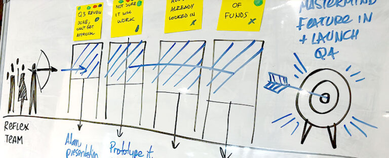
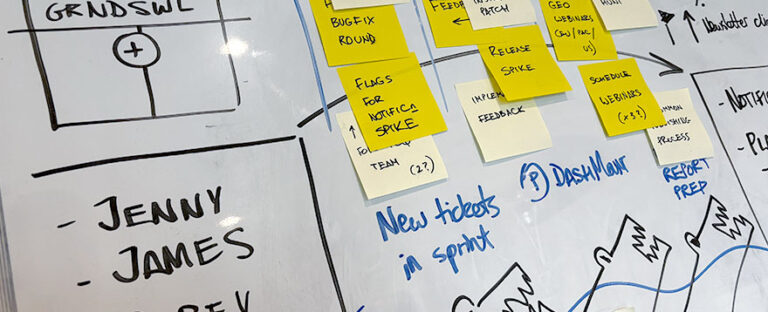
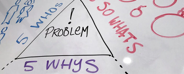
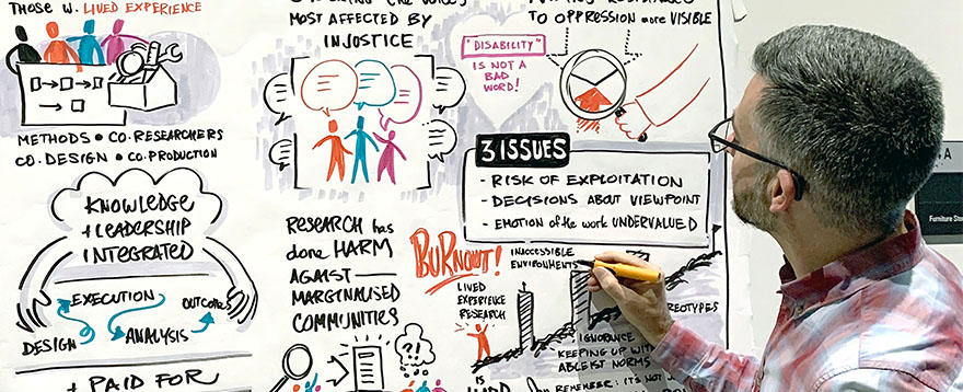
Ever walked out of an event thinking, “Well, that was great… but what actually happened?” You’re not alone. Words fly thick and fast, but they don’t always stick. That’s where a graphic recorder (a.k.a. live scribe or visual note-taker) comes in. Here are 6 benefits for having one around.

I’ve been graphic recording at public events, conferences, and meetings for about 15 years, and even with the advent of gen-AI, these 6 benefits still hold true. Actually, even while technology gives so much wow-factor, we still crave connection, and in many ways, these 6 benefits are more important for events than ever.

🧲 1. It makes people look up from their phones

When someone’s sketching the conversation live in big, bold strokes, it pulls attention in a way bullet-point slides just can’t. A visual note-taker brings the vibe of “something really interesting’s happening here”… and suddenly, people are leaning in instead of tuning out.

There’s nothing like seeing a big drawing come to life before your eyes (pictured: Axelle Vanquaillie)

Oh, and sometimes my clients are worried that graphic recording distracts from the speaker. What actually happens is quite the opposite! It’s like watching a documentary; seeing the action unfold while hearing the narration over the top is the perfect combo.

🧠 2. It helps brains actually remember things

Our brains are wired for stories and visuals, not just talking heads and dense jargon. A graphic recorder connects the dots with succinct phrases in attractive lettering, colour, layout, and metaphor, turning a wall of words into something you can see, remember, and talk about later.

And here’s something nobody talks about: a graphic recorder can make a so-so talk MUCH more appealing, since it helps to amplify the content.

🖼️ 3. It’s like getting a Polaroid photo for every event talk

By the end of your event, you’ve got a collection of boards that are like a set of giant hand-drawn Polaroid photos, or a ‘highlight reel’ of key insights. Each board is part artwork, part documentation, and 100% useful. You can take a photo and boom: your post-event wrap-up just got sorted.

The boards (or charts) also act as postcards of each talk, for your attendees to take with them and share (see #5). Of course each ‘postcard’ doesn’t capture all the detail of what’s in the talk. But just like a postcard, each particular piece in the postcard conjures up memories of that detail, to keep those fond memories around for longer.

Graphic recording boards making great souvenirs from a conference

🌐 4. It makes your event more inclusive

Not everyone processes information the same way. Visual note-taking supports people who think better in pictures, who don’t speak the main language fluently, or who need more than just facts and figures to feel knowledged-up on the topic of the talk, or quick actions to try out.

A lot of what a graphic recorder does is to summarise a speakers’ content (or a conversation) by listening, synthesising and translating that summary into a visual summary. So in a way, the graphic recorder is doing the heavy cognitive lifting for the audience, so that they don’t have to.

It’s a win for accessibility and inclusivity.

📣 5. Hello, shareability

Graphic recordings are super snackable content. One photo of a rich, colourful visual summary can do more on social than five paragraphs of text ever will. It’s a dream for your comms team. And of course your audience will love sharing it, too.

Graphic recording works super well at sponsor conference booths too!

🤝 6. It sparks conversations (and a few a-ha! moments)

When people see their own words or ideas pop up on the board, it builds validation, trust and momentum. It invites discussion, reflection, insight, even laughter. A live scribe doesn’t just record the moment; they shape it.

🧭 7. it’s great for strategy and decision-making

Wait! There are actually more than just 6 benefits. This benefit is actually my favourite. Workshops, planning sessions, roundtables, offsites… graphic recorders shine in these, and I see this play out in my own work all the time. They map out ideas in real time, reveal patterns hiding in the noise, and help groups focus better, and get aligned faster.

Think of them as visual GPS for complex conversations.

Even if it’s rough, graphic captures on a whiteboard help groups to focus and have a more productive conversation

🎉 8. It adds that “Wow, they thought of everything” feel

OK, yes, there’s yet another benefit. This one’s definitely for the event organisers. Having the process and product of a graphic recorder around is a little unexpected, a little delightful, a little premium, and always interesting. When people see a live scribe in action, it tells them your event is top-drawer, thoughtful, professional, and designed for deeper engagement, not just an information dump.

Bottom line? A graphic recorder doesn’t just make your event aesthetically nicer and more engaging. They make it stick.

If you want help with getting a visual note-taker at your event, I got you (links to my business website, Bright Pilots). If you want to learn more about how to draw for graphic recording, look no further than my Presto Sketching book.

Filed Under: For meeting leaders and coaches, For project managers and facilitators, Sketchnoting and graphic recording Tagged With: events, graphic recording, meetings, scribing

Discover how your customers tick with the Decision Factors sketch

26/10/2020 by Ben Crothers

It can be really hard getting a handle on what factors affect your customers’ decisions, or how to get buy-in from your stakeholders. The Decision Factors sketch can make it easier.

Why do we buy the products and services we buy? Why do we choose one brand over another? Why do some factors influence us more than others? Or why is it so hard to get teams to use a new system, as part of change management?

If you’re a researcher, designer, marketing professional, product manager, or change manager, you probably spend a lot of your time thinking about these sorts of questions. There’s an incredibly complicated soup of factors and biases going on in the way we make decisions, large and small, as well as various forces that play on those factors and biases. There’s also a huge body of ongoing research into the cognitive psychology and behavioural economics involved in decision-making.

I want to show you a simple framework that has helped me apply the essence of this research: the Decision Factors sketch. It helps you visualise the various factors going on as we make decisions for behaviour change, whether that change is to make a purchase, to join a meeting, to approve a design… anything at all.

What’s in the Decision Factors sketch?

As you can see in the sketch below, there are four main elements going on:

  • SUBJECT – Your customer, persona, stakeholder, staff-member… the person who you want to make a decision for change
  • OFFERING – The thing (idea, solution, product, proposal) that you want the subject to buy, or buy into
  • ATTRACTORS – The factors that attract this person to your offering
  • INHIBITORS – The factors that inhibit, distract, or otherwise prevent this person from making the decision to buy/buy into your offering

By mapping out the factors in this way, you can really put yourself into the mind and shoes of that person, spot gaps in your understanding, and enrich your own thinking about the relationship between your offering and your customers/stakeholders. Let’s take a closer look…

Attractors

By using this sketch to list out the factors that encourage someone to make a decision in favour of your offering, you pull the focus of the offering from its features (usually what we think about the most) to what those features are for. These tend to do with things like:

  • GOAL – What would this person achieve with your offering? This is the main factor that everyone thinks about, and is at the foundation of user-centred design and jobs-to-be-done theory. A decision cannot take place without the recognition of a need of some sort, to help solve their specific problem.
  • OBJECTIVE BENEFITS – What is better about your offering than the competition, or what the person is doing already? You should be able to list some differences your offering affords them, e.g. to do some task easier/ faster/ cheaper, to do better, gain more, save more.
  • SUBJECTIVE BENEFITS – What emotional need lies on the other side of the goal (above)? This is the factor we like to think drives everyone else except us… but we know that’s not really true. This is the factor at play in marketing messages and advertising. These are the ’emotional jobs’ in JTBD theory. Things like: make me look good in front of others, make me more popular, make me feel smarter/ sexier/ cooler/ more powerful. Make me more…complete.
  • TRUST – How much would the person rely on your offering? Past experience of something is our best predictor of the future performance of something similar. The trust earned from a previous positive experience is a strong attractor in itself.

Inhibitors

Inhibitors are the forces that turn us off, hold us back, or get in the way of deciding to buy or change, things like:

  • HABIT – People’s habits — their regular entrenched way of thinking and/or doing things — can be a powerful thing to have to overcome.
  • OBJECTIVE DRAWBACKS – There may well be specific disadvantages that are worth highlighting in the array of factors affecting the person, such as increased cost of time and resources. But sometimes behind these objective drawbacks, lie factors that actually affect that person more…
  • SUBJECTIVE DRAWBACKS – These factors don’t apply to all buying or behaviour change decisions of course, but they can still be powerful deterrents. What might the person be afraid of, if they decide to do/buy/use your offering? Is there a fear of change? Fear of loss of control? Or any limiting beliefs in the way, e.g. “I don’t know if I actually deserve this”, “I’m not worthy of it”, “It’s out of my reach”…?

Visualise the factors at play with different-sized arrows

I hope you can see that the Decision Factors sketch is more than just listing pros and cons for the subject. This is a visual, so we can map how big/small each of the factors are, with different-sized arrows. This helps you (and others you show it to) understand how these various factors might work together, or counteract each other, more quickly, accurately, and comprehensively.

What do I use the Decision Factors sketch for?

You can use this to:

  • Help explore how to make your product/service more desirable to your customers
  • Help analyse research results about customers’ needs and buying habits
  • Help dig into why people are/aren’t adopting a new product/service/way of doing things in your organisation
  • Help yourself prepare for a pitch to stakeholders, to attune your communications to what they care about the most
  • Have a more productive discussion in any 1:1s with staff or stakeholders

How do I do the Decision Factors sketch?

1. Draw up the framework

Start by drawing the basic framework of the Decision Factors sketch on a whiteboard, flipchart, or even just a piece of office paper. You can even put these elements together in an online collaboration space like Miro or Mural.

2. Use the areas as prompts for discussion

Now, use each area to help structure your thinking and prompt group discussions, all with the aim of gaining a deeper understanding of how to maximise the likelihood of a particular subject adopting your offering. You can ask yourself or your group questions like:

  • What’s in it for this person to buy/use our offering / solution?
  • What is holding them back from buying it/using it?
  • What might distract them from making this decision?

Note! You don’t have to solve anything right now. Resist the temptation to justify your offering, or falsely ‘jack up’ the power of some attractors over others, or to rationalise any of the inhibitors away.

3. Capture and visualise the factors

Capture what you’re thinking, or what others are saying, on the sketch as you go. Messy is totally OK; this is definitely a case where the process of using this sketch is often better than the final product. remember to play with the size of the arrows, to indicate what factors are greater than others, or what factors you know you need to focus on. This can also expose some blind spots that you or your group might not have thought about.

4. Discuss next actions

Once you or your group have laid out and assessed the array of various attractors and inhibitors, now you can switch to ‘solution mode’, and think about what you need to do, to increase the chances of this person adopting your offering.

  • Is there something about your offering that needs to be introduced? Or dialled up? Or taken out?
  • Is there a benefit of your offering that just isn’t clear enough?
  • How might you change any marketing or communications to help people decide?
  • Are there any specific messages you need to put out there, to help people deal with the inhibitors?
  • Is there something you can do to help with a specific inhibitor, that would tip the balance in your offering’s direction?

Try it yourself

As I hope you can see, the Decision Factors sketch can be a powerful analysis and re-framing device. It can be fast and light – like using it right before you go into a pitching presentation – or it can be thorough and in-depth, like in a product strategy workshop.

However you use it, I hope it brings you might insight and success!

Filed Under: For designers and researchers, For meeting leaders and coaches, For project managers and facilitators, Problem solving, Sketchnoting and graphic recording, Visual strategy and facilitation Tagged With: change management, product strategy, stakeholder management

Here’s how your pen can break down walls

12/12/2019 by Ben Crothers

In the last post, I showed you an effective way how to chart out a goal and how to get there, using the simple ‘Build a Bridge‘ visual framework. It included a way to plot out the different steps you’d need to take to reach that goal, and the distractions you’d have to watch out for.

You might have been thinking: “What about the things that get in the way of achieving that goal? How do I show those?” And well you should. We come up against barriers all the time, don’t we? I’m always a fan of not loading too much into one sketch to explain something, otherwise it loses clarity. So here’s another type of sketch that might come in handy for you or your team. This is the Goal Barriers visual framework. Take a look, and have a go at sketching it yourself:

It’s pretty simple, but as you’ll see it will communicate a lot. On the left is you. On the right, the target is your goal. That goal could be losing 10Kg, or launching a campaign at work… whatever is meaningful for you. The idea is that you can shoot your metaphorical arrow and hit your target. Now I’m going to add walls in the middle, getting in the way of you hitting that target with your arrow:

It can be incredibly insightful simply thinking and visualising exactly what barriers there are to your goal. Try it yourself, and try to be specific: draw a wall representing each barrier you can think of, and write what the barrier is above each wall. Is it lack of time? A special stakeholder who won’t get on board? Another project in the way, that needs to finish first?

Let’s take this a step further. Just like a wall is made up of bricks, each challenge is probably made up of smaller parts. Draw a few lines across each wall, like this:

We can now add a question below each wall about how we can break down that wall. For example, if the target is to lose 10Kg, and the first wall is “No time to exercise”, the question can be “How might I get some time to exercise?” Now – and here’s another useful thing about visualising barriers and cutting them down – you don’t have to remove the wall entirely, but just enough for the arrow to go over it.

Visualise what are some things you could do to start chipping away at those walls. You might even want to sketch those on the same piece of paper, too. Pretty soon, your walls could look like this, and you can then hit your target:

So go ahead and visualise (1) your target; (2) your barriers; and (3) how you’re going to knock those barriers down. Once they’re out of your head and onto paper, you’re one step closer to knocking them down in real life.

Was it good for you?

I’d be delighted to hear any feedback or questions you have about this Goal Barriers visual framework. Imagine if your whole team could do this together, and start busting down those barriers together?

Filed Under: For meeting leaders and coaches, Visual strategy and facilitation Tagged With: coaching, facilitation, goals, meetings, productivity

See a clearer path to your goal with the Build a Bridge framework

01/09/2019 by Ben Crothers

One of the best things about sketching is how it can help clarify your thinking. I’m sure you’ve had times where your head is swirling with thoughts, questions, worries and maybes… it could be about that important meeting tomorrow, or that prickly situation with stakeholders at work, or maybe something closer to home.

Whatever it is that’s keeping you up at night, getting your thoughts out of your head and onto paper is always a great idea. I want to show you a simple framework I’ve picked up along the way (I forget where I first saw it now) that has helped un-muddle my thinking a lot, and I hope it helps you too.

Visualising your goal with a simple bridge sketch

Take a look at the Build a Bridge framework sketch below, and why not grab a pen and some paper, and try drawing it yourself. It’s a really simple sketch, but I find it communicates a lot.

On the left side is you, and where you are right now. On the right side is your goal. That goal could be something quite tangible (like losing 10Kg, or launching a book by next July), or it could be more intangible (like a stronger team, or a healthier marriage).

Whatever your goal is, try to make it specific and realistic (hello SMART goal framework). You might want to even try drawing what that goal is, rather than a flag like I’ve done.

Next, draw a curved line from one side to the other. As you do that, visualise yourself reaching that goal. This is your bridge to your future. Now draw a few lines on the bridge, like this:

Those little lines across your bridge represent specific steps you can take to get to your goal. Think about these steps, and make notes above the lines about what each step could be. Don’t worry too much about the order and effort needed in each step; just get all those thoughts out as words on the paper, because you can worry about order and effort later on.

Next, draw a couple of crocodiles under your bridge. These are the things you’ll happily avoid now that you have a bridge to your goal (rather than swimming across, geddit?), but can still be distracting for you, as you try to reach that goal. Take a look at my crocs; they’re never going to win a Waterhouse Natural Science Art Prize, but they look enough like crocs to represent distraction.

Now, name each crocodile with a specific thing that could distract you from reaching your goal, like – oh, I don’t know – Toblerone chocolate, or too much scrolling on your phone at night rather than getting a good night’s sleep (guilty!).

“Ah, but what about the things that get in my way, Ben?” I hear you muse. It’s a good thing not to overburden one drawing with too many things. Plus, we’ll deal with barriers in another post…

And behold – this is a map to your future. Look at your drawing, and think: how can I get to each step across this bridge? Keep that drawing taped up in your bathroom, or on your fridge… anywhere where you’re likely to see it every day, as a reminder of what you want to achieve.

It works super well for businesses too. Here’s a variation of the bridge drawing, this time with a building representing an organisation:

I’ve drawn the steps as financial quarters, but these could be anything that represents meaningful progress for your organisation. Why not give this a go in your next project planning meeting, or company strategy meeting?

How was it for you?

Try drawing this visual framework yourself, for a goal of your own. Or, you might like to try it at your next project kick-off meeting, as a way to help everyone get a clear, shared understanding of the project’s goal and major stages, before digging into the detail. If this is useful for you, either for yourself as an individual, or at work, why not drop me a line and let me know?

Until next post, happy sketching!

Filed Under: For meeting leaders and coaches, Visual strategy and facilitation Tagged With: coaching, facilitation, goals, meetings, productivity

Solve the right problem with the Problem Pyramid

23/10/2018 by Ben Crothers

Get clarity on a problem to be solved – either by yourself or as a team – by exploring it, reframing it and articulating it in a more insightful way using this simple visual pattern.

Ambiguity and confusion? You probably don’t have a proper problem statement

Have you ever had those times where you’re lying awake at night, with your mind gnawing on a problem, and you just can’t seem to think it through properly? You toss and turn, and as much as you want to turn your brain off, you can’t!

Or, you might have a project at work where you (and probably others too) can’t really say why you’re doing it. The project might have a goal, but still there’s no clear purpose. Sometimes people might even say smart things like “We need to know what problem this project is solving” (very true!) but still, nobody can actually articulate what the problem is.

Or you might even have a problem statement – or inherited a problem statement from somebody else – but it still just sounds like a goal.

If this is a problem statement, what’s the actual problem?

A proper problem statement – and I can’t believe I have to say this – should contain a problem. Something that is in the way of someone (or a business, or a system) achieving a goal. Yes, the statement itself can contain the goal, and yes it should say something about who has the problem, and no it should definitely not already contain the solution. Here’s a good guide that has always helped me:

[Persona / Customer type] wants to [Goal] but [Problem]. This is unacceptable because [Impact].

Note how adding the impact of the problem helps to say why we need to solve this particular problem, and maybe why we need to solve it now.

Is it hard to come up with such a succinct, insightful problem statement? Usually, yes. Do you come up with it just by getting a group of people to talk? Probably not. Problem framing by definition is all about describing a problem from a specific point of view, and we all know how likely it is that everyone is going to have a different point of view!

That’s why it makes so much more sense to visually map out the problem space, to get clarity and alignment first, before being able to distill it all into a problem statement. And that’s where the Problem Pyramid comes in!

What is the Problem Pyramid?

The Problem Pyramid is a visual pattern you can draw to help you explore and clarify a particular problem space, especially if that problem space is complex, ambiguous or misunderstood. You use it give more structure and meaning to any conversation about the problem space, so that you have a better chance of distilling a more insightful problem statement.

When do I use the Problem Pyramid?

You can apply this to all sorts of problems and in different situations, such as:

  • You have a problem, you’ve tried one or more solutions, but you can’t crack it yet
  • A team is struggling with the scope and purpose of a project, and needs a shared clear understanding of its intent
  • You’ve been given a problem statement, but it’s not helping to point the way to a solution
  • You’re ‘selling a solution’ about a particular problem to management, and you want to check your thinking by asking yourself the hard questions up front

What is the Problem Pyramid made up of?

Take a look at the sketch below:

In the triangle you write whatever you think is the problem you need to solve (this is the existing problem statement). The triangle (or pyramid) has 3 sides, which symbolise 3 different ways to explore that problem:

  • 5 Whys – root cause analysis
  • 5 Whos – perspective analysis
  • 5 So whats – impact analysis

How do you do the Problem Pyramid?

You can draw this Problem Pyramid on a whiteboard, paper, even in an online collaboration space (like Miro or Mural). You can do it with your team as a session on its own, or as part of an existing meeting.

Let’s take a look at how you and your team can tackle a problem by visually exploring each of these ‘sides’ together. Be sure to share some markers and sticky notes around for different people to add what they want to, at different points throughout this activity.

Start by drawing a large triangle in the centre of a whiteboard, and write what you think is the problem you’re trying to solve so far inside the triangle. This may well change… but you have to start somewhere!

5 Whys

Problems are usually tackled more effectively when they’re addressed at the source, rather than tackling just a symptom of the problem. The ‘5 Whys’ activity is well known in the design and product innovation domains, and helps us do root cause analysis. For more information about 5 Whys, see the Gamestorming 5 Whys activity or IDEO.org’s 5 Whys activity.

Ask everyone why the problem written in the large triangle is happening (or what is causing the problem), get them to write their responses on sticky notes, and stick them in the area below the large triangle. For example: if the problem is “We didn’t reach our quarterly target of selling 15 thousand shinklebots“, ask them “Why didn’t we sell 15 thousand shinklebots?”

There’ll probably be several different answers to this question that you can read on the sticky notes that people wrote, and you may need to group any duplicates. Now, take each response, and ask why again. For example, if one of the responses was “The factory couldn’t make the shinklebots fast enough“, ask “Why isn’t the factory making shinklebots fast enough?”, and so on. The ‘5’ in the ‘5 Whys’ is to get you and your team to really push your thinking beyond the default top-of-mind cause. The deeper you dig, the better insights you’ll get.

Before long, you’ll unearth some juicy root causes to the original problem that as a team you’ll want to focus on more than others. It’s tempting to now race off and solve one of those causes, but hold up! We have to explore the other two sides first…

5 Whos

Next, ask everyone who is affected by this problem, and get them to write on sticky notes (one per sticky note) who they think is most involved, and group as necessary. Depending on the nature of the problem, it’ll be a mix of particular types of customers, or types of staff members, or partners…maybe even you and your team.

If the team come up with more than 5 (there usually are more than 5), ask them: who is most affected by or involved in this problem?

Why do we do this? Because it’s important to get everyone out of their own mental bubble, and thinking of others. This isn’t a blame game at all; it’s about seeing who’s who in the whole system of the problem space. Identifying different kind of people affected by the problem then leads to helping to see and describe the problem through each of their perspectives, which is what re-framing is all about.

5 So whats

Thirdly, it’s good to do some impact analysis. Looking at the causes of the problem and types people who are most involved in the problem you have generated so far, ask “So what?” I don’t mean “So what?” in a glib, negative way, I mean: “What happens next for the people we identified? What’s the impact of that problem on each of them?”. Whatever the answer to that question is, ask “So what?” again, and so on.

For example: if the problem is “We didn’t reach our quarterly target of selling 15 thousand shinklebots“, asking “So what?” generates answers like:

  • Quarterly revenue will be less than expected (business impact)
  • We’ll need to work out why (action to take)
  • There are too many shinklebots taking up space in the warehouse (business impact)

…and asking “So what?” again generates answers like:

  • We don’t get the capital needed to open the new branch yet (business impact)
  • We’ll need to temporarily divert some resources to do customer research (action to take)
  • We need to find more warehouse space for the incoming products (business impact)

You can visually capture these in the same way as the other two ‘sides’ of the problem area, using a mix of writing, sticky notes and simple drawing on a whiteboard. You might like to ask “So what?” for each type of person you have isolated, too. Doing this impact analysis helps you and your team get a keener sense of urgency about the problem, as well as a sense of the impact if you delay action, or don’t do anything at all.

Step back and see the story

Now’s a great time to step back and get a sense of the whole problem space you and your team have generated. You now have a ‘map’ of the problem. It’s bound to contain some areas that are more tightly defined than other areas, as well as areas that may be completely new and insightful for you and others in the team.

You can use this ‘map’ to join up some elements that stick out as being more important. For example, there might be a specific customer type affected more than others, and the impact on them leads to more negative impacts on others. Or there might be an underlying cause that the team needs to focus on and fix, which will alleviate most of the impact for most of the people affected.

This is how the Problem Pyramid has visual storytelling power, as well as analytical power!

Here’s what a Problem Pyramid looks like in action. Note, it’s normal for it to get messy first, before you can ‘join the dots’ and home in on a particular story to distill into a problem statement.

Try it yourself

As with all of the visual patterns I share, do let me know if you try it out, and what worked well, and what didn’t work so well. I hope this Problem Pyramid helps you see your problems better, so that you can solve them better!

Filed Under: For designers and researchers, For meeting leaders and coaches, For project managers and facilitators, Problem solving, Visual strategy and facilitation Tagged With: business strategy, facilitation, problem framing, product design, product strategy, service design, strategy, visual framework, visual frameworks, visual storytelling

Nail your product strategy with the Product Pyramid

04/05/2018 by Ben Crothers

Features! Story points! Sprints! UIs! It’s all too easy to let the detail of product management drown out the actual product strategy. The Product Pyramid can help.

Strategy is a tricky game. The more complicated the product(s), service(s) and business(es), and the more people involved, the trickier things get. Trying to get shared understanding about vision, direction, risk, priority, and so on is hard enough, let alone getting shared alignment, decision, and execution.

But so often I find that it’s all about connecting the various pieces of product management into a cohesive product strategy story. This usually involves visual framing, and getting everyone involved using a shared perspective and vocabulary that describes where we want to play and how we want to win.

Lots of product managers, designers and entrepreneurs struggle with strategy, because they jump into details too soon, or find it hard to separate what they know from what they believe/suspect/assume. Japanese master swordsman, author, philosopher and all round legend Miyamoto Musashi put it well: “Perception is strong and sight weak. In strategy it is important to see distant things as if they were close and to take a distanced view of close things“.

What is the Product Pyramid sketch?

With that in mind, the Product Pyramid sketch is a way for product managers, designers and founders to visually relate the detail of any product (or service) to the rest of what’s important about that product: the experience it provides, the benefits it gives to customers, and the value it creates for customers and the business.

It’s a simple pattern that you can draw on a whiteboard in a strategy meeting, and it looks like this:

How does it work?

The Product Pyramid is a visual guide to remind you and others how all of the parts of your product are related.

  • P = PURPOSE of the product, usually to increase some value to your business and your customers; the change your product is trying to make in the world
  • B = BENEFITS to your customers; what they talk about to others that’s so good about your product
  • J = JOURNEY people go through when evaluating, buying, using, getting help and sharing your product
  • F = FEATURES of the product; what people use in the journey
  • P = PERSONAS that interact with the product; the different types of people that go through different parts of the journey. JTBD and needs (i.e. the jobs-to-be-done framework) fit in here.
  • C = COMPETITION that also attracts the same personas with the same needs

When should I use the Product Pyramid sketch?

Use this sketch (or visual framework) if these sorts of scenarios happen:

  • You can’t seem to focus product conversation at the right ‘level’ (i.e. people get bogged down in talking about user interfaces, bugs or features when you actually need to talk about benefits)
  • You don’t have a shared understanding of the product’s strategy across the team
  • You need to come up with good research questions
  • You can’t remember all your user stories

How do I use the Product Pyramid sketch?

Make sure you have a whiteboard. If any of the symptoms above start to happen in a meeting:

  • Draw a nice big triangle
  • Draw in some horizontal lines to separate the triangle into the different zones (Benefits, Journey, etc)
  • Make some notes in the zone (or beside the zone) that reflect the conversation you’re hearing. It could be questions, assumptions, or things you’re trying to understand better
  • Listen for connections in what’s being talking about, and visually reflect this with arrows from one zone to another

The Product Pyramid is a map

The Product Pyramid is a map. It’s there to help you know where you’re at in a product discussion, and where you want to be. It’s not meant to contain lots of detail, but it does serve to point the way to that detail (that would live elsewhere). For example, the Journey layer should ‘link’ to any customer journey maps you have created.

It’s also there to highlight any gaps, vagueness, or disagreement in your product strategy.

The Product Pyramid is a story

Because the Product Pyramid ‘connects the dots’ of your product’s purpose, benefits, journey and features, it also doubles as a great way to tell your product strategy as a cohesive logical story. Two examples:

Pitch to leaders (top-to-bottom) – “The most important change we want to make in this business is [Purpose]. To do that, we need to help [Persona(s)] with [Benefits]. As they use our product, they [Journey], and they way they experience [Benefit] is through [Features]. If we invest in [Feature], this will unlock greater [Benefit].”

Rationale for a feature improvement sprint to engineering (bottom-to-top) – “This particular [Feature] in our product might be small, but it’s the source of a disproportionate amount of support requests. At the moment, it gets in the way of [Journey], and stops too many customers from realising [Benefit]. That’s why we need to focus on improving it this quarter, so that [Purpose].”

Try it yourself

So, the next time any of your product team meetings include even a bit of product strategy – e.g. sprint planning, feature brainstorming, business review meeting – your team can now have a way to keep all the various parts of the product related, and optimise discussion for business benefit and customer benefit.

Filed Under: For designers and researchers, For meeting leaders and coaches, For project managers and facilitators, Problem solving, Visual strategy and facilitation Tagged With: facilitation, product design, product strategy, service design, visual frameworks

3 ways to visualise psychological safety for better team performance

22/01/2018 by Ben Crothers

Think about you and your team at work for a minute. How supportive would you say it is for everyone to speak their mind, try new things, and learn from mistakes? Is it a pretty open, encouraging team, or is it rife with politics? Do you feel like you can be yourself there?

This is what psychological safety is all about: having a culture where you and your team can bring your whole selves to work, speak your mind with respect for each other, trust each other, be curious, be assured that it’s okay to try new things, and not be penalised speaking out, or for taking small risks. Psychological safety is essential if an organisation wants to have a culture where inventing and implementing breakthrough ideas can thrive.

Using sketching to promote and embed psychological safety

That sounds like a pretty good culture to work in, doesn’t it? So how can you promote and embed that sort of culture? By using more sketching and visualising in your team, of course! Here are 3 ideas to get you going.

1. Draw project ‘horror movie’ posters

I’m a big fan of awesome movie posters, as well as pre-mortem activities, where a team can discuss what they think could go wrong in a project at the beginning of the project, and then discuss what they can do to avoid those things. This is a great way for everyone to be more real with each other, air those anxieties, and be more connected by realising that everyone probably feels the same anxieties.

At the beginning of a project as part of a kick-off meeting, ask everyone to imagine (in silence) the project as a horror movie or disaster movie, where everything they think could go wrong HAS gone wrong. Then, give everyone a sheet of paper and a pencil or marker, and ask them to each draw a promo poster for that movie, showing what has gone wrong.

The drawing doesn’t have to be good at all; just enough to get their idea across. And like all visualisations, just getting those vague thoughts out of people’s heads and out in the open can be really clarifying. You can put everyone at ease by showing them a rough drawing you’ve done yourself, earlier.

Once everyone has finished (after 5 or so minutes), get everyone to stick them up on the wall, and let everyone tell each other about what they’ve drawn. Then, discuss as a team how to avoid those things going wrong. It’s fun, it’s really revealing, and it bonds the team a bit closer together.

2. Do a ‘Circle of expectations’ sketch

Another good activity to do during a project kick-off, or whenever someone new starts on the team, is to do a ‘Circle of expectations’ sketch. Draw a big circle on a whiteboard, and write ‘IN’ in it. Outside the circle on one side, write ‘OUT’.

Set the scene by saying that everyone has a part to play in the culture of the team, and this is the opportunity to state what behaviour expectations we all have. It’s a good idea to demonstrate what you’d like everyone else to do, so go ahead and write something like ‘WE DO THE TASKS WE SAY WE’LL DO’ inside the circle.

Ask everyone to grab a whiteboard marker and write what behaviour they think everyone should have in the team inside the circle. And then ask everyone to write what they don’t want outside the circle.

Discuss as a group how to make sure that everyone does what is inside the circle, and avoid what’s outside the circle. This is a great way to foster honesty, and having each others’ backs.

3. Draw a superhero drawing of yourself

This is a fun and very insightful 15-minute ice-breaker activity to do with your team. Ask everyone to draw a simple outline of a superhero on a sheet of paper (you can use something like the image below as a template if you want).

  • Ask everyone to imagine themselves as a superhero, and then write or draw their own SUPER POWERS around the outline. It’s totally fine to be a bit silly with this; it gives people a chance to get past any awkwardness about drawing and sharing this sort of stuff.
  • Then, ask people to write or draw what they really value inside the outline; this is the POWER SOURCE of you as a superhero. You might want to drop hints by including things like authenticity, honesty… things that reveal what really motivates you.
  • Thirdly, ask everyone to write or draw their KRYPTONITE, the things that make you anxious, annoyed…the things that sap your mojo.

As with all of these activities, get everyone to talk through what they’ve drawn, and discuss as a group how you can support each other to stay connected to your power sources, use your super powers to help each other, and avoid the kryptonites.

Your turn

The only way these activities will bring better psychological safety to your team is for you to actually do them. Maybe try them alone first to get the hang of them, and then do them with your team. I’ve used these over and over again, I’ve seen them bring great benefit to teams, and I guarantee you that they will improve your team’s psychological safety too.

So if you do try any of these activities with your team, let me know, send me a photo… it’d be great to hear how they’ve worked for you!

Filed Under: For meeting leaders and coaches, For project managers and facilitators, Fun and creativity Tagged With: camaraderie, check-ins, coaching, drawing, facilitation, group drawing, teams, visual metaphor, visual thinking

5 MORE tips for better whiteboarding awesomeness

29/05/2017 by Ben Crothers

My last post about whiteboard tips seemed to really strike a chord with a lot of readers, so here for your further whiteboard mastering pleasure are 5 MORE tips. If you missed out on the first 5, don’t worry; you can read them here.

There’s no harm in saying again that writing and drawing on a whiteboard is not only a great way to visually reflect what’s being said in the meeting, it’s a great way to command the meeting. By that I don’t mean making YOU the centre of attention; I mean making the IDEA, or the QUESTION, or the DECISION the centre of attention.

So, here are 5 more ways you can rock the whiteboard, to make sure everyone in the meeting focuses on what really matters.

1: Plan the structure  of your whiteboard space

It’s really easy to let a meeting take your hand all over the whiteboard. Before you know it, you’ve scrawled willy-nilly all over it like a bee on Red Bull, darting from flower to flower. This might feel good, in a Beautiful Mind aren’t-we-brilliant kind of way, but it may not help everyone in the meeting to get more clarity, meaning, structure, and connection from what’s being discussed.

Instead, plan the spatial structure of what you’re going to write and draw on your whiteboard ahead of time. Using either a dashed line, or just your mind’s eye, mark out a set of smaller areas on the whiteboard, where each area will correspond to a particular part of the meeting or workshop, like this:

This will help everyone understand and remember the various parts of the meeting much better. Also, try to make the shapes photo-friendly, to make taking photos of them easier (see point #5 below).

2: Use colour to add meaning and emphasis

Now, I’m assuming you’ve done tip #2 of the last 5 tips for whiteboarding awesomeness, and you have several good-quality whiteboard markers in several colours at the ready. Choose one marker for the bulk of what you write and draw (hint: black), and then choose a colour or two to use with the black, to represent specific meaning(s).

In the example below, I’ve used red to emphasise some elements of an outcomes hierarchy that I would need the room of people to pay attention to:

In this example, the red emphasises 3 things at a glance: There’s a box in the bottom right corner that isn’t connected to anything (this could represent a project that isn’t contributing any outcomes); another project added to the left that we’ve forgotten about; and the highest-level outcome is in a warning-state somehow.

3: Breathe life into those boxes and arrows

If I had a dollar for every box and arrow I’ve ever drawn on a whiteboard, I could definitely buy an island right now, and I’m guessing you’d probably be on your way, too. Boxes and arrows are the bread-and-butter of whiteboard discussions, so why not give them a lot more life and meaning?

You’re probably used to sketching something like this on your whiteboard, or seen it done:

But what if you did something like this:

There are several extra things going on here:

The shape of the arrows adds more meaning – The middle arrow is in a spiral, indicating something that’s either iterative, or complex, or just plain dizzy. The top arrow arcs up and over, indicating a part of the process that soars over the rest, leading to a positive outcome.

The boxes have character – Simply adding a face to a box gives it life, character, and meaning. Depending on what you want to communicate, this sort of tip can be a powerful ally for helping people to remember certain concepts and ideas.

Colour is used to indicate meaning – Red is used for something unfavourable, while green is used for something – well – good!

4: Give them the pen

According to maestro visual communicator and author Dan Roam (and I’ve seen this in action myself), there are 3 types of people in the room when it comes to whiteboards:

  • The Black Pen People – they can’t WAIT to jump up and start drawing on that whiteboard (me!)
  • The Yellow Pen People – they’re happy to hang back a bit, and add to someone else’s work
  • The Red Pen People – they wait until the end, question it all, and might just jump up and re-draw it all

It’s really useful to know what sort of Pen People you have in your meeting, because you can use that to your advantage. For brevity, I’m going to focus on the Yellow Pen People, since they’re the ones who will give a lot of value to a meeting through visual communication, if nudged in the right way.

Here’s how. On your whiteboard, draw things that let the Yellow Pen people easily see where they can add their bit to, give them the pen, and then ask them questions. Here are a few examples:

  • Sliding scales – Draw: a sliding scale, with an alternative at either end // Ask: “Is this a low-risk move or a high-risk move? Where do you think a circle should be on this risk scale?”
  • Fill in the gaps – Draw: a set of circles representing the set of whatever you’re talking about (e.g. projects) // Ask: “Are there any projects missing? Could you draw any more in?”
  • Make connections – Draw: a set of circles representing the set of whatever you’re talking about // Ask: “How are these connected? Could you draw lines in where you think the connections are?”

5: Capture those whiteboard drawings clean and fast

It stands to reason, the sooner you can get a good clean picture of the whiteboard into your team members’ (or stakeholders’) inboxes, the better. The more you use images that they’ve seen before to reinforce what was talked about or decided, the greater your influence will be.

Thankfully, there are some great (and free) smartphone apps out there that will take a great photo, clean it up and send it to your inbox in a jiffy. My current favourites:

  • Microsoft Office Lens (for iOS, Android or Microsoft)
  • CamScanner (for iOS or Android)
  • Adobe Capture (iOS and Android)

You can read a whole lot more about capturing your whiteboard drawings in this Presto Sketching blog post: Capture photos of your sketches like a pro.

Well, there you have it! 5 more tips that I hope will really improve your whiteboarding skills, as well as the meetings and workshops that you and your team have. Let me know in if and how you put these tips into practice, and if they’ve improved your meetings.

Filed Under: For meeting leaders and coaches, For project managers and facilitators, Getting started, Visual strategy and facilitation Tagged With: facilitation, meetings, tips and tricks, whiteboarding

5 tips for better whiteboarding awesomeness

12/05/2017 by Ben Crothers

No-one likes boring aimless meetings, or long wordy slide decks, and a big way to make meetings much more engaging is to use a whiteboard. Writing and drawing on a whiteboard is a great way to visually reflect what’s being said in the meeting. In a way, the whiteboard becomes your second voice in the room.

No matter what you think your ability at the whiteboard is, here are 5 ways you can take your own whiteboarding skills from good to great.

1: SLOW DOWN

Drawing on a whiteboard is a lot like public speaking: if we rush it, we won’t sound very confident in our ideas, what we draw will look like an unruly mess, and others won’t be as confident in our ideas either. How often have you seen this sort of thing on the whiteboard, scratched your head and wondered what it was:

Just slow down. Slow. Down. Breathe. Spend just a few extra seconds as you draw, and be more deliberate with each line. It will inject so much more confidence in what you draw and what you say. And when you project more confidence, others will have more confidence in your ideas. And they’ll remember them longer, too. Try to aim for something that’s just a bit neater, like this:

2: Get decent whiteboard markers

There are a lot of really ordinary whiteboard markers out there, and they do you and your ideas no justice at all. Let the ink speak to the quality of your ideas, and get a set of decent markers that don’t run out by the end of the meeting. Chances are, there’s a newsagent or office supplies store near you that has a range of markers to choose from, for less than the price of a cup of coffee. My favourite tends to be a chisel-tip marker (rather than a bullet tip), so I get a chunkier line:

3: Practice your writing

This is related to tip #1: be a little more deliberate and neat with your writing. What you write is like your voice recorded on that whiteboard long after you’re not in the room, so it’s worth putting a bit of effort into your lettering.\

We’re not aiming for precise calligraphy with graceful ligatures and flourishes, of course! But just a bit of neatness goes a long way to projecting more of your character, and more of that confidence. Try practicing on the whiteboard before the meeting, in both lowercase and capitals:

4: Master outline text

Outline text is eye-catching and, used sparingly as a title or two on your whiteboard, will command attention and inject a little more life and energy into the meeting, for very little effort. It’s best to practice beforehand, if you’re not confident. The best way I know to get good at outline text is to draw each letter in capitals first (with plenty of breathing room between the letters), draw an outline around it, and then rub out the first line:

5: Master a small set of icons

Try to practice a small set of simple icon-like pictures that you’re likely to use over and over, from meeting to meeting. You might like to start with some like the ones below, that represent things like goal, problem, process, conversation, security, company, options, and so on.

These tips will really take what you draw on the whiteboard to the next level, and inject more confidence and life into what you have to say, so why not try them in your very next meeting?

Let me know if and how you’ve put these tips into practice, or maybe a share a killer tip of your own. Here’s to better whiteboarding, and better meetings!

Filed Under: For meeting leaders and coaches, For project managers and facilitators, Getting started, Sketchnoting and graphic recording, Visual strategy and facilitation Tagged With: meetings, tips and tricks, whiteboarding

Sketch the resource Tank for better team efficiency

05/05/2017 by Ben Crothers

I’m sure you know the feeling of being absolutely overwhelmed. You’ve got so many things going on in your head, and then one extra simple thing comes along, and you’re just flummoxed. Stressed. Jammed. Stuck.

Welcome to cognitive overload.

Not fun, is it? But hey, aren’t you glad there’s a sketch you can try, to visualise all those things, and then work out how to make sense of it all? I know, right?

The Resource Tank visual framework

I’d like to introduce you to my friend the Resource Tank sketch, and it basically looks like this:

You draw a tank, with a wavy line to show that it’s full of liquid, and then some straws coming out of it, going to various things that are drawing on that resource. The resource itself – the liquid in the tank – can be different things, like fuel, or time, or attention, or patience, or money.

When we run into a problem, or have to make a decision, it draws from our ‘cognitive fuel tank’. A few things or a few decisions are okay, but when there are more and more, it can drain us dry. Visualising it on paper (or on a whiteboard) like this is a great way to bring all those unseen things out of the fog of your mind and into the light, and then think about what we can do about them. But wait, there’s more:

By putting levels in your ‘tank’, and straws that go to different depths, you can also explore how different things can drain more of the resource, whether we want them to or not. This is a really neat visual metaphor that you can adapt and use in a variety of ways, e.g.:

My ‘attention map’ – what are the things that matter the most to you? There should always be ‘fuel’ for those things, which is why they get the deepest straw. There are things that matter a lot less, so we should only let them have a shallow straw.

Budget and expenses comparison – what would it look like if you compared what your budget expenditure should be, to what it actually is? Are there types of expenses that are crowding out other types, draining resources away from the things that matter?

Team resources and expenditure comparison – What would the fuel tank look like if it were your team? Say you manage a support team; are you leaving enough fuel in the tank for your premium clients? Or is energy being sapped by lots of seemingly urgent and important tasks?

These are just a few examples of how you can use the Resource Tank visual framework, and I’m sure that if you applied it to your own situation, you could probably think of (and sketch!) some more. Whatever happens, we all want to move away from this situation (below)!

So have a go, and have a think about how deep all of those straws are sinking into your valuable energy and attention, and then have a think about what changes you could make to set those straws at more – ahem – fuel-efficient levels!

Filed Under: For meeting leaders and coaches, For project managers and facilitators, Problem solving, Visual strategy and facilitation Tagged With: coaching, productivity, visual framework, visual metaphor

  • Page 1
  • Page 2
  • Go to Next Page »

Primary Sidebar

Recent Posts

  • Draw more creatively with FLARE
  • How adding a graphic recorder to your event makes it a game changer
  • Volume 2 of Journey Mapping Icons out now!
  • How to construct a great story
  • Why your project needs storyboarding

Categories

  • For designers and researchers
  • For meeting leaders and coaches
  • For project managers and facilitators
  • Fun and creativity
  • Getting started
  • Problem solving
  • Sketchnoting and graphic recording
  • Visual strategy and facilitation

Archives

  • July 2025
  • June 2025
  • September 2024
  • May 2023
  • August 2022
  • January 2021
  • October 2020
  • December 2019
  • September 2019
  • June 2019
  • January 2019
  • October 2018
  • September 2018
  • August 2018
  • May 2018
  • February 2018
  • January 2018
  • August 2017
  • July 2017
  • May 2017
  • April 2017
  • March 2017
  • Home
  • About the book
  • About the author
  • Learn
  • Presto Sketching Blog

© 2025 Ben Crothers, author of Presto Sketching - a book to help you think and communicate better with drawing.