• Skip to primary navigation
  • Skip to main content
  • Skip to primary sidebar

Presto Sketching

A book to help you think and communicate better with drawing

  • Home
  • About the book
  • About the author
  • Learn
  • Blog

Draw more creatively with FLARE

25/07/2025 by Ben Crothers

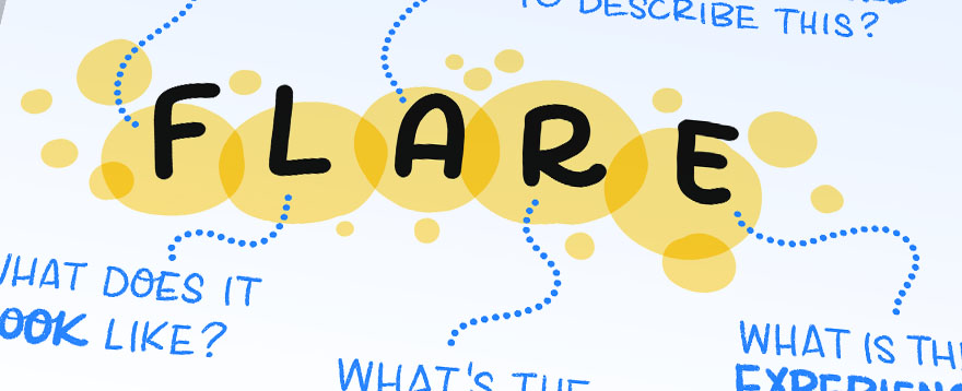
If you want to find ways to draw topics more creatively, or you feel like you’re in a bit of a rut drawing things the same way all the time, then the FLARE prompts are for you.

How do you draw a person? Or a building? Or a tree? There are lots of ways to draw real-world objects, and we can use curiosity, observation and practice to draw these in satisfying ways.

A group of simple drawings depicting common objects like a lightbulb and cloud

Some simple images of simple real-world objects

But how do you draw more complex and abstract concepts, like ‘innovation’, ‘strategy’, or ‘diversity’? It’s much harder, isn’t it?

A couple of years ago, Axelle Vanquaillie (a masterful visual practitioner, facilitator and leadership coach, and owner of the company Visual Harvesting) and I were discussing how to help people in our training workshops with this common challenge: how do you illustrate abstract concepts in more creative ways? We realised that many of us anchor on to one idea, and find it hard to go beyond that. My design background has always taught me that it’s always better to use divergent thinking, and that the way to have one great idea is to have 100 so-so ideas first. 

With that in mind, we pooled our knowledge, sketched a lot, and swapped stories of various training sessions we had run and examples we’d come up against. And that’s how FLARE was born.

We’ve since used FLARE with a variety of different groups in training sessions, with a variety of levels of confidence in drawing, and it has always helped everyone be more creative and get more satisfying results from their drawing. And now it’s your turn to learn!

A photo of a participant in one of our training sessions reflecting on the experience of using FLARE to illustrate a tricky concept

A participant in one of our training sessions reflecting on the experience of using FLARE to illustrate a tricky concept

What is FLARE?

FLARE is a set of prompts you can use to help you move beyond the way you’re used to thinking about a topic you want to draw, and think about it in new ways. What you get is a much greater range of ideas that you can then refine and combine into one final image.

A drawing of the process of coming up with ideas without FLARE and with FLARE

The FLARE process gets you more initial ideas from which to create your final visual

FLARE stands for:

  • Feel – What does it feel like? What emotions does this trigger?
  • Look – What does it look like? What are the real-world objects at play?
  • Another word – What’s another word (or words) to describe this?
  • Result – What is the result of this? What is the end-game of this topic or scenario? Is there a benefit realised? Or a negative impact that might happen?
  • Experience – What is the experience of this? Is it something where there are several steps involved? Or several devices, places, people or roles involved?
A drawing of the word FLARE with text expanding on what each letter stands for

How to use FLARE

It’s really important to understand that when you use FLARE, you don’t try to come up with The Perfect Image first. What we’re doing here is generating lots of different ideas first, to help us explore the topic in better ways, and then we go back and refine and combine our best ideas.

1. Write your topic in the middle of a big page

Start with a topic – especially a complex or abstract topic – you have in mind to draw. It’s best if it doesn’t include any clichés or existing visual metaphors. If it does, try to restate it in a clearer way. Then, write it down in the middle of a big blank page.

Now, write the letters of FLARE around it. We’re going to make a mindmap. You can also do this as a grid if you like; the main thing is to give yourself plenty of space to write first, and then draw your ideas.

In this example, I’m going to go with “Teams struggle to understand each other”…

A drawing of a prompt in the middle, surrounded by the letters FLARE around the outside

2. Ask yourself the first FLARE prompt and draw your ideas

The first FLARE prompt is F: “What does it feel like?” Too often, concepts are – well – too conceptual, and it’s easy to forget that whatever the concept is, it probably affects people in ways that might actually be relevant to capture. Jot down some words that describe how your topic feels.

A drawing with a prompt in the middle surrounded by the letters FLARE

3. Jot down ideas for the other four prompts

Repeat step 2, and write down any ideas you come up with for the other four prompts. Allow each prompt to help you think about the topic in new ways, from new perspectives. You should have a set of descriptions around your original topic.

A drawing with a prompt in the middle surrounded by the letters FLARE

Don’t worry if you can’t think of several things for each of the five prompts. Some prompts won’t suit the topic as well as others. If you get stuck, just move on.

4. Draw lots of different ideas based on what you wrote

Now we get drawing! Go back over everything you wrote, and do some quick sketches to capture what you wrote. Remember, this isn’t about trying to draw the One Perfect Image now, or even to draw the entire topic or concept in one go; this is still just brainstorming.

A drawing with a prompt in the middle surrounded by the letters FLARE

As I sketched various ideas based on what I’d written for this example, I made sure not to self-edit as I went. The more rough sketches, the better.

5. Refine and combine

Now comes my favourite part! This is where you channel your inner editor, look over all your various sketches from across the prompts, and choose the ones you think are most relevant, most compelling, and/or most insightful. There might be one that just nails it on its own, but typically there are a few. 

A drawing with a prompt in the middle surrounded by the letters FLARE

As I went back over what I’d written and sketched in this example, the bridge idea really resonated with me, as well as showing several different languages. The going-around-in-circles also appealed to me.

Now, draw something that unites those several good ideas into one single cohesive picture.

Two different drawings illustrating the prompt

As you can see here, I landed on two different ideas. The first idea to illustrate the topic of “Teams struggle to understand each other” uses speech balloons and thought balloons… No surprises there, but positioning them on a roundabout double arrow added some more meaning. As I thought about my second idea with the bridges, it occurred to me that it could look interesting if either ‘side’ basically built their own different bridge, and even though both bridges are complete, they never meet in the middle. This speaks to the inward-looking nature that some teams have when they struggle to communicate with one another.

Which one do you prefer? What do you think you would draw for this topic?

Some tips to help

Here are a few other things to consider about the FLARE method

  • Trust the process! Too often we’re hard-wired to try to draw just one image that works the first time. Embrace the fact that it’s better to create and explore many options first, and then you’ll have more to choose from. And who knows, you might have some a-Ha moments about the concept itself you’re trying to draw along the way, as well as how to draw it.
  • Not all prompts have to be present in the final image. Try not to force an image that includes something that speaks to every prompt. It’s totally fine if your final image ends up just being about how your topic feels. It’s also fine if you land on an image that combines feel with look and result.
  • Feel free to skip step 3 if you like, and jump straight to drawing your answers to each prompt. I put this step in to help you if you’re more comfortable with writing as well as drawing.
  • Not all prompts will make sense all the time and that’s okay. They’re just prompts; if you’re stuck on a prompt because it doesn’t seem to work for your topic or context, just move on.

Taking FLARE further

I encourage you to give FLARE a go the next time you need to illustrate a tricky topic, or if you want to try illustrating a familiar topic in a more creative way. The FLARE prompts help you think deeper about the topic, and maybe help you to clarify your point of view, too.

With that in mind, there are other ways you can use the FLARE prompts.

  • Group drawing – FLARE is fun in pairs! Two heads are better than one, as they say, and if you try these prompts with someone else, you’ll both benefit from each other’s different experiences and points of view.
  • Facilitation questions – If you run any meetings at work, you probably know that great facilitation is often about asking great questions, to help your group have a better conversation. The FLARE prompts might give you ideas about how to enrich your next conversation, by helping everyone think about their topic in different ways.
  • Problem solving – As Charles Kettering is said to have said, “A problem well stated is half solved”. So often, a great solution lies in the way a problem is articulated in the first place. Using the FLARE prompts can help you and your team approach any problem or challenge from a different point of view, to perhaps reveal a hidden solution.

Feel free to drop me a line and let me know if this helps your drawing. 🙂

Filed Under: For designers and researchers, For project managers and facilitators, Fun and creativity, Problem solving, Sketchnoting and graphic recording, Visual strategy and facilitation Tagged With: creativity, flare, visual metaphor, visual thinking

How adding a graphic recorder to your event makes it a game changer

07/06/2025 by Ben Crothers

Ever walked out of an event thinking, “Well, that was great… but what actually happened?” You’re not alone. Words fly thick and fast, but they don’t always stick. That’s where a graphic recorder (a.k.a. live scribe or visual note-taker) comes in. Here are 6 benefits for having one around.

I’ve been graphic recording at public events, conferences, and meetings for about 15 years, and even with the advent of gen-AI, these 6 benefits still hold true. Actually, even while technology gives so much wow-factor, we still crave connection, and in many ways, these 6 benefits are more important for events than ever.

🧲 1. It makes people look up from their phones

When someone’s sketching the conversation live in big, bold strokes, it pulls attention in a way bullet-point slides just can’t. A visual note-taker brings the vibe of “something really interesting’s happening here”… and suddenly, people are leaning in instead of tuning out.

There’s nothing like seeing a big drawing come to life before your eyes (pictured: Axelle Vanquaillie)

Oh, and sometimes my clients are worried that graphic recording distracts from the speaker. What actually happens is quite the opposite! It’s like watching a documentary; seeing the action unfold while hearing the narration over the top is the perfect combo.

🧠 2. It helps brains actually remember things

Our brains are wired for stories and visuals, not just talking heads and dense jargon. A graphic recorder connects the dots with succinct phrases in attractive lettering, colour, layout, and metaphor, turning a wall of words into something you can see, remember, and talk about later.

And here’s something nobody talks about: a graphic recorder can make a so-so talk MUCH more appealing, since it helps to amplify the content.

🖼️ 3. It’s like getting a Polaroid photo for every event talk

By the end of your event, you’ve got a collection of boards that are like a set of giant hand-drawn Polaroid photos, or a ‘highlight reel’ of key insights. Each board is part artwork, part documentation, and 100% useful. You can take a photo and boom: your post-event wrap-up just got sorted.

The boards (or charts) also act as postcards of each talk, for your attendees to take with them and share (see #5). Of course each ‘postcard’ doesn’t capture all the detail of what’s in the talk. But just like a postcard, each particular piece in the postcard conjures up memories of that detail, to keep those fond memories around for longer.

Graphic recording boards making great souvenirs from a conference

🌐 4. It makes your event more inclusive

Not everyone processes information the same way. Visual note-taking supports people who think better in pictures, who don’t speak the main language fluently, or who need more than just facts and figures to feel knowledged-up on the topic of the talk, or quick actions to try out.

A lot of what a graphic recorder does is to summarise a speakers’ content (or a conversation) by listening, synthesising and translating that summary into a visual summary. So in a way, the graphic recorder is doing the heavy cognitive lifting for the audience, so that they don’t have to.

It’s a win for accessibility and inclusivity.

📣 5. Hello, shareability

Graphic recordings are super snackable content. One photo of a rich, colourful visual summary can do more on social than five paragraphs of text ever will. It’s a dream for your comms team. And of course your audience will love sharing it, too.

Graphic recording works super well at sponsor conference booths too!

🤝 6. It sparks conversations (and a few a-ha! moments)

When people see their own words or ideas pop up on the board, it builds validation, trust and momentum. It invites discussion, reflection, insight, even laughter. A live scribe doesn’t just record the moment; they shape it.

🧭 7. it’s great for strategy and decision-making

Wait! There are actually more than just 6 benefits. This benefit is actually my favourite. Workshops, planning sessions, roundtables, offsites… graphic recorders shine in these, and I see this play out in my own work all the time. They map out ideas in real time, reveal patterns hiding in the noise, and help groups focus better, and get aligned faster.

Think of them as visual GPS for complex conversations.

Even if it’s rough, graphic captures on a whiteboard help groups to focus and have a more productive conversation

🎉 8. It adds that “Wow, they thought of everything” feel

OK, yes, there’s yet another benefit. This one’s definitely for the event organisers. Having the process and product of a graphic recorder around is a little unexpected, a little delightful, a little premium, and always interesting. When people see a live scribe in action, it tells them your event is top-drawer, thoughtful, professional, and designed for deeper engagement, not just an information dump.

Bottom line? A graphic recorder doesn’t just make your event aesthetically nicer and more engaging. They make it stick.

If you want help with getting a visual note-taker at your event, I got you (links to my business website, Bright Pilots). If you want to learn more about how to draw for graphic recording, look no further than my Presto Sketching book.

Filed Under: For meeting leaders and coaches, For project managers and facilitators, Sketchnoting and graphic recording Tagged With: events, graphic recording, meetings, scribing

Volume 2 of Journey Mapping Icons out now!

04/09/2024 by Ben Crothers

I’ve just released a second volume of journey mapping sketched icons, containing 120 more icons. All images are in 300dpi PNG format, with transparent backgrounds, available for you to use in any way you like.

You’ll find some additions to existing categories found in the Volume 1 set of icons, including expressions, people, devices, technology, and buildings:

You’ll also find icons for some new categories, like weather, artificial intelligence, and digital lifestyle:

Who are these icons for?

This set is for anyone who likes to use drawing and visualisation in their work, to help themselves and others think better and communicate better when it comes to explaining problems and plans, and generating ideas and solutions. This includes:

  • Designers and Researchers – User Experience (UX) Designers, Visual Designers, User Interface Designers, Service Designers, Product Researchers
  • Product Managers, including Product Owners and Feature Leads
  • Project Managers, including Scrum Masters, Program Managers and Studio Coordinators
  • Marketing Managers, Community Managers, PR and Communications Managers

The icons not only come in handy for UX design (e.g. journey maps, user flows, task flows, storyboards), but also for business communication and generally spicing up any presentation slides.

You can use these PNG files in your favourite design software (Figma, Canva, Photoshop, Illustrator), presentation software (PowerPoint, Keynote), or even in online collaboration spaces like Miro and Mural.

Go check out the Journey Mapping Icons Volume 2

Filed Under: For designers and researchers, Visual strategy and facilitation Tagged With: AI, artificial intelligence, cx, design, icons, journey mapping, product design, resources, service design, storyboarding, ux

How to construct a great story

31/05/2023 by Ben Crothers

As I’ve written about before (and in my Presto Sketching book!), storyboards give you great bang for buck when you want clarity and direction in any project, especially for product and service design. Here’s how to construct the most essential ingredient: the story itself.

Storyboards can guide you and your team from problem to solution to experience to execution. They serve as explainers for an existing experience (e.g. a customer experiencing a problem), or as prototypes for a future experience (a customer achieving their goal using a solution). And by ‘drawing it out’, you can spot gaps in your thinking, and invite more effective feedback from team members and stakeholders alike.

A hand-drawn image showing how ideas can flow between people with storyboards
Storyboards are great for clarifying and refining problems, solutions and envisioned experiences as a team

Get your story straight

Whether you’ve never drawn a storyboard before, or you’re a seasoned veteran, it can be daunting to put pen to paper, let alone show your storyboards to others!

Never fear.

The most fundamental element of a successful storyboard is not the actual drawing. It’s the story itself. I’ve seen storyboards that weren’t that useful, even though they were sketched by people who are ‘good at drawing’, because the story didn’t make sense.

It’s the story that joins all the frames together. It’s the story makes your audience care. It’s the story that feeds their curiosity, sparks imagination, and keeps them reading to find out what happens next.

Don’t go on the Hero’s Journey

As a designer, I was taught the Hero’s Journey story format, the Monomyth by author Joseph Campbell, in his book The Hero with a Thousand Faces. On one level, it’s easy to see how you can use it as a way to tell your customers’ stories: by casting your customer as the hero, you can then illustrate a challenge they’re up against, and your solution as the Helper or Mentor.

Even when I first tried to apply it, I found it problematic. For a start, the way of using it I just described ignores most of what’s actually on the Hero’s Journey, including the whole point of it: the Hero returns not only conquering whatever Enemy needed conquering, but a transformed version of themselves. That’s what makes so many stories so endearing. Plus, do we really want our customers to go through the Abyss, and Atone for their mistakes…?

The diagram of The Hero's Journey, but annotated to show how it does not work well for UX journeys

And that’s only the start of it. It’s been rightfully claimed that when Joseph Campbell combed through the stories of all ages and cultures to derive a single Monomyth, he basically cherry-picked what already fit the prevailing cultural narrative of the ‘rugged individualist’. In this way, what he did was falsely reductive and colonialist.

Also: is conquering enemies – even metaphorical ones – the only way to resolve things? What about collective experiences, rather than individual ones?

If you want to pen the next Star Wars or Lord of the Rings, go for it. But I think our customers’ and communities’ stories deserve better.

The Freytag story arc

There’s no doubt that stories of challenge and achievement have a huge pull on us, and it’d be rude if I didn’t mention the arc from Gustav Freytag’s book Technique of the Drama. Freytag rationalised stories into 5 acts: exposition, rising action, climax, falling action (or final suspense and resolution), and denouement (conclusion).

A hand-drawn picture of the Freytag story arc
My pictorial adaptation of Gustav Freytag’s story arc

This might work well for the story you want to tell, but it always still fell short for me. Being mad keen on storyboarding my entire design career, and wanting to find a repeatable successful story framework that worked for me, my team, and other design teams, I extracted the best of what I could from these two and made my own narrative structure:

The Presto Sketching story structure

This story structure is purpose-built for product and service teams, but also works for change management projects as well, where you need to show an experience that involves either a problem with a negative impact, or a solution with a positive benefit.

And it goes thus:

A diagram showing the Presto Sketching 6-step story structure

I’ve done a screenshot of these stickies in Miro, to show that you can construct your story using words and simple sticky notes, whether real sticky notes, or digital. Let’s take a look:

  • CONTEXT – Set the scene. Who is the story about? Where is this character or protagonist? Why are they there, or what is their goal? This helps your audience to know exactly what’s going on.
  • TRIGGER – Show the motivation. What is the unmet need or problem? Without this, it’ll be hard for your audience to care about what’s going on.
  • SEARCH – Wind up your character, and let them go. What does your character do first (and do next), to try to solve their unmet need or problem?
  • KEY – Show what’s new. What’s the main feature or change that unlocks success from here on in?
  • ACTION – Let your character go again. What do they do next, that involves the feature or change that they have found?

At this point, your story structure will be different depending on what you intend to show:

  • WIN – Show the achievement. What’s the end-game, or benefit? How does your character achieve their goal? OR
  • LOSS – Show the frustration. What’s the negative impact? What is your character left with?

How to use this Presto Sketching story structure

You can use this structure as a way to synthesise and translate the various elements you have into a visual story that your audience can read and act on, based on the 6 ‘stages’ listed above.

Step 1: Set your goal

Decide what the goal of your story is going to be. This includes:

  1. What is the main point you want to make with your story (and then storyboard)? Is it to explain a situation that needs attention/fixing? Is it to show a new idea in action?
  2. Who is your main audience? What is their perspective on the subject of this story? How close or distant are they to the subject matter? What’s in it for them?
  3. What action do you want them to take? As pleasant as it will be for people to read your story/storyboard, there needs to be a clear point to it. Do you need to raise awareness? Clarify and educate? Get them to empathise? If so, why? Do they need to make a decision of some sort?

Example:

Some how-to details on the Presto Sketching story structure

Step 2: Gather your material

You’ll probably need some material to translate into your story. This could include:

  • Customer interviews, survey responses, customer quotes, personas/archetypes, and other authentic user research and analysis
  • Product/service usage data
  • Existing journey maps and service blueprints
  • Existing or new ideas for user interfaces, processes, other other aspects of the experience or change you area designing
  • Existing or new product/service ideas, and ideas for how your customers/employees will use them

Step 3: Get 6 sticky notes

Whether you use physical or digital sticky notes is up to you. Both are quick and cheap to use.

Step 4: Get writing

Label each of the 6 sticky notes with the stage names above (including whether you choose WIN or LOSS). Then, try to write a succinct sentence describing each stage. Note: one stage doesn’t have to equal one scene in your storyboard; it might end up being one frame or several frames. That doesn’t matter right now.

Example:

A diagram showing an example of a user story, using the Presto Sketching story structure

Set yourself up for storyboarding success

Congratulations! Now you have the bones of your story. You have a sound, logical structure that has a beginning, middle and end, and that unites the various essential elements into a coherent whole.

From here, you’re ready to draw your storyboard. This can take several forms – office paper, large long gallery-style sheet of paper, PowerPoint slides, Miro canvas, you name it – but now you have a story that you can tell, and you can adapt to any of these media.

…and drawing the storyboard will be the subject of another blog post. 😉

So, what do you think of this structure? Try it out. I’m interested to know how it works for you, and how you might adapt it for your team and your project.

Filed Under: For designers and researchers, Visual strategy and facilitation Tagged With: collaboration, design, story, storyboarding, storyboards, ux, visual thinking

Why your project needs storyboarding

31/05/2023 by Ben Crothers

There’s that fantastic time in any product or service design project where an idea is just starting to take shape, and spread its wings. Will it be The Next Big Thing? Will it be able to stand up to the barrage of oncoming questions, like: will it resonate with your target audience? How will it work? Is it even feasible?

That’s where storyboards are your friend, and the best way to help your idea spread those wings, and be ready for those questions.

A hand-drawn image showing how ideas can flow between people with storyboards
Storyboards are the ideal method to help you and your team hash out problems and directions early on

Storyboards are sets of frames with pictures and narrative text, organised as a sequence to be read as a story. They’re very useful for when an idea is too hard or conceptual or expensive to prototype. You can sketch out your idea using a sequence of simple pictures arranged like a comic, to show the context of that idea: who is experiencing the idea, what they do, how they do it, when they do it, and why. 

Why storyboarding is so effective for any team project

As far as design asset bang for buck goes, it’s hard to go past storyboards. They not only capture and communicate an experience so fast and so well, they also double as a prototyping tool; the act of drawing a storyboard helps you to understand and test your own ideas. 

Storyboards came from the world of film. They bring the various elements of the craft of cinema – such as script, characters, location, and of course the plot – to life in a unified way that others can start to see how it all comes together.

An example of a storyboard I drew to bring an early mobile experience to life
A storyboard I drew to bring an early mobile experience to life

Storyboards are an important way to visualise stories involved in user experience design:

  • Illustrating an existing experience, often showing a particular problem in the experience, and its negative impact on people
  • Illustrating an envisioned experience, showing a solution and the benefits of that solution
  • Showing state differences in products and services where interface designs wouldn’t be enough, such as showing differences based on different times of the day, different locations, or different personas/archetypes

They are also very handy when it comes to envisioning, prototyping and planning other kinds of experiences, like:

  • Change management envisioning and roll-outs
  • E-learning content and training videos
  • Explainer videos and promotion videos
  • Games
  • Video advertisements 

What storyboards are not

Here’s how storyboards differ from other assets created in the world of product and service design:

Journey maps – journey maps offer a schematic view of an experience from a single user’s perspective, showing how a string of actions leads (or in some cases doesn’t lead) to a goal, and often how that journey feels. Journey maps are useful for visually summarising many different aspects of an experience – such as pain points, opportunities, sentiment – as a single map, in a way that just wouldn’t fit on a storyboard.

Service blueprints – service blueprints are similar to journey maps, but usually replace indications of how the journey feels, with much more information about what the journey includes from a system perspective, covering all user types. This means that what happens behind the scenes (or off-stage) is visually captured as well as what happens from the user’s perspective (on-stage). This can include internal teams, processes and systems, such as customer support resources and approval processes. 

User flows – user flows are a schematic view of the experience from a task perspective. They typically show a flowchart of the sequence of actions and decision points linked together, usually outside of time. They capture what happens, rather than how, or how long.

Screenflows – screenflows and user flows are often interchangeable, but screenflows show the experience from the interface perspective. They tend to be sets of simplified screen designs or wireframes. They are useful for understanding how a given task/s is/are achieved across various screens and interface elements on a website, application, or other product, rather than who is doing the actions, or when.  

What makes a great storyboard for your project?

Storyboards are best used as instruments of process, not product. In other words, they are best used to stimulate discussion, not seek approval. They are best used as prototypes, sketches only, made to inform others and get feedback about how an idea works, rather than being a fully-formed aesthetically-pleasing product about what the idea is.

A photo of a team at Pixar discussing a movie, surrounded by storyboards
Director Pete Docter during a meeting for Pixar’s Inside Out. Note the various storyboards around.

Storyboards should focus on being:

Quick – they take hours – rather than days or weeks – to create

An example of a simple but effective storyboard
This is a simple storyboard from a team at BBC. Note how rough and ready it is, and yet conveys the story it needs to.

Cheap – they are created using simple tools like pencil, sticky notes and paper, possibly some pre-made templated elements (rather than needing sophisticated software and training), before needing to spend any great amounts of money.

Another example of a simple storyboard
A simple storyboard by Bryant Hodson

Evocative – they should capture your audience’s attention, and help anchor discussion to how to improve the experience, not how to make the solution. In a now-famous move, Airbnb hired Pixar animator Nick Sung to bring specific moments in their customers’ experiences to life (code-named “Snow White”), and posted them around the organisation’s office walls.

An example of a storyboard used in UX strategy at Airbnb
A single frame and a look at some of the other storyboard frames from Nick Sung, for Airbnb

Unifying – storyboards are great at giving everyone – from designers to developers to customer support agents to managers – a common language to use, to discuss and improve customer experiences or employee experiences.

An example storyboard with added UX details under each panel
A storyboard for a fictitious startup called You’re In, by Jordan Husney. Notice how you can arrange other information (in this case potential projects to prioritise) under each frame.

Minimal – they should focus on the essence of what needs to be communicated and validated. This includes the level of detail and draughtsmanship finesse; when it comes to communicating the idea of a house, a simple blocky rendering of a house is the same as a professionally-drawn house, or a computer-generated image of a house. In cases like these, simple drawings are usually better, because extraneous distracting details can be omitted, e.g. age and style, size, materials.  

As author Scott McCloud says, they focus on amplification through simplification.

What you need to create a storyboard

I’ll get into how to draw storyboards in another post, but for now, it’s good to know that you need the following elements to set yourself – and the idea that you want to communicate – up for success:

  • A user type – Who is your main character?
  • A goal – Why is the character doing what they’re doing?
  • An audience – Who will read this storyboard, and what do you want from them? Are you wanting to persuade them about fixing a particular problem? Or for them to provide feedback on a particular solution? Or to empathise with customers in a particular way?
  • A story – All of these elements come together and are brought to life through the story itself, or a sequence of events that is usually meant to engage your audience’s head (how does it relate to their knowledge and experience), heart (what does it mean to them) and hands (what do you want them to do). 

That last element – crafting your story – is the subject of another post too.

Filed Under: For designers and researchers, Visual strategy and facilitation Tagged With: change management, design, design critique, product design, service design, storyboarding, storyboards, ux

Here’s how AI visualises your company’s vision

12/08/2022 by Ben Crothers

UPDATE: I originally wrote this post in August 2022. AI-generated images have obviously come a long way since then. Please read this post with this in mind…

I had a play with MidJourney to find out if it would steal my job as a visual practitioner or not, and the results were – well – comforting…

Technology has always pushed our craft forward

Ever since we humans first started using stones rather than our hands to cut and shape things, technology has been advancing our capabilities. History is often marked by huge jumps in progress, thanks to one innovation unlocking more innovations. New technologies have always changed our impact on the world, on each other, and the way we think about ourselves, and our place in this world (and beyond).

Granted, some technologies have been pretty benign (I mean, bricks are a pretty awesome invention, if you think about it). Others have been ultra-disruptive (hello Gutenberg Press, the steam engine, nuclear fission, the Internet).

Think impact, not job

And technology has always shifted our thinking and assumptions of what any certain job should be. If you have a fixed job-oriented mindset, then you’re up for a world of anxiety, because it’s only a matter of time before any new technology challenges, disrupts, or even completely removes the need for that job.

But if you have a more open impact-oriented mindset, then new technologies will always present new opportunities for you to make your mark in the world in new and better ways.

How will AI-powered image generators affect the visual practice field?

In recent years, AI and smart programs have been advancing in leaps and bounds, and every new app seems to make yet another industry really nervous about their livelihoods. The release of AI-powered image generators like DALL-E, DALL-E Mini, Imagen, and MidJourney is certainly making a lot of people in the fields of visualisation, illustration, art, design and photography pretty twitchy.

And no doubt about it, the images these service generate are pretty amazing. Here’s what you get when you prompt it with the word “happiness”:

An AI-generated image of 'happiness', depicting a smoky-looking meadow with flowers
Happiness – generated by MidJourney

There’s loads of commentary going on about what this means for the visual practice field (i.e. illustration, art, graphic recording, visual storytelling), but rather than just add more words to that, I thought I’d run a little experiment, to show some evidence to us as a community of what to be twitchy (or not twitchy) about…

An AI-augmented visualisation experiment: illustrating company visions

I thought I’d get the AI-powered image generator MidJourney to illustrate some company visions, to see what it created, and to see what I could learn from that.

Why company visions? I help teams gain clarity and direction through visualising their complex and often ambiguous and esoteric information and ideas. So, if I were to go toe-to-toe against MidJourney, I thought I’d choose something that we can all reference, as a starting point.

Using MidJourney is a bit tricky; it uses Discord as its interface, which means it’s easy to lose your creations (MidJourney’s creations?) amongst hundreds of other images going on in the same big stream of messages. There are tons of others in the same channel, and most of what they’re prompting MidJourney for are for pictures of cyberpunk cities, elves, hot medieval chicks and robots. Kids today, hey.

A screenshot of the Discord interface
Creating MidJourney-generated images within the Discord interface

Basically, you type imagine/ and then whatever text description you want as the prompt for the image generator. It then generates 4 ‘draft’ images. From there, you can opt for a variation on any one image, or select one image for it to create a final, larger, more detailed piece.

Here’s what MidJourney generated for Nike’s vision: “To bring inspiration and innovation to every athlete in the world“. As you can see in these shots, the images start as broad shapes and colours, and gain detail and specificity over about a minute.

Two AI-generated images of Nike's vision statement
Rendering…. rendering…
Another set of AI-generated images depicting Nike's vision statement
The finished render of Nike’s vision, visualised

What about Amazon? “to be Earth’s most customer-centric company, where customers can find and discover anything they might want to buy online”:

A set of AI-generated images depicting Amazon's vision statement
These look like album covers of music I’d like to listen to!

You wondering what Tesla’s vision “to accelerate the world’s transition to sustainable energy” looks like? Here you go:

Another set of AI-generated images depicting Tesla's vision statement
Whoosh! Go-faster lines!

I dig the other-worldly-looking windmills in the lower-left version.

LinkedIn’s vision statement, “Create economic opportunity for every member of the global workforce”:

Another set of AI-generated images depicting LinkedIn's vision statement
I’m all for employment opportunity for people with 3 legs

What can we make of these images?

Any image generation algorithm is written by at least one person, and drawing upon (pun intended) a vast collection of existing (human-made) images of various kinds to create any new image. Looking at these images (above), there seem to be some decisions about colour and composition that would have been informed by that collection, and perhaps the visual texture and form also.

The objects and shapes themselves rendered in these images seem pretty generic… but then again the prompts (i.e. the vision statements) use pretty generic language. Bland words yield bland images. That’s on the vision statements, not on the AI.

So, what does this mean? A few things jump out for me:

The images are novel, but not original

Every AI image is re-sampling images that already exist. Can original art come from existing art? Yes, absolutely. Music by DJs like Moby re-sampled existing tracks, but is still fresh and original; it’s music we haven’t heard before. But these are just derivative, by definition.

The people who make AI image generators steal from the original creators

Speaking of images that already exist, the images feeding the generator have been taken off the internet without permission and without payment, and there is no attribution given to the artists who created the original images. This is theft, plain and simple.

Which is not cool.

What’s more, it breeds the mindset that most people have about images online, and that is if it’s on the internet, it must be free. Not so.

The fight against this behaviour is on. For example, Getty Images is suing AI art generator Stable Diffusion in the US for copyright infringement. This article on The Verge is a great exploration about the issues at stake.

The magic is in our interpretation, not in their generation

The introduction of the camera catalysed a wild explosion of new thought about art, and a range of modern art movements, like impressionism, expressionism, surrealism, and cubism. We (i.e. human artists) reacted to this new technology, and intentionally challenged existing ideas of aesthetics, technique and composition, and created whole new ways of expressing ourselves visually.

AI-generated images don’t intentionally challenge existing patterns and compositions, or re-interpret existing metaphors or existing visual treatments of subject matter. The algorithms are serving up a range of calculated renderings, and then we choose what ‘stands out’ and what does not. Any freshness, originality, or aesthetic value we ascribe to any of these images comes from us, not the AI.

We are still doing the synthesis

These AI algorithms ape some of what we intuitively do when thinking how to visualise something, but not all of it. In Presto Sketching, I wrote about how we do that. Generally we:

  1. Understand – We check that we ‘get’ the concepts that need to be visualised
  2. Synthesise – Then, our clever brains make a multitude of choices about what those concepts mean, how are they connected, what to include, what not to include, what to emphasise, how to appeal to our intended audience, is there a metaphor at play, and so on.
  3. Translate – Then, we think about how to visualise and communicate that synthesis. This is steered by our own memory and experiences, our visual diet, our confidence and competence in being able to render something (on paper or pixels).

I think AI-powered image generators do an amazing job of #3 Translate, but they can’t do #1 Understand or #2 Synthesise. You can see this when you look at the visual rendering of the vision statements above; yes, the text is very generic, so all it can do is algorithmically reach for a ‘stock’ object that fits a word, or render a ‘stock’ abstract symbol that represents a concept (e.g. the ‘go faster’ lines) for “innovation”).

Bottom line? It’s an illegal type of brush

As long as we demonstrate understanding and synthesis, I think we still have a massive edge over AI-powered image generation. I see it as a new type of brush that we can paint with, and it’s up to each of us and our conscience whether or not we use it. What ‘colours’ do you put on the brush? How do you wield the brush? It depends on the prompts you use.

But this (to me) calls for three pursuits:

Broaden your visual diet. Whatever your role is, intentionally go after a richer variety of visual stimuli. Go to nature, seek out different kinds of First Nation art, go through old art books… but do what it takes to feed your eyeballs and your brain with a wider range of visual layouts, colours, textures, treatments, and subject matter.

Cultivate your creativity. Intentionally colour outside the lines. Create things for the sheer heck of it, not for money or likes or any reward. Be impulsive. Swap out a familiar tool with an unfamiliar tool. Set yourself a new constraint for each project.

Example: Here’s what MidJourney makes with my nonsense prompt: “yuopoyy at bhlkip asd”:

AI-generated images for a nonsense text prompt
Behold, my own subconscious…

Interesting, hey?

Skill up in synthesis. Cultivate and improve your skills of listening and observing, questioning, empathising, critical thinking, (re)framing, (re)classifying, (re)grouping, (re)wording, and resampling.

And last thing: Check out the subtle art of prompt whispering. 😉

What are your thoughts? I’m keen to know!

Filed Under: Fun and creativity Tagged With: AI, AI art, DALL-E, digital, Midjourney

5 principles of great layout for your visuals

14/01/2021 by Ben Crothers

Your visual communication pieces can land with your audience or miss them entirely, depending on what layout you choose. This post shows you the principles behind why some layouts work better than others.

Layout: your secret sauce for communication success

One of the questions I get asked a lot in the training sessions I do about sketchnoting (or visual note-taking) is: how do I organise content on the page?

Visual layout is really important. It’s what guides your audience’s eye around the page (or screen), and sends them a bunch of signals about what parts to pay more attention to than others. And it’s just as important regardless of size and medium, whether it’s small format (like sketchnoting), or larger-format, like scribing and graphic recording, and whether it’s physical or digital.

Some might say that layout doesn’t matter if you’re sketchnoting just for yourself, but I disagree. Once you finish a sketchnote, you actually swap from being the creator to the audience, i.e. you still have to read and understand it yourself. So, why wouldn’t you make it easier for yourself, as well as for others, to appreciate and understand your good work?

Introducing the 5 principles

Let’s jump into 5 principles of great layout. You’ll find that once you see these in other sketchnotes (or anything laid out in print or digital, really!), you won’t be able to unsee them.

A diagram of some gestalt layout principles
Some principles involved in layouts that make them work so well

These principles from from the world of graphic design, and are known as gestalt principles.

Let’s take a closer look at each one.

Balance

Think of all the various words, images, lines, frames and whatnot that you draw in sketchnoting as having a visual weight, i.e. a mass and density that they take up on the page (or screen). Some elements – and groups of elements – are going to be visually heavier and denser than others, and this affects how our eyes and brain judge them to be in balance.

Elements that collectively have a visual balance tend to convey calmness, order, and stability. Elements that are not in balance tend to convey disorder, discomfort, and tension. You can use this to great effect, depending on your subject matter, and what you want to communicate!

Visual hierarchy

Our eyes will gravitate to larger visual elements (text or images) before smaller visual elements. That’s why titles are usually the largest thing on a page, and footnotes are the smallest. That’s the logic of having sub-titles smaller than the title, but larger than regular text (or ‘body copy’ in print design parlance). As visual note-takers and communicators, this visual hierarchy of elements is super important to understand and use. We can change the proportion of elements on our pages to guide our audience’s eyes around the page, and use variable proportions of elements to convey what’s more important.

Repetition

Related to visual hierarchy and proportion is repetition. Being consistent in the layout and proportion of elements is a great way to convey unity and in your visual note-taking and graphic recording work, and make them easier to read and remember. Examples:

  • Keeping all your sub-titles the same size and colour helps your audience to scan and understand the piece much more easily
  • Using one, two or three colours to set up a visual pattern is often better than trying to use every colour marker you’ve got in the one piece
  • Using a small set of different types of frames, separators and backgrounds in the one piece, rather than hitting your audience with a kaleidoscope of umpteen different elements

Flow

I mentioned how we can lead our audience’s eyes around a page using visual hierarchy. We can also do this by paying attention to the rhythm, proximity, and flow of visual elements (or groups of elements). Layouts help us ‘package’ groups of elements together, according to rhythm, proximity, and flow.

This makes it easier for our audience’s eyes to read the whole by intuitively knowing what order to read various groups of elements. If there is no layout in place, our eyes find it harder to know how to navigate the whole; if that happens we fall back to an intuitive default of scanning a page from the top left corner to the bottom right corner (for Western audiences at least).

As visual note-takers and recorders, we of course have other juicy elements that pop up in various layouts, to help with flow. These are super effective, and other visual communicators can’t often use these the way we can:

  • Arrows – arrows are purpose-built to guide the eye. They convey sequence, order, step logic, and progress. Sometimes they even convey speed. Sometimes the whole layout is just one big arrow!
  • Separators – we can use lines of all kinds and characters to visually separate and sequence ideas and content
  • Frames – we can add order, sequence and hierarchy using frames of different kinds. Frames can also help audiences know what type of content to expect to read, which helps understanding and recall.
  • Shapes – we can use different kinds of shapes to arrange and classify content types in layouts. Shapes can be schematic (rectangles and circles), but they can also be metaphorical (e.g. silhouettes of icebergs, hot air balloons, mountains and clouds).

White space

Closely related to flow is knowing how layouts use white space. Layouts have areas of white space built-in.

Use them wisely!

Now that you know these 5 principles, here are some tips to help you actually do something with them:

  • Take a look at others’ sketchnotes or graphic recordings, and ‘read’ them according to these principles, to help you understand how to apply them. What can you detect about the pieces you see, when it comes to Balance, Visual hierarchy, Repetition, Flow, and White Space?
  • Deconstruct some of your own sketchnotes or drawings. How might you improve them, according to each of the principles?
  • The next time you do a sketchnote or graphic recording, pick one principle, and try to do the best you can in expressing that one principle.

I hope this helps you improve in your visualisation and drawing journey!

…

  • Follow Presto Sketching on Instagram for more
  • Sign up to the Presto Sketching newsletter by using the box at the top right of this page, and get more tips and techniques like this
  • Buy the Presto Sketching book, and get an absolute boat-load of this sort of stuff in one go, and really amp up your visual thinking and visual communication game.

Filed Under: Getting started, Sketchnoting and graphic recording Tagged With: graphic recording, layout, sketchnoting

A guide to sketchnote layouts

14/01/2021 by Ben Crothers

Here’s a set of sketchnote layouts to try, plus some tips about which layouts to use for which particular purpose.

Lead them down the garden path

One of the questions I get asked a lot in the training sessions I do about sketchnoting (or visual note-taking) is: how do I organise content on the page?

The layout of your sketchnotes and graphic recordings is really important for guiding your audience around the information you want them to take in, much like paths in parks and gardens are designed to help people see the best of what’s on offer. The layout you choose also makes it easier for your audience’s eyes to read the whole by intuitively knowing what order to read various groups of elements. If there is no layout in place, our eyes find it harder to know how to navigate the whole; if that happens we fall back to an intuitive default of scanning a page from the top left corner to the bottom right corner (for Western audiences at least).

Sketchnote layouts to try

Here is a poster image of various kinds of layouts you might like to try. I know there are lots of these summaries around, but these are the ones I teach, that are most effective, most of the time.

Note that these layouts work well for portrait or landscape… or square, for that matter. They’re all based on some age-old gestalt principles, borrowed from the world of graphic design.

And don’t forget to continue reading past this image, because we’ll get into some ideas for which layouts to try for which purpose…

A visual summary of various sketchnote layouts to try

Which layouts to try for which purpose

Columns and grids are your gateway

If you’re fairly fresh to sketchnoting, all this layout business might seem a bit daunting! By now though, I hope you can appreciate that using different layouts isn’t just about making content look more attractive; it’s about adding order and sequence, to make the content more meaningful, more understandable, and more memorable.

The thing about text-based communication is that it treats any topic the same way. Whether it’s a news article, a how-to guide, a work email, or a letter from your grandmother (this blog post, even!), it’s all arranged the same (barring being broken up with images). Paragraphs always come one after the other. To consume a text communication, you start at the top, and work your way through in a linear fashion.

I’m certainly not hating on this format (I rely on it for this post, after all!) but it’s very limiting. By contrast, using different layouts helps us to break out of that linear flow, and lay out our ideas in a sequence and space that often makes communication more effective and more meaningful.

Column layouts are your gateway to this new world! This is the easiest way to start the progression from the regular habit of text-based note-taking, and communicating everything in the same format of slabs of text:

Just like we can break up our text and images into columns, we can also break them up into rows…. although not too many, otherwise it turns into a spreadsheet! 😉

2×2 grids and 3×2 are very popular for communicating content that can be mapped on 2 spectra/axes, or for displaying content in a storyboard-like set of panels.

Radial layouts for guides

Continuing with the theme of freeing up content from the linear railway-carriage style of text-based communication, you might like to indulge in a radial layout.

Radial layouts come in handy when there is a set of principles or ideas related to one overall concept or message, in no particular order. You see this at work in listicles (I mean, try not to click on 20 Lipstick Names That Are Awkward As Hell), and in some public talks and podcast sessions.

Start with the title in the middle of the page (rather than at the top of the page), and capture each idea around the title. Link them with lines and arrows if you want to. Need to go over more than one page? No problem. Just repeat the title in the middle of the next page, and away you go.

Pathway layouts for stories and sequences

If there is a set of ideas that need to be in a specific sequence, then you probably need something like a pathway layout. Pathway layouts are especially good when you know the main topic of what you are capturing is a story of some kind, but you’re not sure where it’s going to go.

Stories and journeys pop up in books (surprise surprise), public talks, podcast sessions, blog posts… you name it! It’s a great format to listen to, and to remember sequences of ideas and events, and pathway layouts lend themselves well to visually capturing these sequences.

Basic layouts for business meetings

Visually capturing the progress and results of business meetings is a huge win for you, and (in my humble opinion) for your team as well. If you jot down your thoughts and reflections of what you experience in a meeting just for yourself, that will definitely improve your focus and your productivity. But if you capture progress and results for everyone else too, in view of everyone as the meeting progresses, you will definitely help everyone’s focus and productivity.

This is a HUGE part of visual thinking and communication to get into, so let me just offer a first step into getting started, with a few examples of simple layouts for a few different kinds of meetings:

Do you need help everyone to:

  • Define a guiding vision and purpose? Draw the object and subject as a basic map, where object = your customers, clients or community, and subject = you, your team, your product, your service. Draw in the reason driving the object and subject (WHY) perhaps as a mountain. Leave a space for HOW you’re going to achieve this vision.
  • Analyse the progress of their team or project? Visualise a retrospective by dividing a page into two space to capture your notes: looking back and looking forward
  • Get clarity and alignment on a topic or scope? Draw two concentric circles, label the outer circle OUT and the inner circle IN. Use this as a guide to help people define (and align on) what’s out of scope and what’s in scope.

Experiment!

I don’t want you walking away from this post thinking that this layout game has super strict rules. Au contraire, rules – once understood – are made to be broken, and one of the great gifts that sketchnoting has given us is its freedom and fluidity! So go ahead and have a play, try different layouts, make them, break them, and see each one as an experiment.

Further reading and watching

If you’d like more inspiration and further thoughts on this area of sketchnoting, try the following places as suggestions:

  • Sketchnote Basics: Layout – Emily Mills
  • Sketchnote Layouts: The Ultimate Guide – Chris Wilson
  • Sketchnoting Layout: Portrait or Landscape? – Video by Verbal to Visual

…

  • Follow Presto Sketching on Instagram for more
  • Sign up to the Presto Sketching newsletter by using the box at the top right of this page, and get more tips and techniques like this
  • Buy the Presto Sketching book, and get an absolute boat-load of this sort of stuff in one go, and really amp up your visual thinking and visual communication game.

Filed Under: Getting started, Sketchnoting and graphic recording Tagged With: design, graphic recording, layouts, sketchnoting

Discover how your customers tick with the Decision Factors sketch

26/10/2020 by Ben Crothers

It can be really hard getting a handle on what factors affect your customers’ decisions, or how to get buy-in from your stakeholders. The Decision Factors sketch can make it easier.

Why do we buy the products and services we buy? Why do we choose one brand over another? Why do some factors influence us more than others? Or why is it so hard to get teams to use a new system, as part of change management?

If you’re a researcher, designer, marketing professional, product manager, or change manager, you probably spend a lot of your time thinking about these sorts of questions. There’s an incredibly complicated soup of factors and biases going on in the way we make decisions, large and small, as well as various forces that play on those factors and biases. There’s also a huge body of ongoing research into the cognitive psychology and behavioural economics involved in decision-making.

I want to show you a simple framework that has helped me apply the essence of this research: the Decision Factors sketch. It helps you visualise the various factors going on as we make decisions for behaviour change, whether that change is to make a purchase, to join a meeting, to approve a design… anything at all.

What’s in the Decision Factors sketch?

As you can see in the sketch below, there are four main elements going on:

  • SUBJECT – Your customer, persona, stakeholder, staff-member… the person who you want to make a decision for change
  • OFFERING – The thing (idea, solution, product, proposal) that you want the subject to buy, or buy into
  • ATTRACTORS – The factors that attract this person to your offering
  • INHIBITORS – The factors that inhibit, distract, or otherwise prevent this person from making the decision to buy/buy into your offering

By mapping out the factors in this way, you can really put yourself into the mind and shoes of that person, spot gaps in your understanding, and enrich your own thinking about the relationship between your offering and your customers/stakeholders. Let’s take a closer look…

Attractors

By using this sketch to list out the factors that encourage someone to make a decision in favour of your offering, you pull the focus of the offering from its features (usually what we think about the most) to what those features are for. These tend to do with things like:

  • GOAL – What would this person achieve with your offering? This is the main factor that everyone thinks about, and is at the foundation of user-centred design and jobs-to-be-done theory. A decision cannot take place without the recognition of a need of some sort, to help solve their specific problem.
  • OBJECTIVE BENEFITS – What is better about your offering than the competition, or what the person is doing already? You should be able to list some differences your offering affords them, e.g. to do some task easier/ faster/ cheaper, to do better, gain more, save more.
  • SUBJECTIVE BENEFITS – What emotional need lies on the other side of the goal (above)? This is the factor we like to think drives everyone else except us… but we know that’s not really true. This is the factor at play in marketing messages and advertising. These are the ’emotional jobs’ in JTBD theory. Things like: make me look good in front of others, make me more popular, make me feel smarter/ sexier/ cooler/ more powerful. Make me more…complete.
  • TRUST – How much would the person rely on your offering? Past experience of something is our best predictor of the future performance of something similar. The trust earned from a previous positive experience is a strong attractor in itself.

Inhibitors

Inhibitors are the forces that turn us off, hold us back, or get in the way of deciding to buy or change, things like:

  • HABIT – People’s habits — their regular entrenched way of thinking and/or doing things — can be a powerful thing to have to overcome.
  • OBJECTIVE DRAWBACKS – There may well be specific disadvantages that are worth highlighting in the array of factors affecting the person, such as increased cost of time and resources. But sometimes behind these objective drawbacks, lie factors that actually affect that person more…
  • SUBJECTIVE DRAWBACKS – These factors don’t apply to all buying or behaviour change decisions of course, but they can still be powerful deterrents. What might the person be afraid of, if they decide to do/buy/use your offering? Is there a fear of change? Fear of loss of control? Or any limiting beliefs in the way, e.g. “I don’t know if I actually deserve this”, “I’m not worthy of it”, “It’s out of my reach”…?

Visualise the factors at play with different-sized arrows

I hope you can see that the Decision Factors sketch is more than just listing pros and cons for the subject. This is a visual, so we can map how big/small each of the factors are, with different-sized arrows. This helps you (and others you show it to) understand how these various factors might work together, or counteract each other, more quickly, accurately, and comprehensively.

What do I use the Decision Factors sketch for?

You can use this to:

  • Help explore how to make your product/service more desirable to your customers
  • Help analyse research results about customers’ needs and buying habits
  • Help dig into why people are/aren’t adopting a new product/service/way of doing things in your organisation
  • Help yourself prepare for a pitch to stakeholders, to attune your communications to what they care about the most
  • Have a more productive discussion in any 1:1s with staff or stakeholders

How do I do the Decision Factors sketch?

1. Draw up the framework

Start by drawing the basic framework of the Decision Factors sketch on a whiteboard, flipchart, or even just a piece of office paper. You can even put these elements together in an online collaboration space like Miro or Mural.

2. Use the areas as prompts for discussion

Now, use each area to help structure your thinking and prompt group discussions, all with the aim of gaining a deeper understanding of how to maximise the likelihood of a particular subject adopting your offering. You can ask yourself or your group questions like:

  • What’s in it for this person to buy/use our offering / solution?
  • What is holding them back from buying it/using it?
  • What might distract them from making this decision?

Note! You don’t have to solve anything right now. Resist the temptation to justify your offering, or falsely ‘jack up’ the power of some attractors over others, or to rationalise any of the inhibitors away.

3. Capture and visualise the factors

Capture what you’re thinking, or what others are saying, on the sketch as you go. Messy is totally OK; this is definitely a case where the process of using this sketch is often better than the final product. remember to play with the size of the arrows, to indicate what factors are greater than others, or what factors you know you need to focus on. This can also expose some blind spots that you or your group might not have thought about.

4. Discuss next actions

Once you or your group have laid out and assessed the array of various attractors and inhibitors, now you can switch to ‘solution mode’, and think about what you need to do, to increase the chances of this person adopting your offering.

  • Is there something about your offering that needs to be introduced? Or dialled up? Or taken out?
  • Is there a benefit of your offering that just isn’t clear enough?
  • How might you change any marketing or communications to help people decide?
  • Are there any specific messages you need to put out there, to help people deal with the inhibitors?
  • Is there something you can do to help with a specific inhibitor, that would tip the balance in your offering’s direction?

Try it yourself

As I hope you can see, the Decision Factors sketch can be a powerful analysis and re-framing device. It can be fast and light – like using it right before you go into a pitching presentation – or it can be thorough and in-depth, like in a product strategy workshop.

However you use it, I hope it brings you might insight and success!

Filed Under: For designers and researchers, For meeting leaders and coaches, For project managers and facilitators, Problem solving, Sketchnoting and graphic recording, Visual strategy and facilitation Tagged With: change management, product strategy, stakeholder management

Here’s how your pen can break down walls

12/12/2019 by Ben Crothers

In the last post, I showed you an effective way how to chart out a goal and how to get there, using the simple ‘Build a Bridge‘ visual framework. It included a way to plot out the different steps you’d need to take to reach that goal, and the distractions you’d have to watch out for.

You might have been thinking: “What about the things that get in the way of achieving that goal? How do I show those?” And well you should. We come up against barriers all the time, don’t we? I’m always a fan of not loading too much into one sketch to explain something, otherwise it loses clarity. So here’s another type of sketch that might come in handy for you or your team. This is the Goal Barriers visual framework. Take a look, and have a go at sketching it yourself:

It’s pretty simple, but as you’ll see it will communicate a lot. On the left is you. On the right, the target is your goal. That goal could be losing 10Kg, or launching a campaign at work… whatever is meaningful for you. The idea is that you can shoot your metaphorical arrow and hit your target. Now I’m going to add walls in the middle, getting in the way of you hitting that target with your arrow:

It can be incredibly insightful simply thinking and visualising exactly what barriers there are to your goal. Try it yourself, and try to be specific: draw a wall representing each barrier you can think of, and write what the barrier is above each wall. Is it lack of time? A special stakeholder who won’t get on board? Another project in the way, that needs to finish first?

Let’s take this a step further. Just like a wall is made up of bricks, each challenge is probably made up of smaller parts. Draw a few lines across each wall, like this:

We can now add a question below each wall about how we can break down that wall. For example, if the target is to lose 10Kg, and the first wall is “No time to exercise”, the question can be “How might I get some time to exercise?” Now – and here’s another useful thing about visualising barriers and cutting them down – you don’t have to remove the wall entirely, but just enough for the arrow to go over it.

Visualise what are some things you could do to start chipping away at those walls. You might even want to sketch those on the same piece of paper, too. Pretty soon, your walls could look like this, and you can then hit your target:

So go ahead and visualise (1) your target; (2) your barriers; and (3) how you’re going to knock those barriers down. Once they’re out of your head and onto paper, you’re one step closer to knocking them down in real life.

Was it good for you?

I’d be delighted to hear any feedback or questions you have about this Goal Barriers visual framework. Imagine if your whole team could do this together, and start busting down those barriers together?

Filed Under: For meeting leaders and coaches, Visual strategy and facilitation Tagged With: coaching, facilitation, goals, meetings, productivity

  • Page 1
  • Page 2
  • Page 3
  • Page 4
  • Go to Next Page »

Primary Sidebar

Recent Posts

  • Draw more creatively with FLARE
  • How adding a graphic recorder to your event makes it a game changer
  • Volume 2 of Journey Mapping Icons out now!
  • How to construct a great story
  • Why your project needs storyboarding

Categories

  • For designers and researchers
  • For meeting leaders and coaches
  • For project managers and facilitators
  • Fun and creativity
  • Getting started
  • Problem solving
  • Sketchnoting and graphic recording
  • Visual strategy and facilitation

Archives

  • July 2025
  • June 2025
  • September 2024
  • May 2023
  • August 2022
  • January 2021
  • October 2020
  • December 2019
  • September 2019
  • June 2019
  • January 2019
  • October 2018
  • September 2018
  • August 2018
  • May 2018
  • February 2018
  • January 2018
  • August 2017
  • July 2017
  • May 2017
  • April 2017
  • March 2017
  • Home
  • About the book
  • About the author
  • Learn
  • Presto Sketching Blog

© 2025 Ben Crothers, author of Presto Sketching - a book to help you think and communicate better with drawing.